
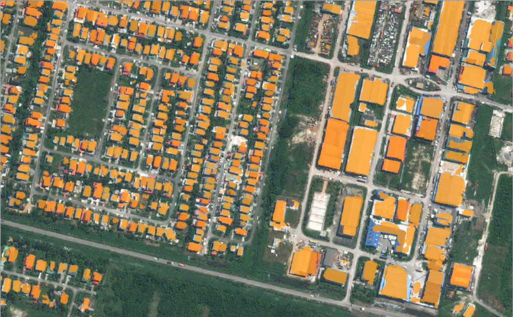
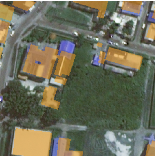
Deep learning models perform best when trained on a large number of correctly labeled examples. The usual approach to generating training data is to pay a team of professional labelers. In a recent project for the Inter-American Development Bank, we tried an alternative, lower-cost approach. The goal of the project was to detect buildings in satellite imagery using a semantic segmentation model. We trained the model using labels extracted from Open Street Map (OSM), which is an open source, crowd-sourced map of the world. The labels generated from OSM contain noise — some buildings are missing, and others are poorly aligned with the imagery or missing details. The predictions from the model we trained looked reasonably good, but we wondered how these labeling errors affected the accuracy. In this blog post, we will discuss some experiments to try to answer this question.
Experimenting with noisy labels
In order to measure the relationship between label noise and model accuracy, we needed a way to vary the amount of label noise, while keeping other variables constant. To do this, we took an off-the-shelf dataset, and systematically introduced errors into the labels. We used the SpaceNet Vegas buildings dataset, which contains ~30k buildings labeled over 30cm DigitalGlobe WorldView-3 imagery. Rather than making the errors completely random, we constrained them to approximate the types of mistakes we’ve observed in OSM — missing and shifted building outlines. We generated a series of noisy datasets, trained a model on each one, and recorded the accuracy of the predictions against a held-out, uncorrupted set of scenes.
Data preparation
The SpaceNet dataset contains a set of images, where for each image, there is a set of polygons in vector format, each representing the outline of a building.
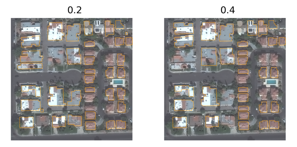
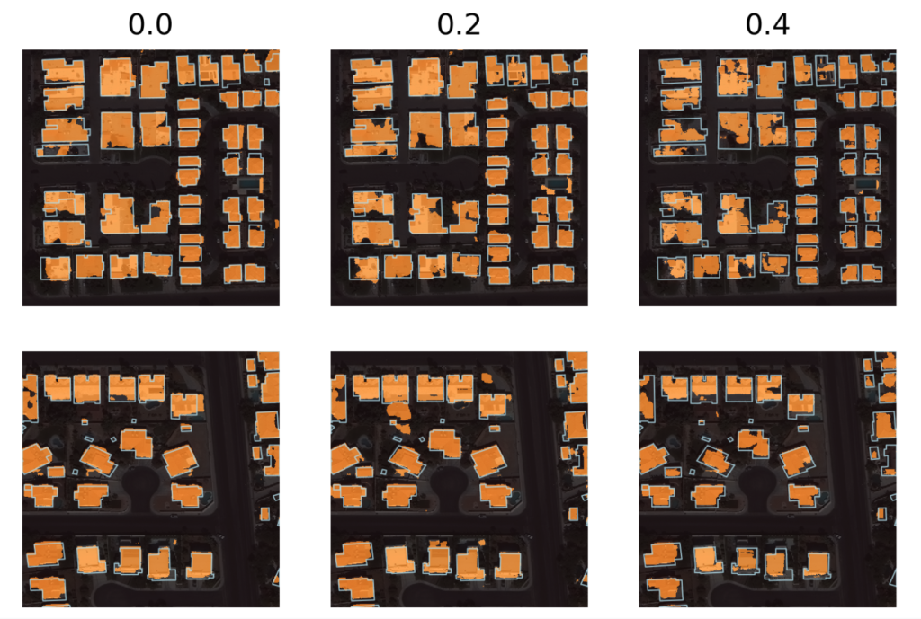
- The first series of noisy datasets we generated contain randomly dropped (ie. deleted) buildings. There are six datasets, each generated with a different probability of dropping each building: 0.0, 0.1, 0.2, 0.3, 0.4, and 0.5.
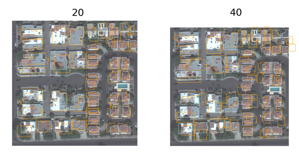
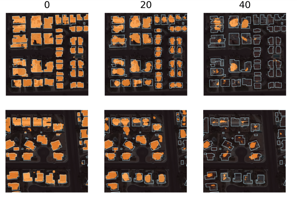
- The second series of noisy datasets contains randomly shifted buildings. There are six datasets, each with a different level of random shifting in pixel units: 0, 10, 20, 30, 40, 50.
For each dataset, each individual polygon was shifted independently by two random numbers (for the x and y axes), each drawn independently from a uniform distribution between -k and k. The figure below shows examples of scenes from a few of these noisy datasets.
Training the models
We trained a UNet semantic segmentation model with a ResNet18 backbone, using the fastai/PyTorch plugin for Raster Vision for each dataset. Each model was trained for 10 epochs using a fixed learning rate of 1e-4. The evaluation metrics reported are pixel-wise, and use the rasterized version of the vector labels. The code for replicating these experiments is open source.
Qualitative Results
The figure below shows the ground truth and predictions for a variety of scenes and noise levels. As can be seen, the quality of the predictions decreases with the noise level. Another pattern is that the background and central portions of buildings tend to be predicted correctly, whereas the model struggles with the borders of buildings. These visualizations can give a rough idea of whether the predictions are good enough to be used for a particular application. For example, the predictions in the middle column (with moderate amounts of noise) are not good enough to generate a cartographic-quality map, but may be useful for change detection and population estimation.
Quantitative Results
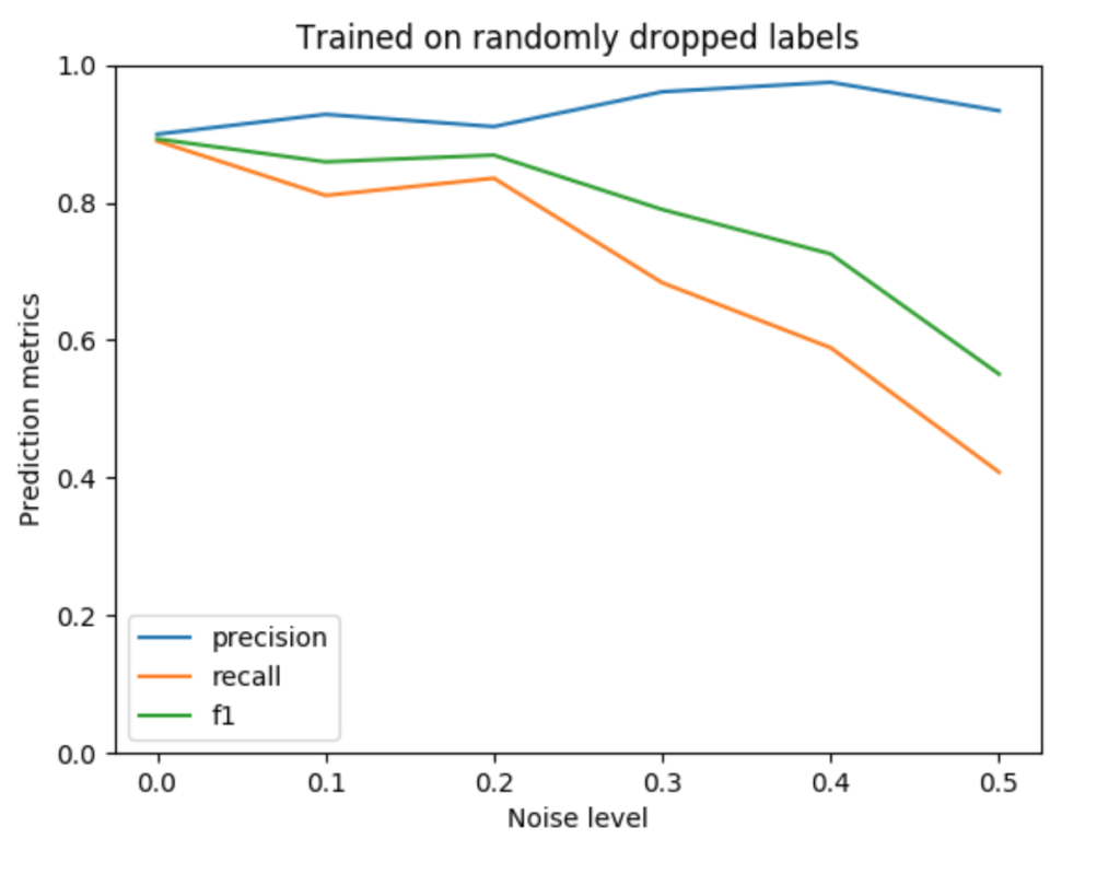
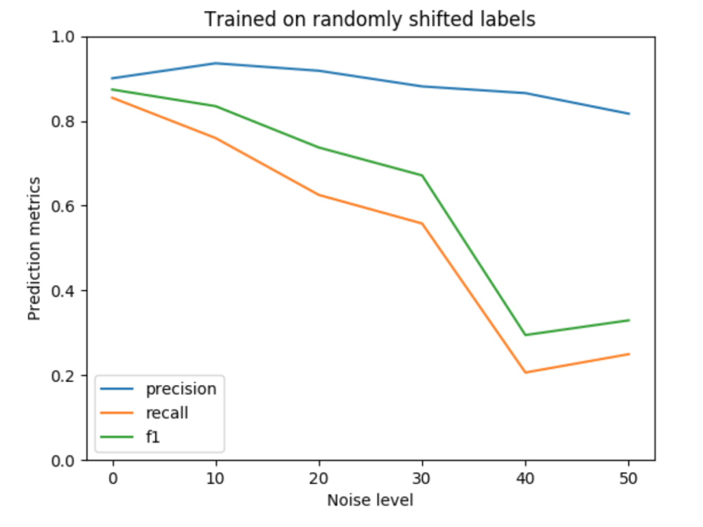
For a more quantitative look at the results, we’ve plotted the F1, precision, and recall values for each of the noise levels below. The precision falls more slowly than recall (and even increases for noisy drops), which is consistent with the pattern of errors observed in the prediction plots. Pixels that are predicted as building tend to be correct, leading to a high precision value. On the other hand, many pixels along building boundaries are missing, leading to poor recall values.
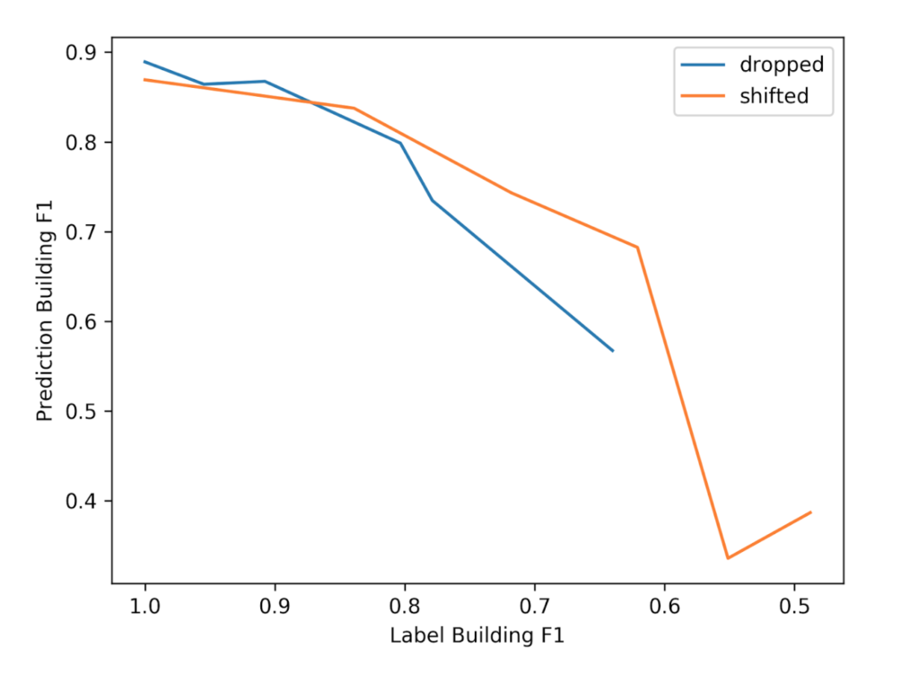
The above plots use x-axis units that are intuitive: the noise level is simply the parameter used by the noise generating process. However, this prevents us from combining and comparing the two plots because they each use different units. To fix this problem, we can quantify the noise level for the two plots in the same way: by measuring the F1 score of the noisy vs. ground truth labels, which is a function of the pixel-wise errors. (Typically we use the F1 score to measure the disparity between ground truth vs. predictions, but it can also be used for ground truth vs. noisy labels.)
Using the F1 score to measure label error also has the benefit of being more scale-invariant, which facilitates comparison across different datasets and object classes. For instance, a noisy shift of 10 in a dataset with large buildings might result in a different proportion of erroneous label pixels than in another dataset with small buildings. The figure below combines the noisy drops vs. the noisy shifts in a single graph using F1 to measure the noise level and F1 to measure prediction quality. From this, we can see that some of the shifted datasets have a greater level of noise, but that the prediction F1 scores are similar between the two series when the noise level is similar.
Conclusion
The experiments described in this blog post are a small step toward answering our original question of how much accuracy we sacrificed by using labels from OSM. The results suggest that accuracy decreases as noise increases, but that “good enough” results can be obtained with “small” amounts of noise. It also seems like the model becomes more “conservative” as the noise level increases, only predicting the central portions of buildings.
A limitation of these results is that the level of noise in OSM for most areas is unknown, making it difficult to predict the effect of using OSM labels to train models. Since we have the SpaceNet labels for Las Vegas, we could compare them to the OSM labels for Las Vegas. However, this wouldn’t tell us the noise levels for other parts of the world.
The noisy shift experiments suggest that the relationship between noise level and accuracy might be nonlinear. However, more work will be needed to quantify the functional form of this relationship. It would also be interesting to look at how the size of the training set interacts with the noise level. Perhaps a larger, noisier dataset is better than a smaller, cleaner dataset. Some work toward this goal was described in [1], but it focused on the case of image classification on Imagenet-style images. However, rather than pit these two extremes against each other, a more promising approach is to train a model on a massive, but noisy dataset, and then fine-tune it on a smaller, clean dataset as reported in [2].
References:
- [1] Deep Learning is Robust to Massive Label Noise
- [2] Mapping roads through deep learning and weakly supervised training
Learn More about Deep Learning at Azavea: