![]()
Now in its second year, Azavea’s Summer of Maps Program has become an important resource for non-profits and student GIS analysts alike. Non-profits receive pro bono spatial analysis work that can enhance their business decision-making processes and programmatic activities, while students benefit from Azavea mentors’ experience and expertise. This year, three fellows worked on projects for six organizations that spanned a variety of topics and geographic regions. This blog series documents some of their accomplishments and challenges during their fellowship. Our 2013 sponsors, Esri and Tri-Co Digital Humanities helped make this program possible. For more information about the program, please fill out the form on the Summer of Maps page.
Using Raster Analysis in ArcMap to Create a Normalized Weighted Risk Index
This summer I worked on a GIS-based project for DVAEYC, Delaware Valley Association for the Education of Young Children, to create reports for each house, city council, senate and congressional district in Philadelphia. These reports were about each district’s access to high-quality early childhood education programs. As part of this project, I was asked to create an index of early childhood risk based on a number of risk factors, including children under five years with a single mother and children under five years under 100% of the poverty line. I used this index to rank each district in comparison with the other districts in the same chamber. To combine the 12 risk factors into a single, quantitative measure of risk which I could then aggregate to legislative district, I decided to use raster analysis. Raster is best suited for this because it would not be concretely linked with any geographic boundary.
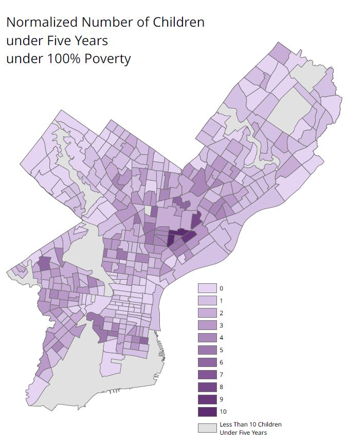
The bulk of the risk factor data was American Community Survey (ACS) 2011, 5-year estimates and was downloaded using Azavea’s ACS Alchemist. These vector census tracts had aggregated counts of the risk factors. Though I created percentages from these counts to make easily-understood maps of each individual risk factor, I decided to use counts for the raster analysis. This is because the raster analysis was meant to identify areas with high incidence of the combined risk factors, making percentages for each census tract not ideal. Using the counts, however, posed a difficulty because factors with higher counts (for example, the number of children under five as opposed to the number of children under five below the poverty line) would be weighted more heavily when the risk factors were added together. I needed to create a way to give all the risk factors equal weight.
To do this, I created new fields in each risk factor’s attribute table for calculating the normalized value. For each risk factor, I then divided the range of values into ten equal intervals. Then, back in the attribute table, I calculated the new field with values 1 through 10 for each equal interval using Select by Attributes and the Field Calculator. A normalized value of 1 indicated the least amount of risk and a normalized value of 10 indicated the most amount of risk. Zero values were given a value of zero in the normalized field, except in instances where a zero value is equal to the most risk (for example, for number of fresh food outlets within walking distance). In those cases, only 9 equal intervals were used, and the zero values were their own interval (with a value of 10).
After the normalization fields were completed, I exported only the tracts where the population of children under five years was greater than 10 as new feature classes, as I considered the tracts with less than 10 children under 5 years to be outliers.
I then converted these new risk value feature classes from vector to raster using the Polygon to Raster tool. I encountered some problems in this step. To troubleshoot, I completed the conversion on a local drive instead of a network file share, saved the output to a simple file path with no spaces anywhere in the path, and kept the file name under 10 characters.
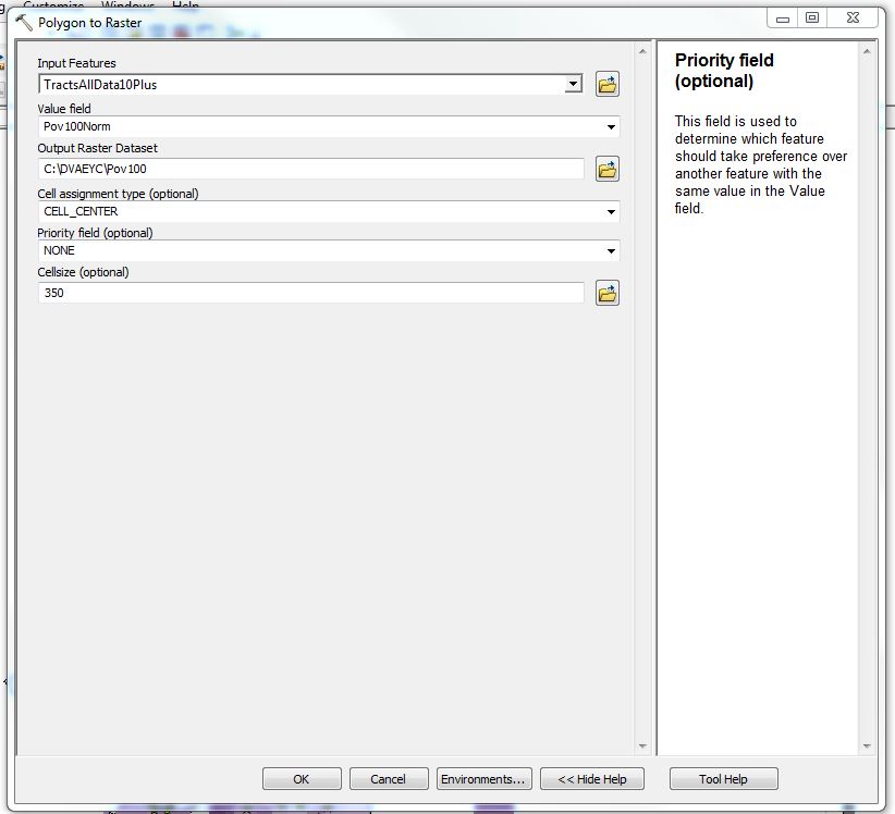
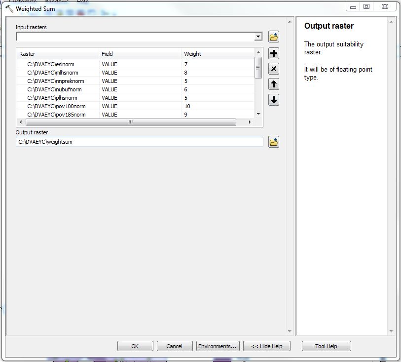
To combine all the rasterized risk factors into one layer, I used the Weighted Sum tool, which multiplies each raster by a number of your choice and then sums all the values. I received the weights for the risk factors from DVAEYC.
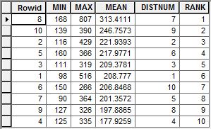
I then used the Zonal Statistics as Table tool to calculate the average amount of childhood risk for each of the legislative districts. The Input Raster or Feature Zone Data was the vector boundary file, and the Zone Field was the district number. This Zone Field must be a text field. The Input Value Raster was the weighted sum raster. I chose MIN_MAX_MEAN as the Statistics type. I was most interested in the mean, but I also wanted to look at the range of risk in each district.
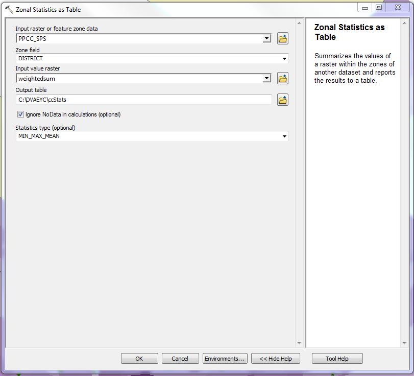
The Zonal Statistics as Table tool outputs a table with the statistics. To complete my study, I then used these tables to rank the districts by average risk and complete my study.
-

Figure 3 – The Weighted Sum tool in ArcMap. Raster analysis, and specifically normalization and the Weighted Sum and Zonal Statistics as Table tools were easy to use and essential for the completion on my Summer of Maps project with DVAEYC.

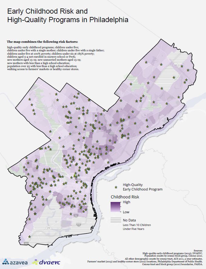
Figure 6 – This map shows the completed raster risk analysis. The green stars are high-quality early childhood programs.