
This post is part of a series of articles written by 2018 Summer of Maps Fellows. Azavea’s Summer of Maps Fellowship Program is run by the Data Analytics team and provides impactful Geospatial Data Analysis Services Grants for nonprofits and mentoring expertise to fellows. To see more blog posts about Summer of Maps, click here.
America is facing an eviction crisis, and New Orleans, Louisiana is not immune. While the national eviction rate is estimated to be 2.75%, the New Orleans rate is almost double that, at 5.22%. This is count of evictions ordered over number of rental units, and it means that in 2017 in New Orleans, 1 out of every 19 rental households were faced with an eviction order.
Working with eviction data
There’s actually no national database of evictions; every courthouse has their own system for organizing records. The closest thing to a national eviction database is the information that the Eviction Lab has compiled on housing precarity across the country. But, data for New Orleans is an interpolation based on poverty levels and data from risk assessment companies. Incredibly, a community justice lawyer at Loyola University, Davida Finger, put together a dataset of evictions ordered in the city by compiling courthouse records dating from January 2015 to June 2018. From this dataset, we learned that since January 2015 there have been 15,518 evictions filed, and 13,309 ordered. Based on average household size in different areas of the city (and excluding evictions ordered on the same tenant), we can estimate that since January 2015, 24,666 people have been displaced in the throes of the eviction crisis.
One organization in New Orleans that aims to bring attention to this crisis is Jane Place Neighborhood Sustainability Initiative, a Community Land Trust (CLT) and housing rights organization. They’re dedicated to sustainable, equitable and economically just communities. They are interested in where evictions are happening across the city, as well as why evictions are happening where they’re happening.
Connecting evictions with redlined districts
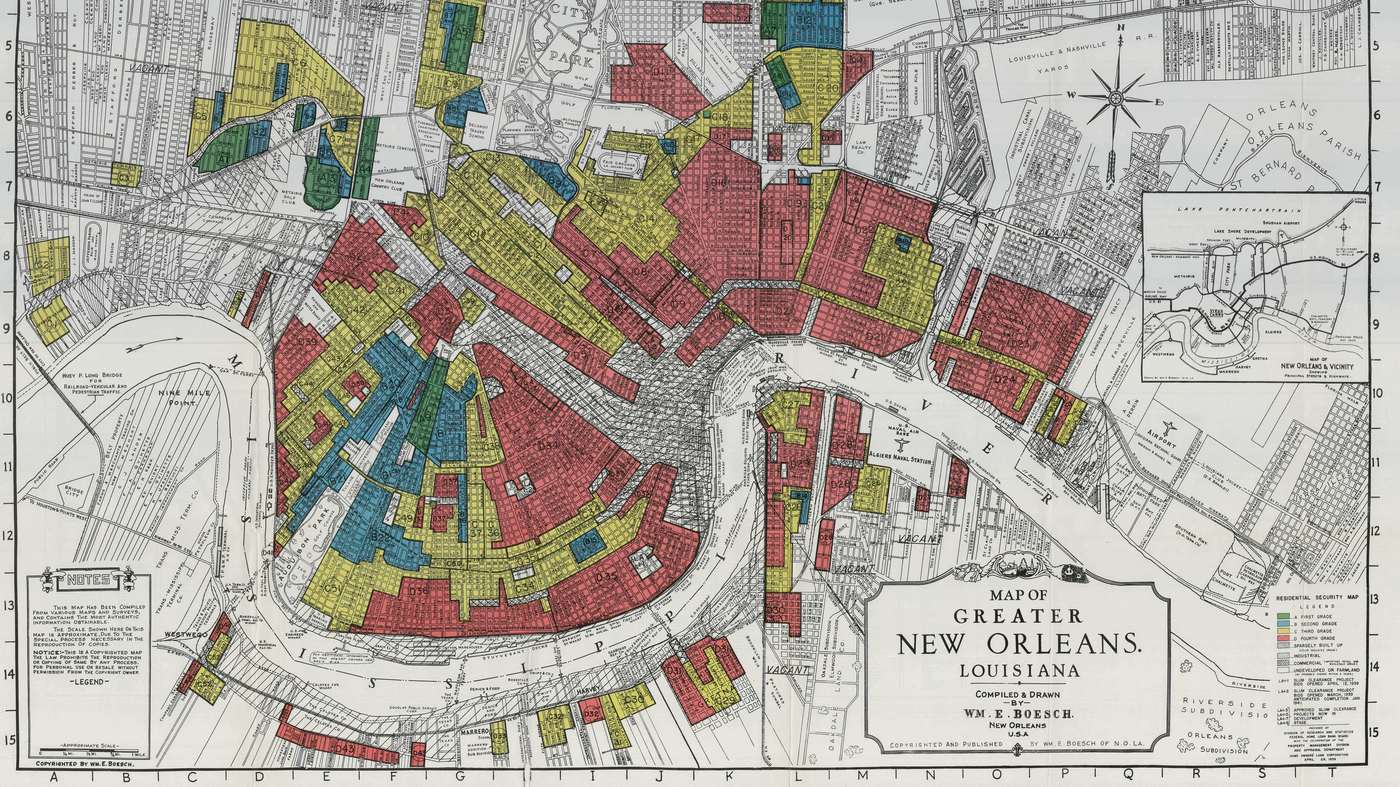
Jane Place was particularly interested in drawing a connection between past divestment in certain communities via redlined districts and the current eviction rates. Redlined districts were drawn by the government sponsored Homeowners Loan Corporation, and designated risk to neighborhoods or communities based on racial make-up. Red areas (“redline districts”) were categorized as “hazardous” due to high proportions of Black residents. They were categorized as risky by banks and lenders, and were systematically divested from and excluded from lines of credit for mortgages.
These security maps of redline districts served as a foundation for perpetuating race and class divides across America, and barring communities of color from access to homeownership. Being barred from buying a home increased the generational wealth gap between white and black families which persists today. Lack of homeownership increases housing instability, as families are subject to rent raises and vulnerable to evictions. You can read more about the legacy of these zones here. The zones are available as scans of historic security maps, but were recently digitized through a project of University of Richmond Digital Scholarship Lab, available for download as shapefiles which enables analysts to easily incorporate the maps into spatial analysis.

Optimized hotspot analysis of evictions
To answer the broad question of where evictions are happening, I geocoded evictions by the address associated with the court ordered eviction, the result being point data. To connect this point data with regions of interest (HOLC zones), I limited the study area to evictions that have happened within graded zones. This way I could compare eviction rates within that boundary based on which zone they fell into.

To determine the relationship between HOLC zones and evictions, I used the Optimized Hotspot Analysis tool in ArcGIS. This tool identifies statistically significant spatial clusters of high values and low values (hotspots and coldspots). It aggregates incident data to boundaries of the analyst’s choice. I chose city blocks, after comparing a few different aggregation boundaries like hex bins and neighborhood boundaries.
Analyzing the relationship between evictions and redlining
The striking result here is that the areas where evictions are happening in significant numbers coincides with with D graded redlined districts, in which residents were denied access to credit and thus home ownership. By combining Optimized Hotspot Analysis with digitized HOLC maps, we can explore the relationship between two spatial datasets, and in this case reveal an overlap between past divestment and statistically significant areas in the current eviction crisis in New Orleans.

Legacy of redlined districts
Another way to combine these two datasets is to categorize each city block based on which grade it was assigned in the 1930s, and visualize this in tandem with its modern day eviction rate. I performed spatial joins to assign city blocks with their HOLC grade and the eviction rate of the census block group the city block falls into. The eviction rate is an average of rates from 2015, 2016, and 2017. You can see the results below:
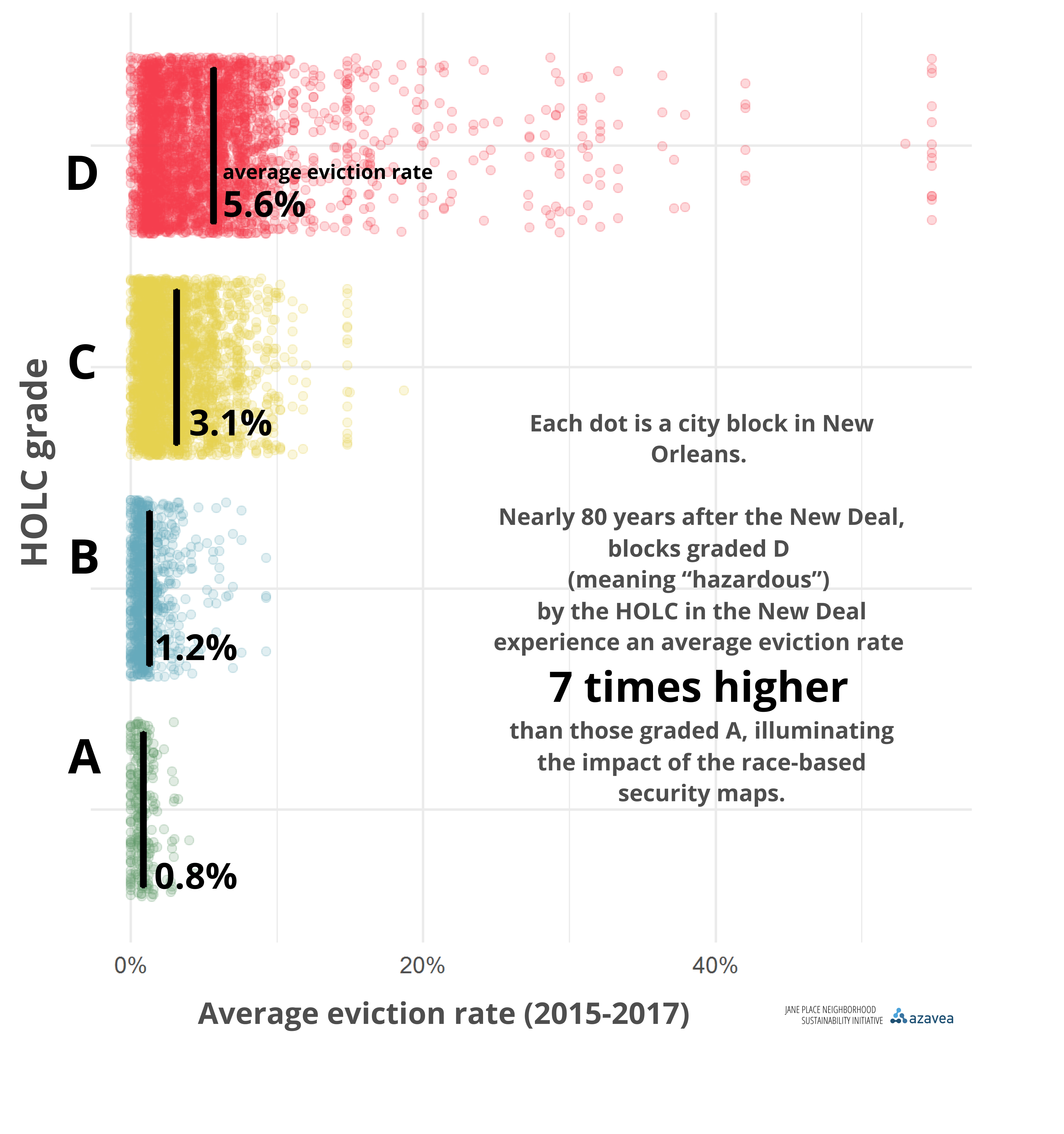 The red dots are city blocks that were zoned D by the Homeowners Loan Corporation, the yellow were zoned C, and so on. As you can see, there’s a seven fold increase in average eviction rate for blocks that were redlined. The legacy of the New Orleans redlined districts prevails, and communities that were excluded from mortgages and paths to home ownership are still dealing with the consequences.
Thanks to the compilation of courthouse records and thus a dataset of evictions to work with, we can begin to answer questions about where evictions are happening, who is most affected, and what systems are or were in place that perpetuate inequitable housing.
If you’re interested in working on similar projects during the 2019 Summer of Maps fellowship, sign up to receive notifications about future opportunities.