
This post is part of a series of articles written by the 2020 Summer of Maps Fellows. Azavea’s Summer of Maps Fellowship Program is run by the Data Analytics team and provides impactful Geospatial Data Analysis Services Grants for nonprofits and mentoring expertise to fellows. To see more blog posts about Summer of Maps, click here.
Aggregating points and the modifiable areal unit problem
When we’re working with vector point data, there are a number of reasons we might want to aggregate those points into larger areas:
- Visualization / Interpretability: It may be easier to visualize and interpret points on a map when they’re aggregated, especially if the dataset includes many overlapping observations.
- Required by analysis: Some analysis methods, such as a calculation of Moran’s I, require aggregated polygon features.
- Joining with other data: We might want to join the point data with existing polygon data, like census tracts.
- Processing efficiency: It might be faster and more efficient to process the data in an aggregated form.

However, aggregating the dataset leads to the well-known modifiable areal unit problem. The choice of unit of aggregation can lead to totally different conclusions about the distribution of the data, as shown in the images here.
The example shows a few different shapes, but let’s say we just want to use square grid cells, like a raster, to aggregate our point data. Our question then is: what’s the right pixel size?
There’s no one correct answer or approach. A good practice is to choose a cell size that aligns with the spatial process that determined the locations of the points in the first place. For example, if we were analyzing pickup locations for taxi rides, we might choose a pixel size that’s roughly walking distance. Often, it comes down to “what looks right” compared to what we know about the data and the phenomenon, but that’s not always a scalable or replicable approach.
Gun crime data – The State Gun Law Project
The State Gun Law Project recently compiled a massive dataset of geolocated gun crimes from 34 American cities. There is significant heterogeneity in the data for each city:
- Each city’s data covers different time spans.
- Some cities include only violent gun crimes, but others also include non-violent gun crimes like illegal possession.
- The classification methods differ for each city. Whereas some cities explicitly report certain crimes as gun crimes, for other cities the State Gun Law Project had to make assumptions about whether a crime was likely a gun crime based on its description.
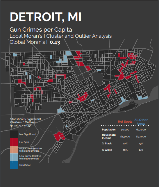
In addition, the cities exhibited unique spatial patterns. Some cities, like Detroit, featured smaller, more scattered hot spots, suggesting that gun crimes sort at a smaller spatial unit in those cities, like individual blocks or streets.
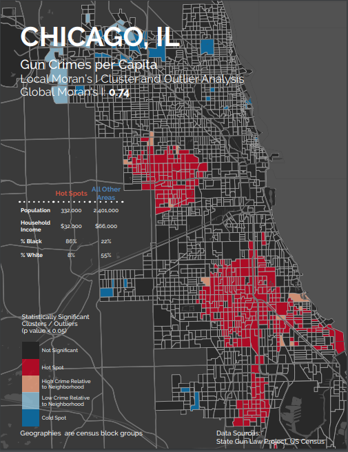
Others, like Chicago, exhibited larger, more sprawling hot spots that suggest gun crimes are influenced at a much larger spatial scale.
With such a diverse set of point patterns spanning so many different settings, the “what looks right” approach quickly becomes impractical. How can we choose a grid cell size for each city in a scalable, replicable way?
Choosing a spatial unit of analysis
One approach recently published by Malleson, et al. (2019) aims to systematize the “what looks right” approach. While their paper offers a good deal of discussion on the topic, they distill the “most appropriate” spatial scale down to the scale that “is as large as possible without causing the underlying spatial units to become heterogeneous with respect to the phenomena under study”. That is, the patterns exhibited in the aggregated grid cells should line up with the patterns in the underlying point pattern.
In the remainder of this blog post, I walk through the authors’ proposed methodology by applying it to the State Gun Law Project’s gun crime data for the city of Baltimore.
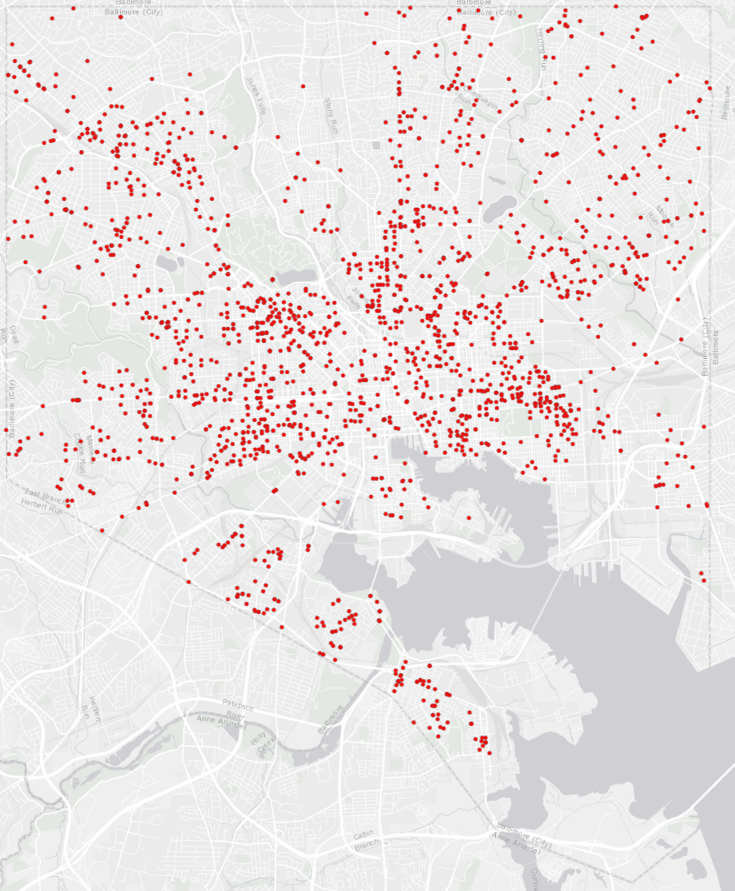
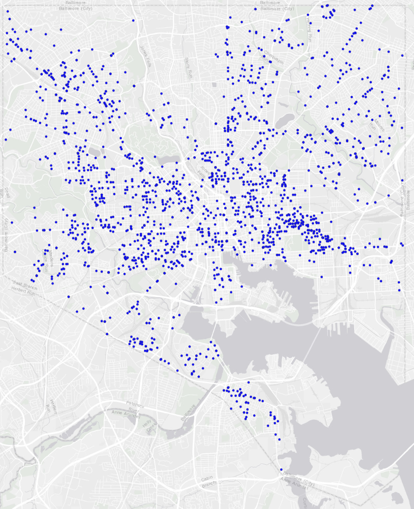
We begin by choosing two similar point patterns: gun crimes in Baltimore in 2017 and 2018.

Baltimore gun crimes, 2017 
Baltimore gun crimes, 2018
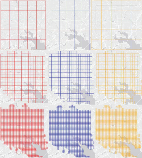
Then, we draw a series of rasters over Baltimore with progressively smaller grid cells. For each raster, we count the number of gun crimes from each of the two years that occur in each cell. Additionally, we repeat the process a few times for each grid cell size but shift the entire raster randomly in the X and Y dimensions to add some robustness to our estimates. Examples of a few of the rasters are shown below.
For each raster we’ve created, then, we’ll have two sets of cell values: the number of crimes that occurred in the cell from 2017, and the number of crimes from 2018. Using a Fisher’s exact test, we determine how “similar” those two sets of counts are for each raster. If we plot this measure of similarity, which ranges from 0 to 1, on the y-axis, and then the number of grid cells contained in each raster on the x-axis, we see the overall similarity of the rasters increases monotonically as the raster cells become smaller.
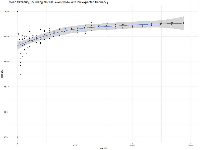
This makes intuitive sense. As the raster cells become smaller, more of them will contain zero crimes. The more cells that contain zero crimes, the more “similar” the rasters would be in terms of the aggregated counts of crimes across the two years. Many tiny pixels containing zero crimes, however, is not what we’re interested in, so we need to set some sort of lower bound.
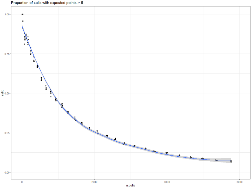
Using a Chi-squared test, we can find the “expected” number of gun crimes in each raster cell. Following standard recommendations, we can then filter out any cells expected to contain fewer than five crimes. Plotting the proportion of cells expected to contain at least five crimes against the number of cells in each raster shows that the proportion decreases as the cells become smaller, an inverse of the previous chart.
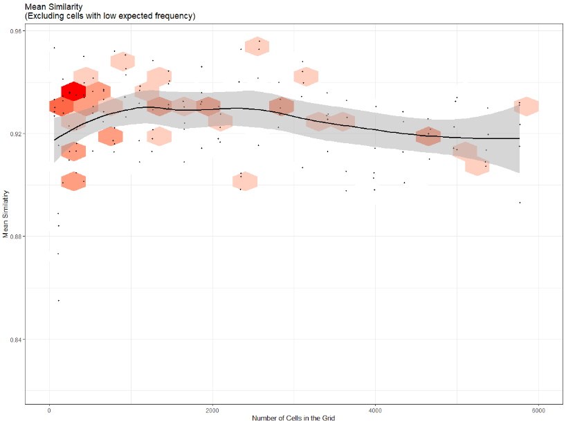
We can then recalculate similarity for each raster, this time considering only the grid cells expected to contain at least five gun crimes. We see now that similarity no longer increases monotonically as the raster cells become smaller. Instead, similarity peaks when the rasters contain roughly 1,200 cells. We interpret this as the most “appropriate” spatial unit for gun crimes in Baltimore. It is at this cell size that the patterns shown in the aggregated rasters most closely resemble the patterns exhibited in the underlying points. Cells that are larger than this size may be smoothing over some smaller-scale spatial influences that affect gun crimes in Baltimore. Cells that are smaller than this may be picking up more noise in the spatial distribution of gun crimes than signal.
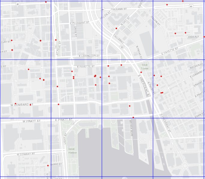
It turns out that 1,200 equally sized squares stretched over Baltimore leads to raster cells that are roughly 50 acres in area. Below, we can see some of the final grid cells overlaid on Baltimore, along with some of the gun crimes from 2017.
Conclusion
The methodology proposed by Malleson et al. for determining an appropriate spatial unit for analyzing point patterns is a useful framework for the State Gun Law Project for two reasons. The first is that the determination of the appropriate spatial unit can be a finding in and of itself. In this post, we learned that the most appropriate spatial unit of aggregation for gun crimes in Baltimore, based on the sample of points available and their distribution across the city, appears to be units that are approximately 50 acres in area.
To the extent this differs significantly from our findings for another city, we can interpret this to mean that gun crimes in the two cities operate at different spatial scales. We can then use that finding to motivate further research into the differences in underlying behaviors, reporting standards, or perhaps elements of the built environment that might be producing those different spatial scales.
The second reason is that the methodology helps us assess whether a spatial unit of analysis we want to use is meaningful. Place-based gun laws restrict firearm possession in certain areas. The Gun-Free School Zones Act, for example, prohibits possession within 1000 feet of any school. For a researcher interested in studying whether the law has had an appreciable effect on the incidence of gun crime near schools, assessing whether the 1000-foot radius is a meaningful spatial unit in their study area is a critical first step. This methodology brings us a bit closer to understanding whether spatial variations in the crime data are picking up real signals or just noise.