
I’ve written previously about how nearly impossible it is to quantify the accuracy of machine learning models — not because the statistics aren’t sound, but because we feeble humans aren’t equipped to intuitively understand them. The most important piece of advice in that article, and a lesson I’ve learned over and over again, is this:
If you want to understand how accurate a model is, look at its predictions directly, not at its summary statistics.
For most practical applications, it’s a much more worthwhile pursuit to try to get inside the “mind” of a machine learning model than it is to try to reduce it to a single, incomprehensible number purporting to represent “accuracy”. In all of the projects I’ve ever worked on, it would have been more helpful to be able to say something like, “Our model performs about as well as the 80th percentile labeler that contributed to our training dataset” than it would be to say, “Our model performed with an average F1 score of 0.86 across all classes, weighted proportionally.” My mom can understand the first of those statements; I don’t even fully comprehend the second one and I’ve said it out loud before.
Tip 1: Find (or build) a tool for comparing your training data and your model predictions to test data
At Azavea, we work with spatial data — mostly, we use deep learning to extract features from satellite, drone, and aerial imagery. For a long time, we simply used QGIS to visualize the predictions we were making — and it worked surprisingly well! Some layers were images, other layers were predictions, and we would just feverishly toggle them on and off to get a sense of how we were doing. Over time, we’ve built out some tools for ourselves internally to be able to compare images to each other that have made life a little easier, but the important thing is that simply investing the time to figure out how to qualitatively compare your predictions to test data will pay tremendous dividends down the line.
Here’s what a very basic tool looks like for comparing labels and predictions to test imagery:
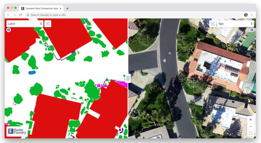
Simply sliding between labeled data, predictions, and test data can yield tremendously helpful insights. For instance, in this dataset, while looking at the training data we found a common thematic error in the data: seam lines. Because the large images we were working with had been chopped up into bite-sized “chips” which were labeled independently, occasionally, we found areas where obvious seams had formed when two labelers working myopically on adjacent chips had made differing decisions. This kind of error is easy to miss if you simply inspect the chips individually, but mosaicking them on a map made it immediately obvious:

Tip 2: Use a confusion matrix to guide your work
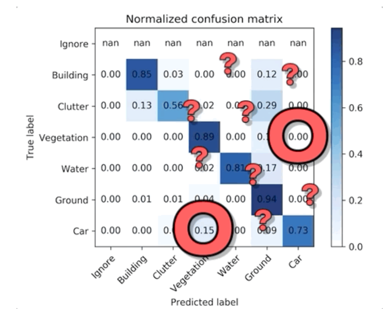
Simply taking the time to look at your data is extremely helpful, but eventually, you’ll start to get worn out. There’s just so much to look out for, and most of it isn’t stuff you know to look for in the first place. The surprises are where all of the value is. One way to help guide your search for interesting insights is using a tool called a “confusion matrix,” which maps a model’s predictions to the ground truth (e.g. labeled data) in a visual way that highlights where the model is most likely to “confuse” two classes. For instance, in the model highlighted above, there were seven classes. This is what its confusion matrix looked like:
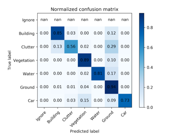
There’s a lot you can infer from this simple table, but let’s pick out one particularly puzzling correlation. According to the confusion matrix, our model never confused vegetation for car but about 15% of the time confused car for vegetation. Uh, what? That is a surprising mistake for a model to make…
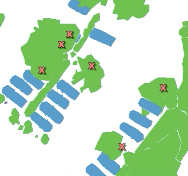
But if we go back to our comparison tool and look for cars near vegetation, we can immediately find something interesting — cars in residential areas are often parked near or under trees (e.g. street trees, yard trees, park trees, etc.). Our labeled data chose a simple heuristic: if a car is parked under tree canopy but still visible, label it as vegetation not car. So the model learned that vegetation is always vegetation — it’s never a car. But sometimes cars are vegetation!
This is the type of unintended consequence that either we can live with (after all, it’s only 15% of the time…) or we can use to inform our labeling practices given the goals of our project. We could change the heuristic and/or prioritize our labeling practices to prioritize imagery likely to contain more examples of trees near or under tree cover to help give the model more context for when to classify a car as a car and when to classify it as vegetation.
Tip 3: Do the labeling yourself
I promise you that you do not understand the nuance of the problem you’re trying to automate if you haven’t manually tried to do it yourself. You think the world is so easy to collapse into a few neat categories? As I’ve written before, no problem is as simple as it seems. There’s no substitute for doing the work yourself — if you’re the person defining the categories you would like to classify, you’ll likely discover quickly that you’ve chosen a terribly fragile taxonomy.
The other advantage doing (at least some of) the labeling yourself offers is the magical experience of seeing your consciousness codified by an algorithm. There’s something truly excited about painstakingly tracing some features in a series of images only to watch an algorithm reproduce your work 10x or 100x faster–and all of the mistakes it makes become more personal.
Whatever you do, don’t allow yourself to be seduced too much by comparative statistics and fancy charts. The most informative work is often very much manual and time-intensive–it’s the sweat equity for the beautiful, automated analysis to come later. Combing through data first-hand and trying to build up an intuition about what a model is relying on when making judgments is the heart and soul of machine learning experimentation. And invariably you’ll find, even when the mistakes a model is making seem on the surface to be staggeringly stupid, they’re logical if you naively work backward to the training data.