
We are living with the unfortunate reality that life expectancy varies wildly among communities in the U.S. Economic and social conditions like income, unemployment, violent crime and access to healthcare all contribute to how long residents of a certain place will live.
A recent Philly.com article used data from the National Center for Health Statistics (NCHS) to reveal a startling reality about the geography of health within the Philadelphia region: short distances separate neighborhoods with dramatically different life expectancies. For example, people born in the Spring Garden neighborhood of Philadelphia can expect to live 21 years longer than those born less than two miles away in Mantua.
These disparities are certainly not unique to Philadelphia. All around the country there are examples of borders that separate high life expectancy areas from low ones. This presents an interesting spatial analysis problem: where are the most extreme examples of these borders?
This post offers a tutorial on how to investigate this very question. It demonstrates how you can combine essential geospatial and non-geospatial Python libraries into one sophisticated analysis.
GeoSpatial Analysis in Python
The data are available at the tract level so we will be looking for the pairs of census tract neighbors that have the highest disparities in life expectancy.
Before you begin, you will need to download two datasets. The first is a csv of tract-level life expectancy from the NCHS. The second is a shapefile of all tracts in the US. The former includes the attribute data (life expectancy) that we need while the latter has the spatial information necessary to determine which tracts are neighbors with each other.
Next, we will load the requisite packages for this analysis.
import pandas as pd
import geopandas as gpd
import pysal as ps
import networkx as nx
import folium
from folium.plugins import MarkerCluster
In the first step, we will use Pandas and GeoPandas to read in the life expectancy dataset and tracts shapefile. After manipulating some column names and types, we merge the two datasets. The end result is one GeoDataFrame of census tracts with geometry attributes and life expectancy appended.
lfe = pd.read_csv('US_A.CSV')[['Tract ID', 'e(0)']] \
    .rename(index=str,
            columns={'Tract ID': 'GEOID',
                     'e(0)':'life_expectancy'})
lfe['GEOID'] = lfe['GEOID'].astype(str)
gdf = gpd.read_file('usa_tracts.shp')[['GEOID','geometry']]
gdf = gdf.merge(lfe).set_index('GEOID')
We will need to eventually create a dataset of every unique combination of census tract neighbors in the entire U.S. For each combination of tracts, we will determine the disparity in life expectancy between the two. Once we have done this, we can rank the pairs according to this metric and find the most extreme cases.
Spatial Weights Matrix
The first step in generating this dataset is to create a spatial weights matrix. A spatial weights matrix is a data structure that accounts for the spatial relationships among all of the geometries within a dataset. We are interested in borders so we will look for contiguity based weights. The two most common criteria for determining contiguity are the ‘queen’ and ‘rook’ relationships.
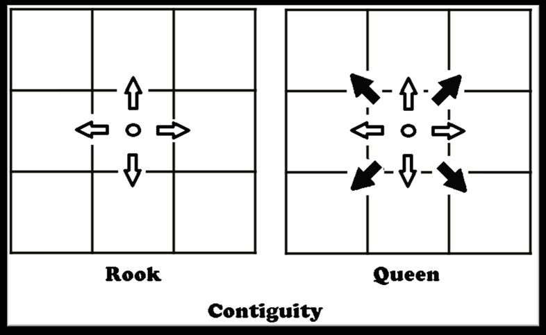
We will use rook contiguity to define spatial weights matrix because we are interested in tract pairs that actually share a border. This is easy to to do using the PySAL library, which allows us to create a spatial weights matrix from a GeoDataFrame.
swm = ps.weights.Rook.from_dataframe(gdf)
tract_to_neighbors = swm.neighbors
PySAL objects contain a ‘neighbors’ object, which is what we are interested in. This object is a dictionary in which each key is a tract ID and each value is a list of IDs for the tracts that border it.
Next we will create a dictionary of tract IDs and their associated life expectancy values.
fips_to_lfe = dict(zip(lfe['GEOID'].astype(str), lfe['life_expectancy']))
Network Analysis
To perform our analysis, we need to encode our tracts as a NetworkX graph. This network structure is made up of nodes (census tracts) and edges (borders between tracts). Organizing our data this way will make it easy to analyze the neighbor relationships among all of the tracts.
The first step is to initialize a graph object and then add a node for each tract within our dataset.
g = nx.Graph()
g.add_nodes_from(gdf.index)
Next we will find the disparity in life expectancy between each pair of neighboring tracts.
for tract, neighbors in tract_to_neighbors.items():
    avail_tracts = fips_to_lfe.keys()
    # some tracts don't seem to show up in the life expectancy dataset
    # these may be tracts with no population
    if tract in avail_tracts:
        for neighbor in neighbors:
            if neighbor in avail_tracts:
                tract_lfe = fips_to_lfe[tract]
                neighbor_lfe = fips_to_lfe[neighbor]
                disparity = abs(tract_lfe - neighbor_lfe)
                g.add_edge(tract, neighbor, disparity=disparity)
    # remove the node from the graph if the node is not in the life
    # expectancy dataset
    elif tract in g.nodes:
        g.remove_node(tract)
After populating our graph, we only need one line of code to find all tract neighbor pairs and sort them by the disparity in life expectancy between the two.
sorted_list = sorted(g.edges(data=True), key=lambda x: x[2]['disparity'], reverse=True)

print(sorted_list)
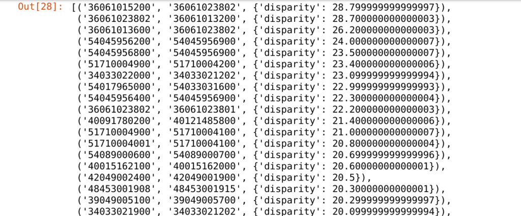
You can see that each element in the list represents a pair of neighbor tracts and the disparity in life expectancy between them. We are only interested in the most extreme examples so we will find the 50 most disparate pairs. We will then extract a GeoDataFrame of only the tracts that make up these pairs.
top_50 = sorted_list[:50]

top_50_tracts = []
for t in top_50:
    if t[0] not in top_50_tracts:
        top_50_tracts.append(t[0])
    if t[1] not in top_50_tracts:
        top_50_tracts.append(t[1])

top_50_tracts_gdf = gdf[gdf.index.isin(top_50_tracts)] \
    .reset_index() \
    [['GEOID', 'geometry', 'life_expectancy']]
top_50_tracts_gdf.to_file('selected_tracts.geojson', driver='GeoJSON')
Mapping the Results
So, where are all of these neighbor pairs? We can create a Leaflet map of them in Python using Folium.
m = folium.Map(tiles='cartodbpositron', min_zoom=4, zoom_start=4.25,
               max_bounds=True,location=[33.8283459,-98.5794797],
               min_lat=5.499550, min_lon=-160.276413,
               max_lat=83.162102, max_lon=-52.233040)

marker_cluster = MarkerCluster(
    options = {'maxClusterRadius':15,
               'disableCusteringAtZoom':5,
               'singleMarkerMode':True}).add_to(m)

folium.Choropleth(
    geo_data = 'selected_tracts.geojson',
    data = lfe,
    columns = ['GEOID','life_expectancy'],
    fill_color = 'YlGn',
    key_on = 'feature.properties.GEOID',
    name = 'geojson',
    legend_name='Life Expectancy'
).add_to(m)

for i, tract in top_50_tracts_gdf.iterrows():
    x = tract.geometry.centroid.x
    y = tract.geometry.centroid.y
    l = tract.life_expectancy
    folium.CircleMarker([y, x], radius=8, color='black',
                        fill_color='white', fill_opacity=0.5,
                        tooltip='Life expectancy: {}'.format(str(l))).add_to(marker_cluster)

f = folium.Figure()
title = '<h2>Does your census tract determine how ' + \
        'long you will live?</h2>'
subtitle = '<h4><i>Census tract neighbors across ' + \
           'the U.S. with the widest disparities ' + \
           'in life expectancy<i></h4>'
f.html.add_child(folium.Element(title))
f.html.add_child(folium.Element(subtitle))
f.add_child(m)

f
Click on a cluster to zoom in to a specific pair of tracts. Hover over each tract to see the life expectancy of those that live there. Consider this example of neighboring tracts in Salt Lake City:
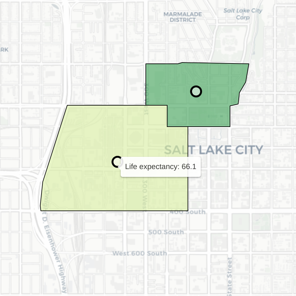
Despite their proximity, residents of these two tracts have dramatically different expected life outcomes. People who live in the tract on the left are expected to live (on average) 18.4 fewer years than those in the tract on the right (average life expectancy of 84.5).
These disparities usually do not occur randomly. It is likely that behind many of these extreme cases are complex stories of real and imagined boundaries. We would need to dig a lot deeper to fully comprehend each of these stories but thanks to this analysis we know where to look.
Intrigued by this analysis? Check out our Data Analytics page for more of our work.