
The City of Philadelphia Office of Open Data and Digital Transformation recently published updated data on Complaints Against Police in Philadelphia on OpenDataPhilly. The release was part of the Philadelphia Police Department’s accountability processes and includes three associated datasets:
- Complaints Against Police (CAP): includes Police District, general classification, and a summary description of the complaint
- CAP Findings: demographic details of the police officer(s) involved, the allegations, and the status of the Philadelphia Police Department Internal Affairs Division investigation of the allegation
- CAP Complainants: demographic details of the complainant(s)
All three datasets are available as a CSV and API and include information from 2013 to the present year. The City indicates that the data will be updated on a monthly basis.
Azavea has played a role in the OpenDataPhilly project since the beginning, so when I heard news of this recent release from former Philadelphia Chief Open Data Officer Mark Headd, I was inspired to dive straight into the data.
This is huge. Underscores the commitment of @PhiladelphiaGov @PhillyMayor to sharing meaningful data for Philadelphians to critically analyze the performance of their government. https://t.co/9upVkAQwnG
— Mark Headd (@mheadd) January 18, 2018
In 2013, Mike Ball built a map that enables users to interact with detailed information on Philadelphia Police Advisory Commission Complaints 2009 – 2012 data. This resource made it possible to investigate potential geographic patterns in the data.
I wanted to provide an initial visualization using the updated data, so I first downloaded the data, then looked into the attribute values and information formats, and then moved forward with a spatial analysis and data visualization.
Exploring the data
First, I downloaded the Complaints Against Police and Police Districts .csv files. While the CAP data includes valuable information about specific complaints, it is not geocoded – this means that the data does not include explicit locational information like the latitude/longitude of the complaint occurrence location. The CAP data table does include both a Police District ID and the address of the Police District office. Since both the CAP and Police District data have Police District IDs, I could join the attributes from the CAP table to the Police Districts spatial data.
This is a simplified breakdown of the attributes included in the three datasets:
- Complaints Against Police (CAP)
- Police District ID and CAP ID included
- CAP Findings
- CAP ID included
- CAP Complainants
- CAP ID included
I used the “Complaints Against Police” general data for the analysis outlined in this post. It would definitely be interesting to conduct a comparative analysis of demographic attributes for the Police Officers and Complainants included in the”CAP Findings” or “CAP Complainants” tabular data in future studies. Some ideas for ways to work with this data are included at the end of this post.
Choosing analysis tooling
This analysis was dependent on joining the attributes from the CAP table to the Police Districts spatial data. Table joins are a common data analysis technique and there are many tools and custom scripts that can help you accomplish this task.
Since I wanted to turn this around quickly and display interactive results online, I decided to use CARTO, a product that offers easy-to-use spatial analysis and visualization tools. I considered using Mapbox GL JS or Leaflet.js to create a custom web app, but the quickest solution seemed to be to leverage the built in analysis and design tools of the CARTO Builder platform.
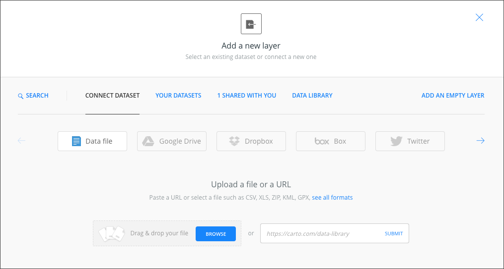
Adding the data to CARTO Builder
The CARTO Builder interface allows you to upload data via drag and drop or by pasting a URL to the upload prompt.
In this case, I downloaded the Police Districts and CAP datasets from OpenDataPhilly.
To normalize the data by population, I also downloaded the American Community Survey Philadelphia census tracts population data from American FactFinder and the census block groups data set from OpenDataPhilly. I generated a point file of polygon centroids from the census block groups vector data and joined the associated population data.
Then, I ran a spatial join to calculate the total [approximate] population within each Philadelphia Police District.
Next, I uploaded the Philadelphia Police District dataset with appended population data and the CAP dataset to CARTO.
Now I had both spatial data and tabular data in CARTO Builder, but I needed to connect the two. By joining the data sets, I would be able to aggregate the CAP details to the polygon features of the Police District datasets based on the Police District ID.
I selected the Police Districts file in the CARTO Builder sidebar and added a new analysis type.
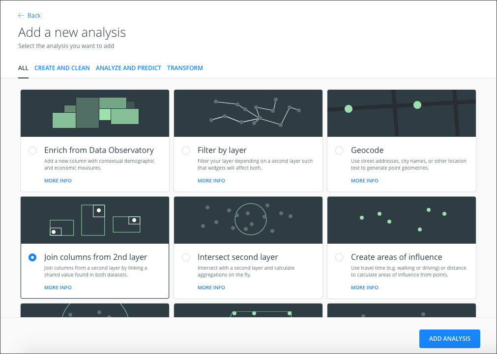
The analysis type I used for this map is pretty self-explanatory – I needed to join columns from one layer with another, so I chose the “Join columns from 2nd layer” tool.
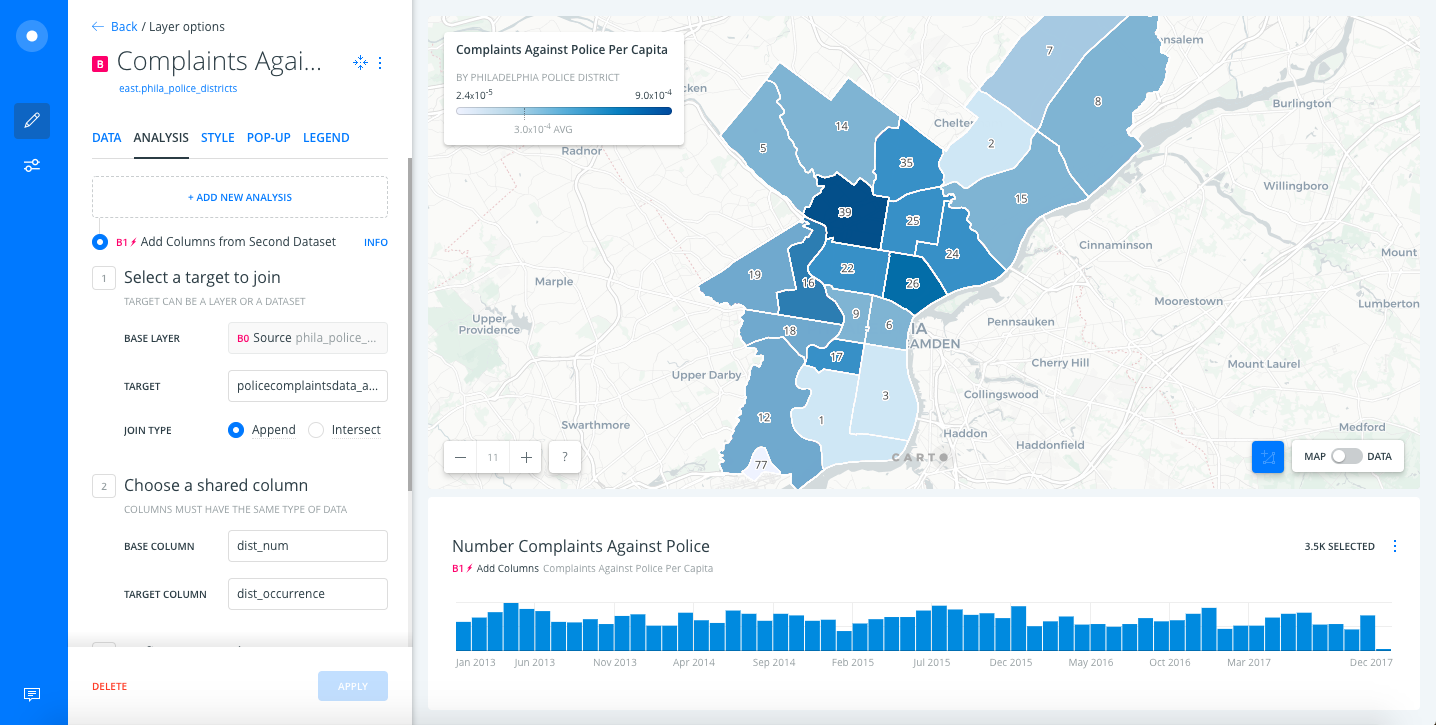
It’s important to note that you need to consider the field type of attributes in all datasets when using CARTO Builder, or any other spatial analysis tools for that matter.
The CAP data include Police District IDs as a string value. In this case, the Police Districts dataset also included a string version of the ID. Otherwise, I would have converted the field type in the Data section of the CARTO interface.
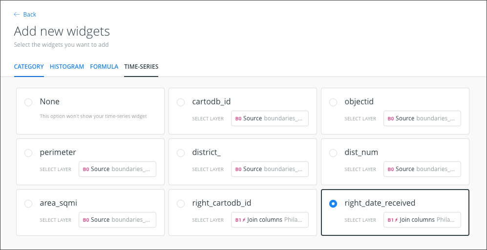
Adding a time series widget
One of the important aspects of the CAP data is that it includes the date that the complaint was received by the Department. Visualizing this data over time could offer some insight into patterns or trends.
CARTO Builder includes a few widget options that you can add to your published map interface. I enabled the “Time-Series” widget and set the field to right-date-received. (The field name in the original CAP data is date-received; right- is and artifact of the table join analysis.)
The Time-Series widget is interactive – try these features out when you use the map:
- Mouse over a column in the Time-Series bar graph to see the number of complaints submitted during that time period.
- Click and drag on the Time-Series bar graph to display a specific period of time. This will also adjust the data that is displayed in the map view.
- Clear the selected areas to visualize all the data on the map.
Cartographic design
After some cartographic styling, including adding a title, description, legend, and choropleth styling, I was ready to publish the map. All styling was completed within the CARTO Builder interface.
Map of Complaints Against Police by Police District
The resulting map displays Complaints Against Police data by Police District. Both datasets were downloaded from OpenDataPhilly on January 18, 2018. The Complaints Against Police dataset covers 2013 through date of download. Number labels on the map are Police District IDs.
Click here to view the full screen map.
Disclaimers and data details
The Complaints Against Police dataset includes data omissions and formatting inconsistencies. This is important to note in the context of this mapping project because the dist_numc field includes null, 0, and x- values that cannot be matched to Police District IDs in the spatial data file. Since I used the built-in join analysis feature that didn’t account for these variations in the data, as opposed to a custom script, rows of data included in the CAP file are not displayed on the map.
As outlined in the sections above, the associated tabular data that was included as part of the”CAP Findings” and “CAP Complainants” files does not include Police District IDs or other location information. Examination of the data reveals that there is a many-to-one relationship between these two associated files and the general CAP file. It’s possible to use software like Esri ArcMap or QGIS to relate one of these associated tables with the general CAP data and then join the resulting table to a spatial dataset. It’s likely that a custom script would be required to create a properly-formatted table relation between three tables.
Open data insights
The work that the Office of Open Data and Digital Transformation is doing to make datasets available to the public is invaluable. Civic tech and advocacy groups alike can use data like Complaints Against Police to power applications and data analyses that derive insight and enable decision-making. The Philadelphia Police Department has also subscribed to a commitment to accountability processes that allow the Philadelphia community to work with law enforcement to create the best possible environment for all citizens.
Because of the efforts of these Departments, we’re able to create tools that answer questions about the data like: “What Police Districts have the greatest number of complaints filed in June 2014?”
But even at first glance there are several questions that arise when visualizing this data on the map:
- The Time-Series chart highlights seasonal patterns in the data. The number of complaints seems to increase during summer months during specific years.
- District 39 has a greater number of complaint occurrences per capita than other surrounding districts. Is this higher number of complaints proportional to the number of calls for service in these districts?
Next steps
This post is a first take at an exploration of this dataset – the task was to associate this new data with a geometry so that we can visualize it on a map. In this initial analysis, I was able to leverage CARTO Builder to join the main CAP dataset to Police Districts. A logical next step would be to relate the two associated demographic data tables to the CAP dataset so that this data can be visualized geographically.
If we were to build a custom web app, we can utilize the APIs for this step and pull related data based on selected geographies.
There are so many opportunities to calculate statistics, conduct geospatial analyses, and visualize results with this data.
Do you plan to work on a project with this data? Need help building a custom tool that utilizes open data sets like this one?