
This post is part of a series of articles written by 2017 Summer of Maps Fellows. Azavea’s Summer of Maps Fellowship Program provides impactful pro bono spatial analysis for nonprofits, while fellows benefit from Azavea mentors’ expertise. To see more blog posts about Summer of Maps, click here.
Analyzing data over space and time can reveal interesting trends that enhance the understanding of changing landscapes. Space-time pattern mining allows for the detection of statistical hot and cold spots within a study region. It is often applied to studies of crime patterns, diseases outbreaks, or environmental issues, among many other topic areas. ESRI’s Emerging Hot Spot analysis tool is a useful example of this type of spatial statistical analysis. It allows users to set a series of parameters and then identifies trends and defines whether the hot or cold spot is persistent, increasing, or decreasing. This blog will walk through how to select data and set parameters for a successful emerging hot spot analysis, using forest loss as an example. 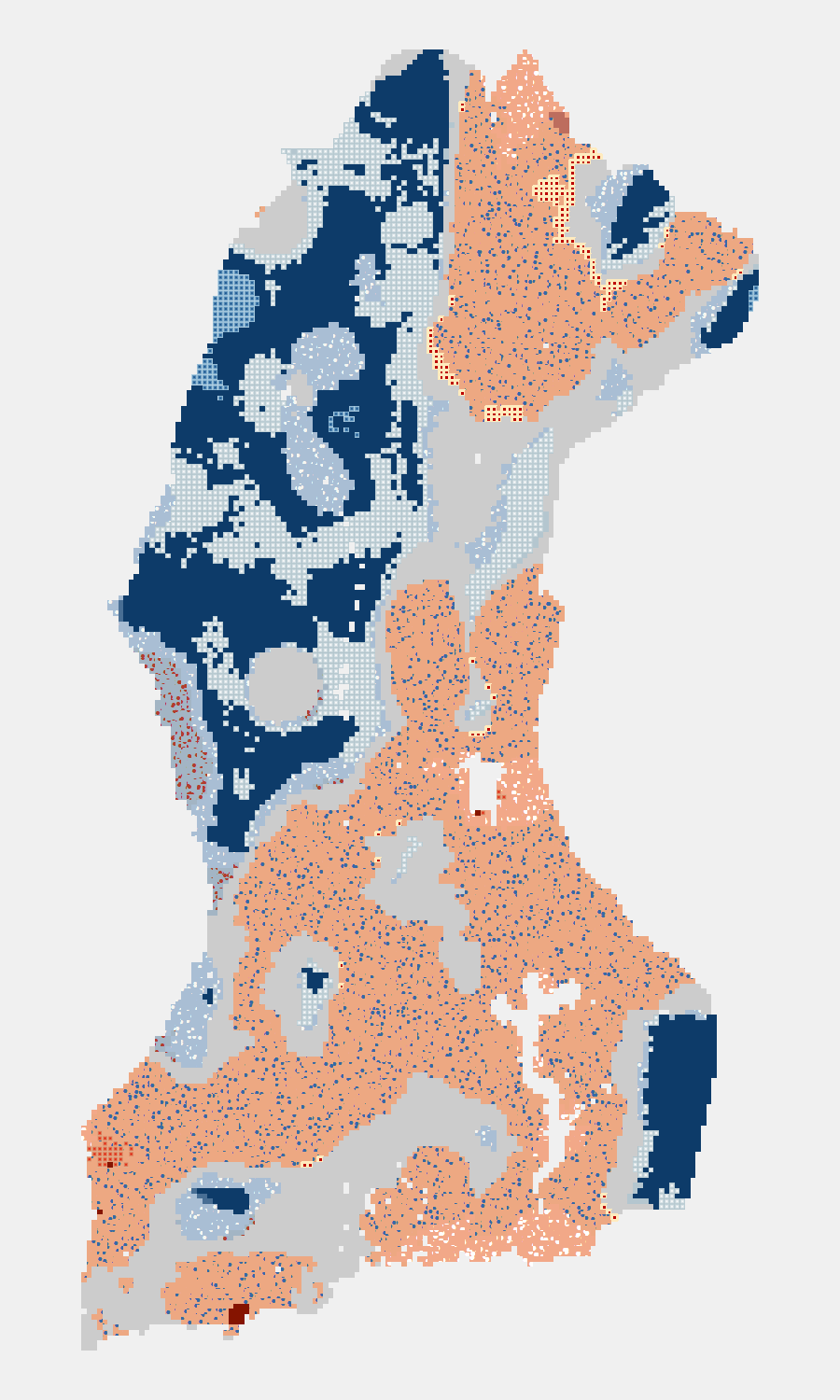
I am working with the World Resources Institute (WRI) to analyze conservation threats and successes in the Lac Tele-Lac Tumba landscape, located in the western region of the Democratic Republic of the Congo and extending into eastern Republic of the Congo. A component of the project is two space-time analyses of satellite-detected forest fire occurrence and forest loss over the twenty-first century.
You can do a space-time analyses using the emerging hot spot analysis tool in ArcGIS. I will outline the necessary steps to conduct this analysis,an emerging hot spot analysis in ArcGIS using examples to highlight how results are impacted by the parameters that are chosen.
ESRI’s Space Time Pattern Mining Toolbox
The ArcGIS Space Time Pattern Mining toolbox contains three tools: Create Space Time Cube, Emerging Hot Spot Analysis, and Local Outlier Analysis, as well an additional Utility toolbox that contains two tools: Visualize Space Time Cube in 2D and Visualize Space Time Cube in 3D. Esri provides detailed information about the toolbox and each of its components in the online tool reference guide.
In my work I utilized Create Space Time Cube and Emerging Hot Spot Analysis to investigate instances of satellite-detected forest loss and fire occurrence over time.
Structure of a Space Time Cube
A space time cube is created by summarizing point data into space-time bins that are stored in netCDF format. NetCDF (network Common Data Form) is a file format used to store array-oriented data.
Each bin in the Space Time Cube has an ID representing its geographic location, and this ID is shared among all bins in the same location. All yellow bins in the image below would have the same location ID. Each bin also has a time-step ID that is shared among all bins within the same time slice, represented by the green bins in the image below.
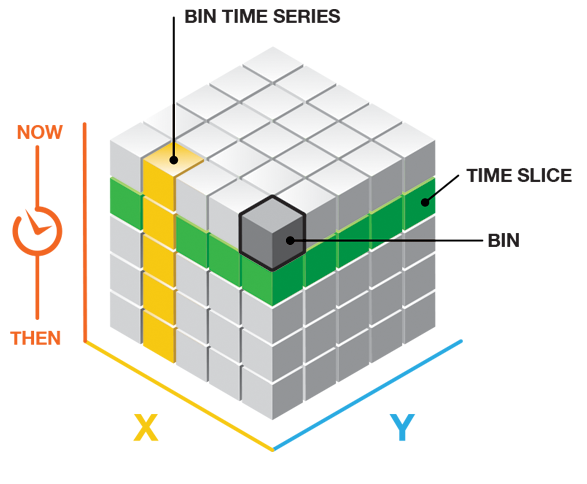
Source: Esri, ‘Visualizing the Space Time Cube’
To create a space time cube you must set a time step interval and a distance interval that will define the bin dimensions for aggregating your data.
Choosing the Time Step Interval
The Time Step Interval defines the time span for each bin. It is crucial to have a field of type ‘Date’ in the attribute table of your data as this field will be used to aggregate points into bins by time.
My fire data was a point dataset with about 62,000 points over a period of sixteen years. The dataset included a Date field representative of the date when the fire was detected by satellite. I chose a Time Step Interval of one year to be able to assess changes in fire occurrence from year-to-year.
My forest loss data was originally in raster format, with an integer code for each pixel from 1 to 15 indicating the year of forest loss (from 2001 to 2015). I converted the raster layer into a point shapefile with about 3.3 million points, assigning the code for year of forest loss to each point in the new shapefile. Then, I created a new field of type ‘Date’ and calculated it based on the year of loss code. For the forest loss data, I also chose a Time Step Interval of one year to assess yearly changes in forest loss patterns.
Choosing the Distance Interval
Aggregation of points across space is dependent upon the Distance Interval that you set. The distance interval defines the spatial dimensions of the bins, which extend across the study area as a fishnet grid. If you are analyzing data at a specific spatial scale, for example the city block level, you would likely choose a distance interval equal to the length of a city block in your study area.
In the case of my analysis, there was no obvious interval to choose so I experimented with different distances to find one that revealed patterns over the study area. Two example results below from emerging hot spot analyses I conducted illustrate the effect of the distance interval. A 10 kilometer distance interval, shown on the left, is too large for point aggregation and obscures complex patterns in the landscape that are evident with a distance interval of 2.5 kilometers, shown on the right. Choosing a distance interval that is too small will result in many bins having zero point counts, making it difficult to assess clustering of hot and cold spots.
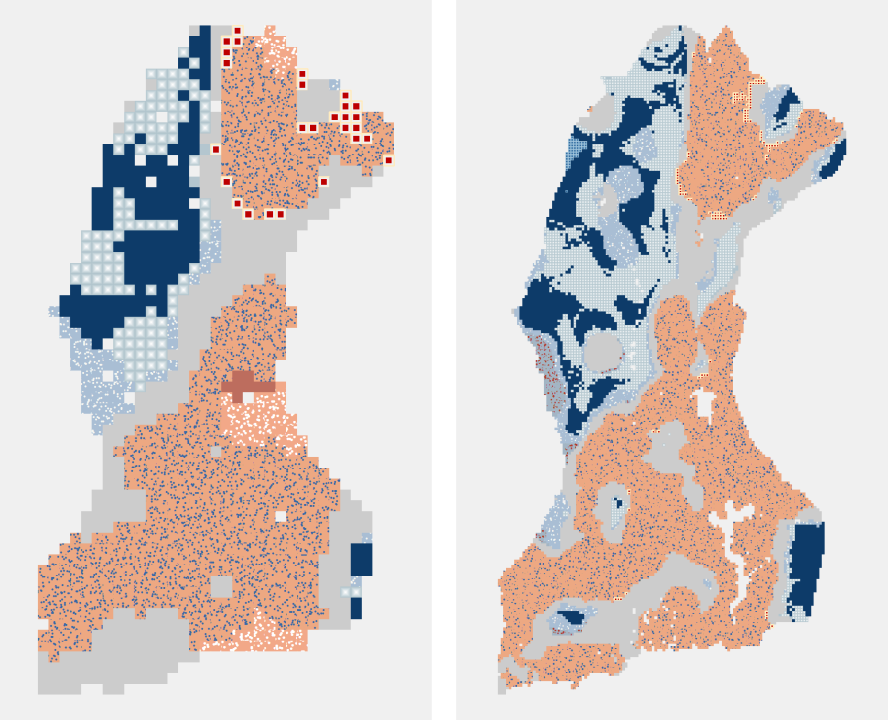
10 km Distance Interval 2-5 km Distance Interval
Creating a Space Time Cube
Points are aggregated into bins based on the chosen Time Step and Distance Interval parameters. A count of points per bin will be calculated. Additionally, you can select any amount of numerical fields within the point dataset to be summarized per bin as well. For both of my datasets I only wanted to get a count of points within each bin.
When ArcGIS creates the Space Time Cube, it calculates the Mann-Kendall statistic for each location independently. The Mann-Kendall test is a rank correlation analysis that assesses whether an increasing or decreasing trend is present in time series data. The result of the test is compared with the expected result of no trend over time to determine if the observed result is statistically significant. Each location is given a z-score and p-value, and these results, in addition to the number of points within each bin, can be visualized with the tools available in the Utility toolbox.
Visualizing the Space Time Cube in 3D
One interesting way to inspect the space time cube data is with the Visualize Space Time Cube in 3D tool. This tool, located in the Utility toolbox within the Space Time Pattern Mining toolbox, creates a three-dimensional representation of the bins that can be viewed in ArcGlobe or ArcGIS Pro.
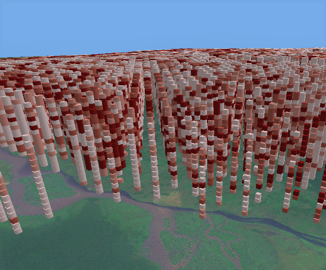
Visualizing the Space Time Cube in 3D
Above is a space time cube of forest fire occurrence visualized in 3D. Each column of stacked bins represents a time series of fire events with the most recent year on the top. In this example, bins have been symbolized to represent the count of fire events per bin. Darker red bins had higher counts of fires and lighter bins had fewer fires.
Emerging Hot Spot Analysis
An emerging hot spot analysis is conducted to investigate trends over space in addition to trends over time. Clustering patterns of point densities or summary fields across the study area are analyzed.
The Emerging Hot Spot Analysis tool takes the space time cube as an input and conducts a hot spot analysis using the Getis-Ord Gi* statistic for each individual bin. The Neighborhood Distance and Neighborhood Time Step parameters define how many surrounding bins, in both space and time, will be considered when calculating the statistic for a specific bin. Then, the hot and cold spot trends detected by the Getis-Ord Gi* hot spot analysis are evaluated with the Mann-Kendall test to determine whether trends are persistent, increasing, or decreasing over time. The results are symbolized with seventeen different categories describing the statistical significance of hot or cold spots and the location’s trend over time. Full descriptions of the categories are available on Esri’s tool reference.
An example of an emerging hot spot analysis of forest loss from 2001 to 2015 is shown below. Note the many different categories of hot and cold spots in the legend.
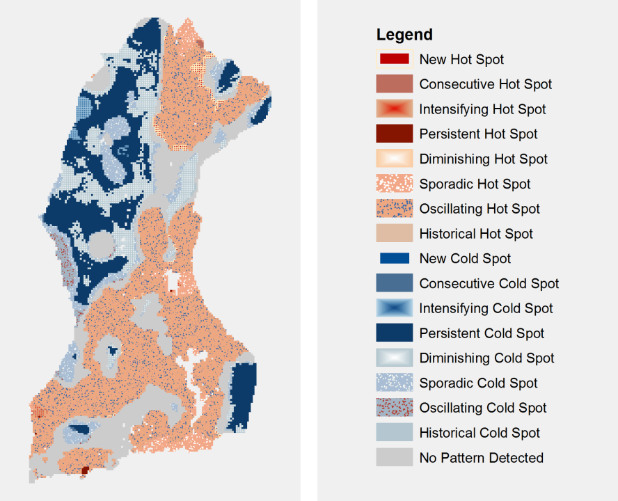 Emerging Hot Spot Analysis Results (w/ default legend) – Forest Loss
Choosing the Neighborhood Distance
The Neighborhood Distance and Neighborhood Time Step parameters strongly impact the results of the emerging hot spot analysis. Esri tool help for Emerging Hot Spot Analysis provides additional details on how to select each parameter.
The Neighborhood Distance defines the size of the area around a bin that encompasses its ‘neighborhood’. A bin is compared with all other bins inside its ‘neighborhood’ to measure clustering of point counts or values.
Each of the three emerging hot spot results below had all of the same inputs except for the Neighborhood Distance. A distance of 10 kilometers (left) creates a map with many small pockets of variation across space as each bin is only compared with others within 10 kilometers of it. A neighborhood distance of 20 kilometers (center) results in map with large contiguous hot and cold spot areas, and a neighborhood distance of 30 kilometers (right) creates even larger clusters of similar categories.
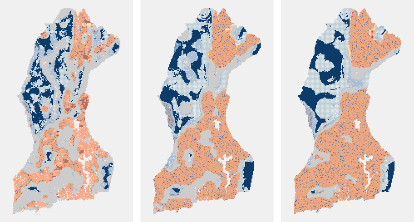
10 km Neighborhood Distance 20 km Neighborhood Distance 30 km Neighborhood Distance
Choosing the Neighborhood Time Step
The Neighborhood Time Step parameter defines the number of years into the past from which bins are included in the hot spot analysis. A time step of 1 would include all bins within the neighborhood distance and within the current year and one year prior of the bin for which the statistic is being calculated. A time step of 2 would include bins from the current year being analyzed and from two years prior.
The images below have time steps of 1, 2, and 3 from left to right. Different emerging hot spot patterns result from using different time steps. The examples below show an increase in persistent hot and cold spots corresponding to an increase in time steps.
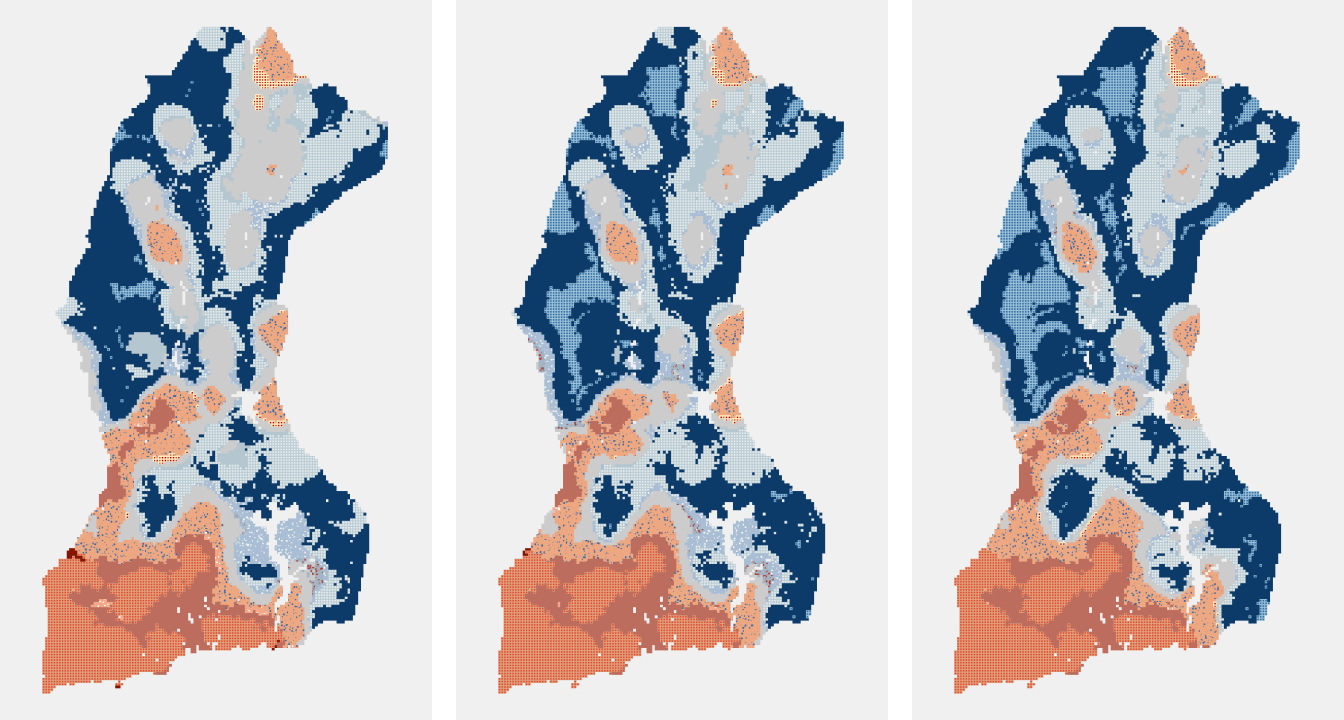
Neighborhood Time Step: 1 Neighborhood Time Step: 2 Neighborhood Time Step: 3
Finally, it is crucial to use a polygon analysis mask when running Emerging Hot Spot Analysis to exclude areas where it is not possible for points to occur. Running Emerging Hot Spot Analysis without a mask may lead to the incorrect identification of areas as cold spots, when in reality it is just impossible for points to occur there. For example, the polygon analysis mask I used in my forest fire analysis excluded bodies of water, because a forest fire cannot occur on a waterbody.
The Emerging Hot Spot Analysis tool allows you to specify a polygon shapefile to use as a mask. When the tool is run, the polygon analysis mask is intersected with the input space time cube causing any areas outside of the mask to be excluded from analysis. In the case of my forest loss analysis, I used a mask that only included areas with greater than thirty percent forest cover. This mask excluded grasslands, patchy forest areas, and bodies of water where either no forest loss can occur, or where satellite detection of forest loss may be inaccurate.
Conclusions
The Space Time Pattern Mining toolbox offers a powerful set of tools for investigating complex data trends that occur across a landscape and change over time. I was able to discover patterns of forest fire occurrence and forest loss in the Lac Tele-Lac Tumba landscape and determine how those patterns have changed over time from the beginning of the twenty-first century to now. Identification of new hot spots and diminishing cold spots will help to determine what regions are facing increasing threats to forest conservation. Areas of persistent cold spots can help identify areas where forest conservation efforts have been successful. I learned a lot about the effects different parameters have on analysis results from conducting emerging hot spot analyses with both data sets. Every data set and study area are different, making it very important to experiment with and select parameters that work well for your particular analysis.
Participate in Summer of Maps
Are you a student that’s looking to grow professionally in a GIS analytics career? Do you want to develop spatial analysis skills in a hands-on learning environment?
Keep an eye out for open application dates later this fall and reach out to us with questions about the program!