
This post is part of a series of articles written by 2017 Summer of Maps Fellows. Azavea’s Summer of Maps Fellowship Program provides impactful pro bono spatial analysis for nonprofits, while fellows benefit from Azavea mentors’ expertise. To see more blog posts about Summer of Maps, click here.
One of the non-profits I am working with this summer is The Common Market, a distributor of regional food from sustainable farms that targets underserved communities. The main datasets I am utilizing for this spatial analysis project offer detailed accounts of each Common Market transaction (from 2014 to 2017) for both of the regions the organization serves – the Mid-Atlantic and Georgia. These data offer a great deal of information about the “flow of food” from farmers to Common Market customers. While searching for ways to visualize the vendor to customer network, I came across Sankey diagrams – which prove to be ideal for these type of datasets.
What is a Sankey diagram?
A Sankey diagram visualizes the proportional flow between variables (or nodes) within a network. The term “alluvial diagram” is generally used interchangeably. However, some argue that an alluvial diagram visualizes the changes in the network over time as opposed to across different variables.
Irish-born engineer Matthew H.P.R. Sankey gave the diagrams their name. A member of the Royal Engineers and perhaps bearer of too many initials, Sankey first presented his diagram depicting the energy flow of steam engines in the Minutes of Proceedings of the Institution of Civil Engineers. In Sankey’s diagram, he visualizes the differences between an actual steam plant and an ideal steam plant. (Note the links between the nodes indicate heat loss. The actual steam plant shows that there is proportionally more heat loss compared to the idealized steam plant.) His flow diagram caught the attention of some renowned engineers, who later deemed such visual as a “Sankey diagram.”

Fig. 1: Sankey’s original diagram found in his article The Thermal Efficiency of Steam-Engines (1898).
Though this particular type of flow diagram bears Sankey’s name, he was not the first one to conceptualize it. French civil engineer Charles Joseph Minard created a flow diagram of the French invasion of Russia, a failed effort by Napoleon and his troops to defeat the Russian army. In this diagram, the audience can see the number of Napoleon’s troops decreasing as they advance towards Russia into the winter (indicated by the light brown line). This diagram is particularly interesting because it is spatially referenced. Theoretically, one could track the route of Napoleon’s army by lining this up above a basemap according to the coordinates listed at each node.
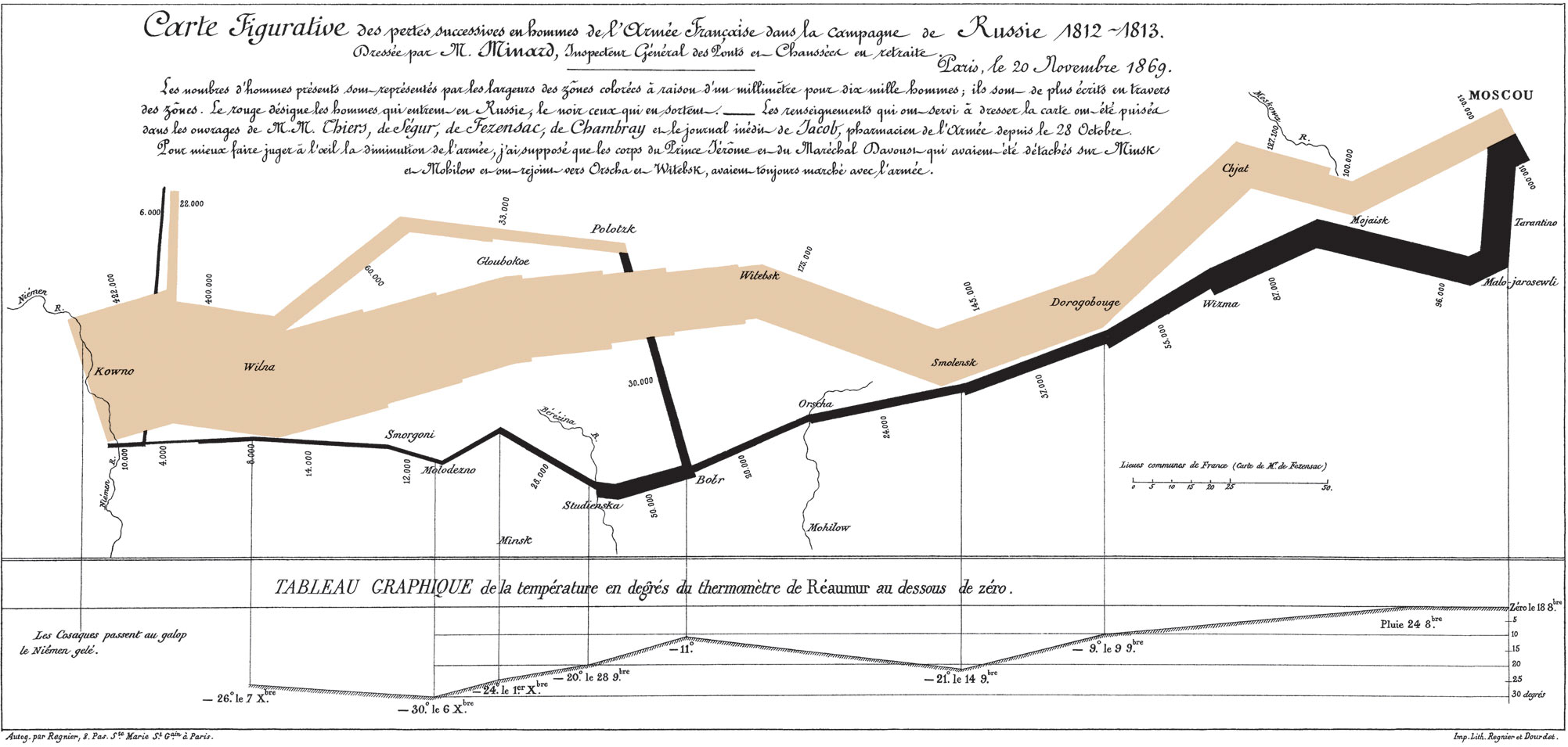
Fig. 2: Minard’s flow diagram of Napoleon’s Russian Campaign of 1812. What is notable about Minard’s diagram is its integration of six different variables as mentioned in Edward Tufte’s work The Visual Display of Quantitative Information (1983).
Preparing your data for a Sankey diagram
Sankey diagrams require multicategorical data. The different variables within the dataset serve as the different nodes within the diagram. There are a number of different ways one could create a Sankey diagram – through R packages, online applications, Tableau, JavaScript libraries, amongst others – so preparing data for a Sankey diagram depends on the tool one wishes to use. At the very least, one would need a dataset that contains a source field, a target field, and a metric that is measured between those two fields. The Common Market operations data are multicategorical in nature. In this case, the source is the vendor and the target is the customer. The other categories in between (such as product and industry type) serve as connecting nodes. The magnitude of the links connecting each node is measured by the price for each transaction.
Tools to create Sankey diagrams
There are a number of different tools available to create Sankey diagrams. In the list below, I showcase six different options that I came across while creating visualizations for the Common Market.
R packages
1. riverplot
As an R user, I explored several R packages to build Sankey diagrams. The first of these packages was riverplot. The package documentation provides a few examples, including a re-creation of Minard’s diagram of the Russian Campaign of 1812. The best way to create a Sankey diagram using the riverplot package is to organize the data as a list of nodes, its partner nodes, and the position each node resides using the makeRiver function.
##Sankey diagram example from riverplot package
library(riverplot)

#define sample data frame
nodes <- c( LETTERS[1:3] )
edges <- list( A= list( C= 10 ), B= list( C= 10 ) )

#plot Sankey diagram
r <- makeRiver( nodes, edges, node_xpos= c( 1,1,2 ),
                node_labels= c( A= "Node A", B= "Node B", C= "Node C" ),
                node_styles= list( A= list( col= "yellow" )) )
plot( r )

# equivalent form:
nodes <- data.frame( ID= LETTERS[1:3],
                     x= c( 1, 1, 2 ),
                     col= c( "yellow", NA, NA ),
                     labels= c( "Node A", "Node B", "Node C" ),
                     stringsAsFactors= FALSE )
r <- makeRiver( nodes, edges )
plot( r )

# all nodes but "A" will be red:
r <- makeRiver( nodes, edges, default_style= list( col="red" ) )
plot( r )

# overwrite the node information from "nodes":
r <- makeRiver( nodes, edges, node_styles= list( A=list( col="red" ) ) )
plot( r )
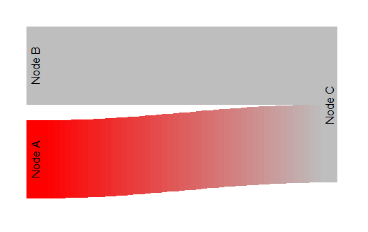
Fig. 3: Basic example code and visual output provided by riverplot package
2. alluvial
An alternative to riverplot is the R package alluvial. For someone who had no prior experience using R, the alluvial package seemed simpler than the riverplot package. For instance, instead of having to assign a position for each node, the alluvial function reads the position of each node based on where they are positioned in the data frame.
3. networkD3
The networkD3 package, based off of the D3.js JavaScript library, allows users to create Sankey diagrams (amongst other network diagrams) that can be saved as standalone graphics or easily integrated into RMarkdown documents or Shiny web applications. Unlike the two other R packages mentioned, the networkD3 package allows for the creation of other network diagrams, including dendrograms and tree networks.
Online Applications
4. RawGraphs
I first read about an earlier version of this online application from Isabel Meirelles’s book Design for Information. After searching for the application and exploring the sample data provided, I was impressed both by its simplicity and functionality. RawGraphs provides a drag and drop interface for users who may be unfamiliar with R or other coding software. There are a number of other graphics that RawGraphs users can choose from, in addition to Sankey Diagrams.
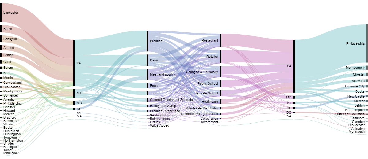
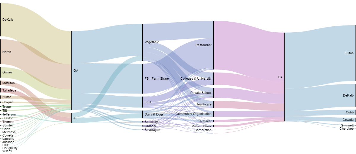
Fig. 4: The Common Market’s Mid-Atlantic (top) and Georgia (bottom) operations in 2016. The variables represented from left to right are as followed: vendor county→vendor state→product type→customer industry→customer state→customer county
5. SankeyMatic
If a user wishes to create a simple Sankey diagram with not too many variables, SankeyMatic seems to be the best option. The difference between this application and RawGraphs is that SankeyMatic requires the user either concatenate the variables into one line or enter the data manually. Whereas RawGraphs is able to aggregate the data according to the chosen diagram.
6. Google Charts
As with RawGraphs, Google Charts allows the user to create a multitude of different graphics, one of which is a Sankey diagram. As with the networkD3 package, the layout for Google Charts is derived from the D3.js Sankey layout. While it is possible to take a screenshot of the final output, Google Charts is mainly used to embed data visualizations on a website.
Overview
This list just scratches the surface of the many different ways one could create a Sankey diagram. Assuming there would be limitations in customizing the diagrams with some of these tools, I was surprised at the different ways one could modify the Sankey diagrams using the online applications. It was also nice to see that a few of these tools had the capability to create other diagrams and charts in addition to Sankey diagrams.
How do they compare?
| Tool | Type | Used to create other diagrams? |
Embed on a web page? |
|---|---|---|---|
| riverplot | R package | No | No |
| alluvial | R package | No | No |
| networkD3 | R package | Yes | Yes |
| RawGraphs | Online application | Yes | Yes |
| SankeyMatic | Online application | No | Yes |
| Google Charts | Online application | Yes | Yes |
Fig. 5: Comparing Sankey diagram tools
Other cool examples of Sankey diagrams
Our Energy System, The National Academy of Sciences
This interactive Sankey diagram estimates the amount of energy used within the United States organized by the sources from the energy is provided, to which sectors they serve, and the amount used vs. unused energy.
Energy balance flow for European Union, Eurostat
Similar to Our Energy System, this interactive web application allows the user to visualize the annual energy balance within different geographic areas within the EU. Upon the user selecting the desired year and country (or supranational entity), the application creates a Sankey diagram on the fly based on those set parameters.
What are you going to do with that degree?, Ben Schmidt
A question I am often asked upon telling people I am getting my Master’s in Geography, this Sankey diagram shows the network between college degrees and professions based on American Community Survey data. Another version of this diagram with broader degree categories can be found here.
Participate in Summer of Maps
Are you a student that’s looking to grow professionally in a GIS analytics career? Do you want to develop spatial analysis skills in a hands-on learning environment?
Keep an eye out for open application dates later this fall and reach out to us with questions about the program!