
This post is part of a series of articles written by 2016 Summer of Maps Fellows. Azavea’s Summer of Maps Fellowship Program provides impactful pro bono spatial analysis for nonprofits, while fellows benefit from Azavea mentors’ expertise. To see more blog posts about Summer of Maps, click here.
The Chemical Heritage Foundation (CHF), a science education non-profit based in Philadelphia, applied for the Summer of Maps for help designing an interactive web application displaying the distribution of air pollution in the United States from 1990-2015.
This interactive application will be part of an exhibit about the history of air pollution monitoring in CHF’s museum, so the intended audience is the general public. This blog outlines my design process and shows how my application evolved throughout the summer.
Web Mapping
Web applications are a powerful and engaging way of telling spatial stories to the public. However, it can be so easy to get caught up in adding more bells and whistles, charts and graphs, and animations and GIFs, that you lose sight of who you are designing the application for and what overall narrative you want to convey.
Learning to design for your intended audience is a critical part of the design process that can get overlooked amidst technical showmanship.
Setting the Stage
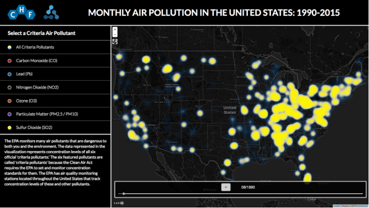
Before beginning this project, I talked with CHF about basic functionalities the application should include. We decided that even though including charts and graphs about the different criteria air pollutants would be interesting, these would ultimately detract from the application’s overall purpose: to visualize how air pollution has changed over the past 25 years.
To make this narrative as clear and easy to understand as possible, we decided to have a button for each criteria air pollutant. When clicked, this button would visualize the corresponding data, change the visualization’s color depending on which pollutant was selected, and change the informational text depending on which pollutant was selected.
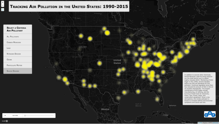
We also wanted to include a time slider that would enable the user to interactively see how air pollution has changed throughout time. The following image is a screenshot from my first attempt at creating this web application; all of the functionality was present, but the design definitely needed improvement.
Reframing the Problem
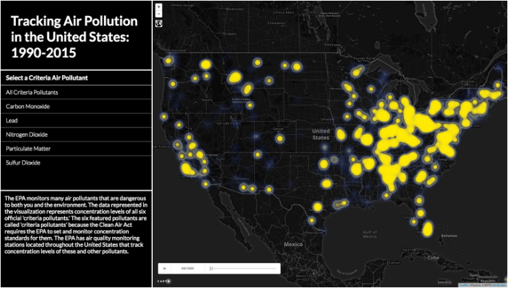
I met with Jeff Frankl, a UI/UX designer at Azavea, to talk about the application’s overall design and feel. He helped me reframe the way I was approaching the design process by reminding me of my intended audience which. This was a continued theme throughout this process. He pointed out that I was designing the application like I would design a static map: the map in the center and the remaining elements spaced neatly around the edges.
This layout may work well for static maps, but it can make interactive web applications confusing and difficult for the user to interpret. Instead, he suggested that I include the title, air pollutant buttons, and informational text in a sidebar next to the map. Having all the text in one place makes it easier for the user to navigate.
The next iteration of the design is shown below:
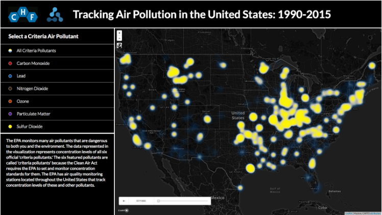
However, even though I had nailed down a general layout that seemed to work, the design still needed refinement.
I wanted to make it obvious which color each air pollutant was associated with, and I wanted to make the sidebar less crowded. To address these problems, I added colored circles in each air pollutant button and changed the layout of the title and sidebar.
The following image is a screenshot at this next stage of my design process:
Time for Public Demo!
At this point, we decided it was time to host a public demo at CHF’s museum. We set up a touch screen monitor with the application, asked museum-goers to interact with it for a few minutes, and then followed-up with a series of questions about whether or not the application was intuitive to use and easy to understand.
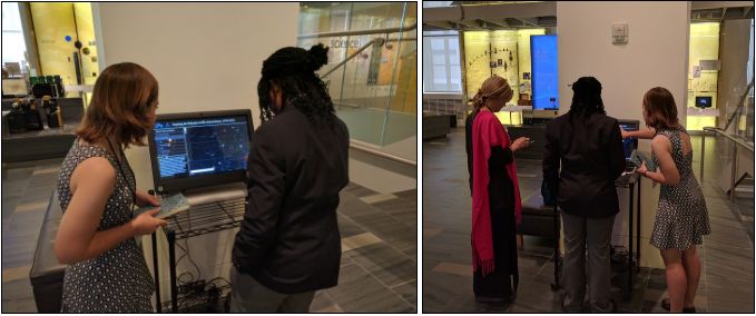
This public demo was the most critical component of the design process since it allowed me to receive feedback from the people who will actually be interacting with the web application.
For example, most people initially struggled with locating and figuring out how to use the timeslider along the bottom of the application, since it was small and difficult to read the month/year text. So, I made the timeslider a more prominent part of the application, made the play button more visible, and increased the text size.
Without user testing, I would not have thought to make these changes to the web application.
Staying Focused
This summer, I learned that designing a web application is much more than knowing which jQuery functions to write or JavaScript libraries to call. While these technical aspects are necessary for software development, learning how to design with your user in mind is even more important.
Adding animations and charts showing different air pollutants may have looked cool, but I decided they did not enhance the overall purpose of the web application. In my case, simple, straightforward design best ensures that museum-goers will be able to learn about and place themselves in the larger narrative of air pollution in the United States.
Staying focused on who your user is and what message you want to convey will make your final web application more effective, compelling, and impactful.
To explore the web application, visit this page or check out CHF’s Museum on 315 Chestnut Street in Old City, Philly!
Learn from Azavea mentors and staff
Summer of Maps fellows are paired with mentors from the Data Analytics team who help them to accomplish the goals of the non-profit projects. Fellows are encouraged to meet with Azavea staff members of all teams, like the User Experience Design team, to learn about current data analysis, cartographic design, and even software development skills.
Are you searching for a program that can help you expand your skills and knowledge?
Keep an eye out for open application dates later this fall and reach out to us with questions about the program!