
Our first opportunity to work with crash data was last summer during our 2013 Summer of Maps Fellowship. Tyler Dahlberg, our fellow working with the Bicycle Coalition of Greater Philadelphia, analyzed bicycle crashes in Philadelphia from 2007-2012. The results of his analysis showed bicycle crashes clustering around some of the wider streets in the city — Market Street, Broad Street and Spring Garden to name a few. Any bicyclist in Philadelphia will tell you these are not their favorite places to ride a bike. Tyler also looked at aggressive-driving related bicycle crashes and found significant clustering in University City, specifically around the 38th street area.
This type of crash analysis had never really been done in Philadelphia, at least with the results available to the public. It generated the interest of some of the city’s civic-minded journalists, including blogger-extraordinaire Jon Geeting. Jon contacted Azavea with the idea to do this analysis on all crashes in Philadelphia — with a specific interest around aggressive driving and pedestrian-affected incidents. We typically think of crashes as “accidents”. Jon’s hypothesis, and one that receives large favor in the planning sphere, is that these crashes aren’t really accidents at all. They can be a direct consequence of how our streets are designed. Therefore, if planners can design our streets in a way that favors lower speeds (traffic calming as it’s referred to) and accommodates all kinds of travelers (bicyclists and pedestrians as well as cars), perhaps the crash rate can be reduced. I’ll leave that analysis up to Jon, and you can read some of it here, here and here.
In this blog I’ll share the workflow and tools used in the GIS part of this analysis. To understand where crashes are occurring, first the dataset had to be mapped. The software of choice in this instance was ArcGIS, though most of the analysis could have been done using QGIS. Heat maps are all the rage, and if you want to make simple heat maps for free and you appreciate good documentation, I recommend the QGIS Heatmap plugin. There are also some great tools in the free open-source program GeoDa for spatial statistics.
Getting the Data into ArcGIS
Our source was Pennsylvania’s Department of Transportation (PennDOT). They maintain the crash data and sent it as a Microsoft Access 2007 database. I’m not sure how the data is stored internally, but at least with Access we can use SQL to query out just what we need. The database contains 12 tables, each with information about each crash related to a more specific topic. For example, there’s a PERSON table that contains information about all people involved in the crash such as their age, sex, drug and alcohol test results and even where they sat in the vehicle. Clearly there’s a ton of information we could look at and hopefully we’ll see some more analysis of this dataset in the future. For the purpose of this study, we’ll just need one table from the database, the CRASH table, which contains the most important information on the crash such as where, when and item counts (how many people, vehicles, pedestrians, bicycles, fatalities, etc.).
The “where” information on the crash is stored in the degrees, minutes, seconds coordinate format, which ArcGIS doesn’t understand. Therefore, it had to be converted to decimal degrees. There are actually quite a few ways to do this. Starting in ArcGIS 10.0, there’s the handy Convert Coordinate Notation tool, which accepts a wide variety of formats. It’s also possible to do this with a python script or VBscript in the Field Calculator. The PennDOT coordinate data doesn’t seem to be formatted the way ArcGIS’s Convert Coordinate Notation tool prefers, so I went the other way and used a python script. Another way to go about this would be to convert the coordinates to decimal degrees inside Access before exporting it into ArcGIS.
With the properly formatted coordinates, now the crashes can displayed on a map.
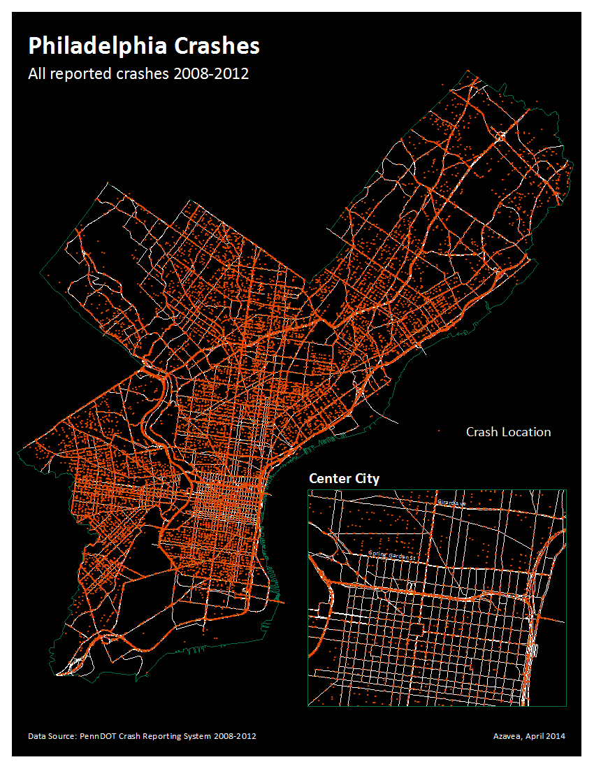
That’s a lot of dots (53,260 to be exact). But it’s not a particularly useful map. A couple ways to make the data more useful would be to look at clusters of crashes, such as hot spots, and calculate crash rates on Philadelphia’s streets.
Hot Spot Analysis
With the data full of so many attributes describing the crash, I wanted to identify clusters of specific attributes. I used the ArcGIS Optimized Hot Spot Analysis tool which calculates a Getis-Ord Gi* statistic for each feature. This determines if there are any statistically significant areas of high or low values of that attribute. Basically, it’s identifying crashes that are surrounded by other crashes that have similar values of either high or low (say for crashes, aggressive or not aggressive). The settings here are really important. I used the SNAP_NEARBY_INCIDENTS_TO_CREATE_WEIGHTED_POINTS aggregation method since there were often multiple crashes at an intersection with slightly different geocoded coordinates. The resulting map shows us each feature and whether it is in a neighborhood of statistically significant clustering of high values and cold spots which are statistically significant clustering of low values. I ran the hot spot analysis on the aggressive driving attribute in the crash data. I didn’t include interstate roads in the analysis since I just wanted to look at where the hot and cold spots for aggressive driving were on city streets (a majority of the aggressive driving crashes overall were on interstate roads).
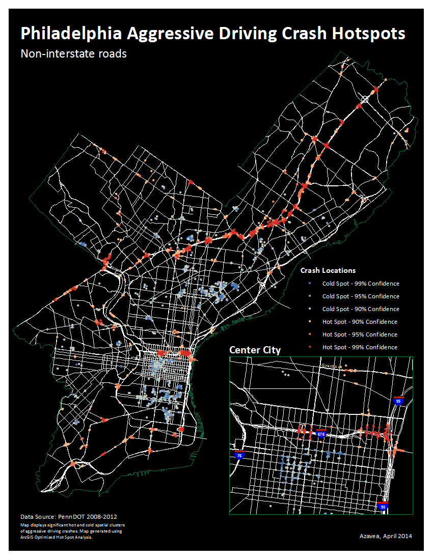
Note on the map above the clusters of hot and cold spots for aggressive driving. The crashes that are not statistically significant are not displayed on the map. Aggressive driving crashes cluster along Roosevelt Boulevard, well-known for its dangerous conditions. Other hot spots appear along City Line Avenue along the western border of the city. There also seems to be quite a bit of hot spot clustering around interchanges along Interstate 676 and the Ben Franklin Bridge. Jon Geeting hypothesizes that this is the result of traffic coming off the interstate and not adjusting to the slower city streets. It’s also interesting to look at the cold spots, or where aggressive driving crashes show a significant level of dispersion. That can be seen in Chinatown, Center City West/Rittenhouse area, and the East Passyunk neighborhood — specifically right along the 9th street market. All three areas have high amounts of pedestrian activity, slower traffic speeds and lots of mixed-use. Could that be a deterrent to aggressive driving?
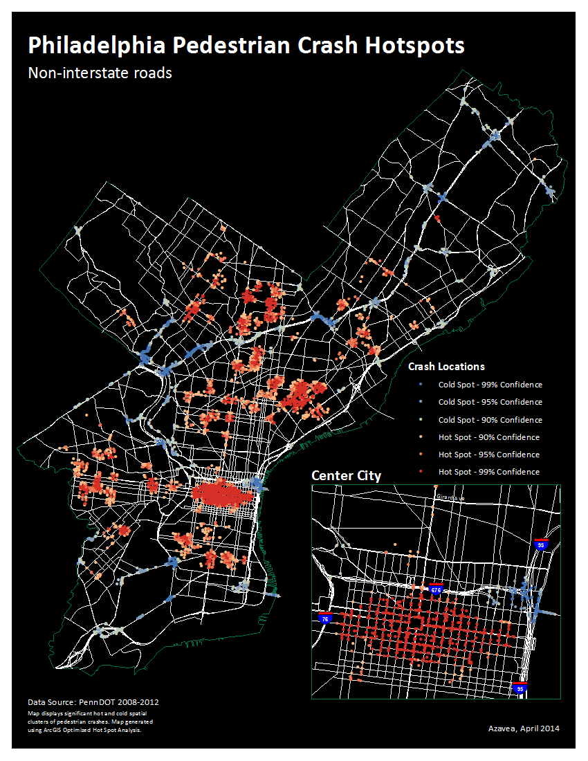
The downside of course could be increased pedestrian crashes or deaths. However, this map of pedestrian crash hot and cold spots doesn’t necessarily indicate that. Center City appears as one giant hotspot. Since we don’t have any way to normalize the pedestrian data by the volume of pedestrians, it’s hard to say whether that’s just related to the higher amounts of pedestrians in Center City. Two of the neighborhoods that were cold spots for pedestrian crashes; Chinatown and Center City West, are part of the greater Center City area which is all a big hotspot for pedestrian crashes (though neither section seems particularly “hot” compared to the rest of Center City). The East Passyunk neighborhood doesn’t appear to have significant clustering either way. Perhaps this indicates that high pedestrian activity reduces aggressive driving but does not result in increased pedestrian crashes, at least in that area.
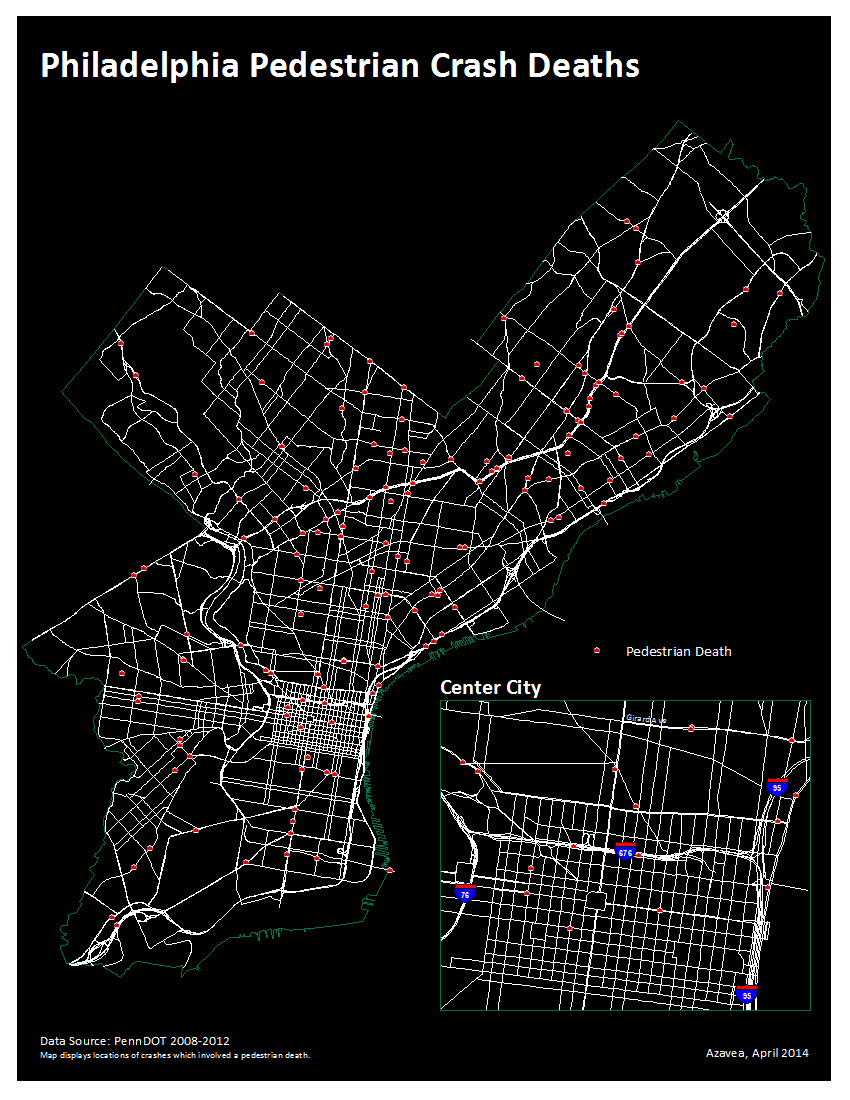
There also doesn’t seem to be an unusually high number of pedestrian deaths in either of those neighborhoods, as you can see on the above map. It does appear that Roosevelt Boulevard in Northeast Philadelphia has a high amount of pedestrian deaths. This is especially true considering there’s much less pedestrian activity there than in Center City, due to the wide street and more suburban built environment of Northeast Philadelphia.
Calculating Crash Rates

One of the dangers of mapping without context is we may be accidentally making a map that simply serves as a proxy for population. A map of the total number of crash deaths per state is probably going to look similar to a map of the total number of people. But if we map the crash rate, we can see which states have a higher number of crashes based on the proportion of population. We can do the same thing by mapping the crash rate on each street.
So, how can we determine if crashes are simply happening because there are lots of cars? We know there will probably be more crashes on streets with more traffic, so we needed to normalize the number of the crashes by the traffic on the street. Unfortunately, I could only obtain reliable traffic count information on PennDOT maintained streets in Philadelphia. Therefore, crash rates were only calculated on those streets. First, the crashes had to be summarized by street segment which can be done with a Spatial Join and Summary Statistics. After running those tools, there are now a total number of crashes on each street segment.
A crash rate can be calculated using the following formula, which is often cited in literature and used by state DOTs:
R = (C × 1,000,000) ÷ (A × 365 × N × L)
Where R is the calculated crash rate, C is the number of crashes on the street segment, A is the Average Annual Daily Traffic volume on the street segment, 365 is the number of days in a year, N is the number of years in the study and L is the length of the roadway segment in miles.
What we end up with is a crash rate per one million miles driven on each street segment.
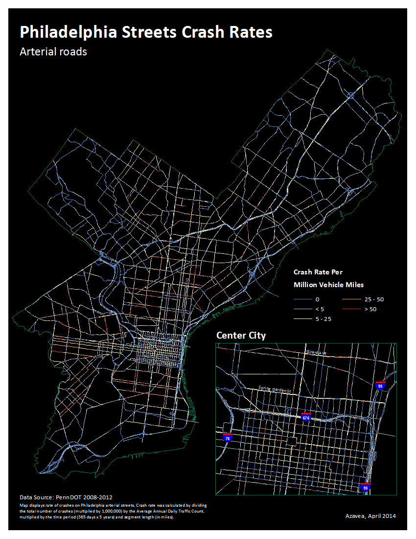
Addition on April 8, 2014: One point about the crash rate calculations. They’re calculated on each segment and while the formula does take into account segment length, it seems as though very short segments tend to show very high rates. This only seems to be an issue on few street segments, but should be taken into consideration when looking at the map.
Shortcomings
One very important note about PennDOT’s crash data. Many have commented that a crash they were involved in (usually these are pedestrian or bicycle crashes) is not on the maps we’ve produced. Here’s one explanation for that: crash data maintained by PennDOT are only “reportable” crashes, defined in Title 75 of the Pennsylvania Consolidated Statutes, Section 3746(a):
An incident that occurs on a highway or traffic way that is open to the public by right or custom and involved in at least one motor vehicle in transport. An incident is reportable if it involves:
- Injury to or death of any person, or
- Damage to any vehicle to the extent that it cannot be driven under it’s own power in it’s customary manner without further damage or hazard to the vehicle, other traffic elements, or the roadway, and therefore requires towing.
Since most bicycle and pedestrian crashes don’t do significant damage to a vehicle, it’s easy to see how many of them simply wouldn’t be reported by PennDOT. So, the problem of bicycle and pedestrian crashes could actually be a lot worse than what is actually shown. I’m hopeful that we’ll see more data released, perhaps by jurisdictional police departments, which may shed more light on this. It would also be great to combine this with some sort of crowdsourced pedestrian and bicycle crash map where users could report those minor crashes that don’t necessitate a police report. That could be a great way to further identify the most dangerous streets and intersections for bicyclists and pedestrians.