
The Case for User Experience Design and Visualizing Climate Data
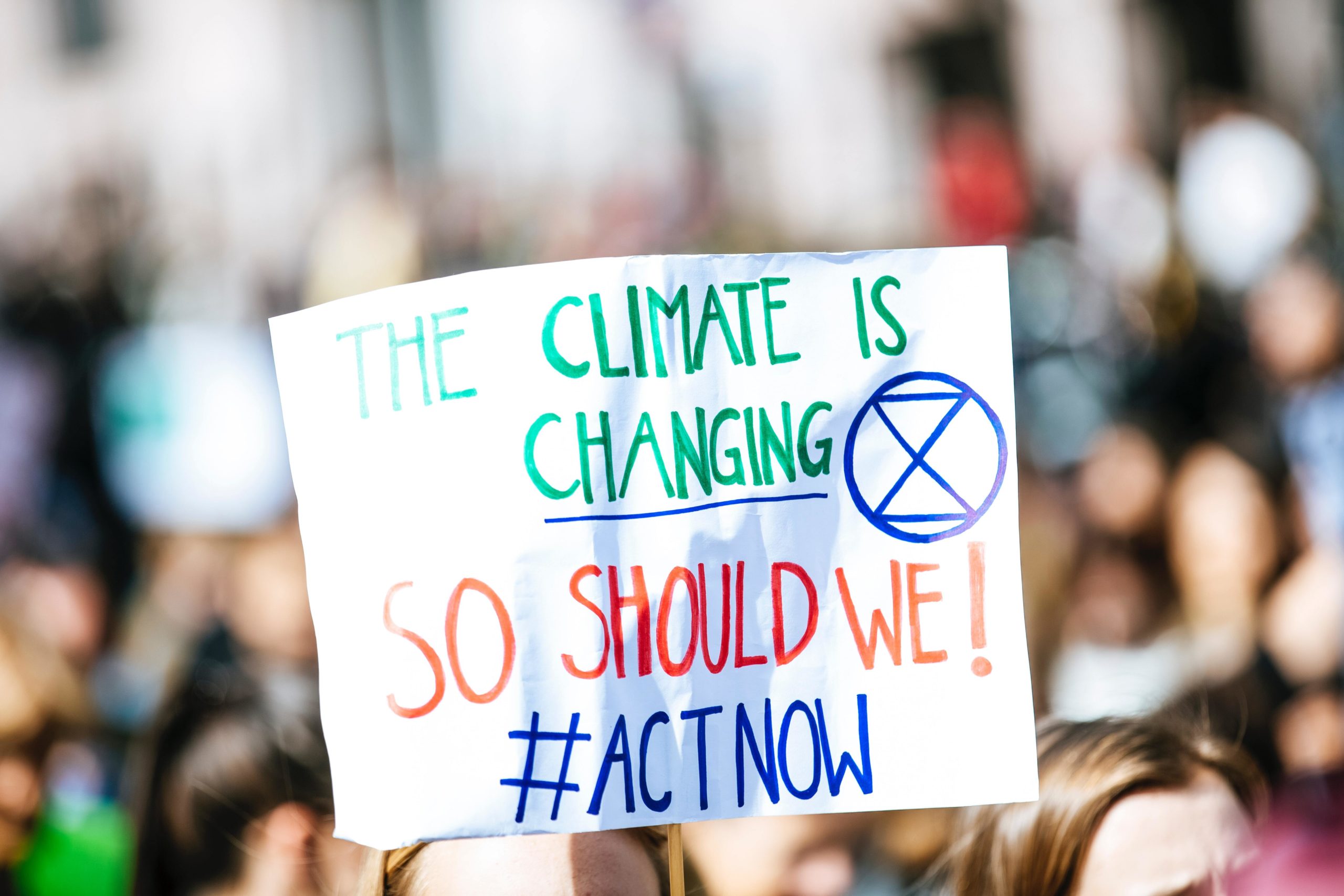
The world is getting hotter, faster. The ten warmest years on record have occurred since 2005. Many people live in a place that has experienced record-breaking weather events such as flooding, drought, wildfires, or heatwaves. Given all of these circumstances, it is understandable that people often feel powerless in what they can do to combat the warming earth.
As a company that builds web-based applications for civic, social, and environmental good, we teamed up with Probable Futures to build a tool to counter the sentiment that there is nothing one can do to slow the impacts of climate change. Probable Futures was founded in 2020 by a group of concerned leaders and citizens who started asking climate scientists direct, practical questions about what climate change would be like in different places around the world. Their mission is to bring an understanding of the basics of climate science and envision the future in ways that would positively affect our thoughts and behaviors. Probable Futures climate data is sourced from the CORDEX-CORE framework, a standardization for regional climate model output that downscales data from the ensemble of global climate models.
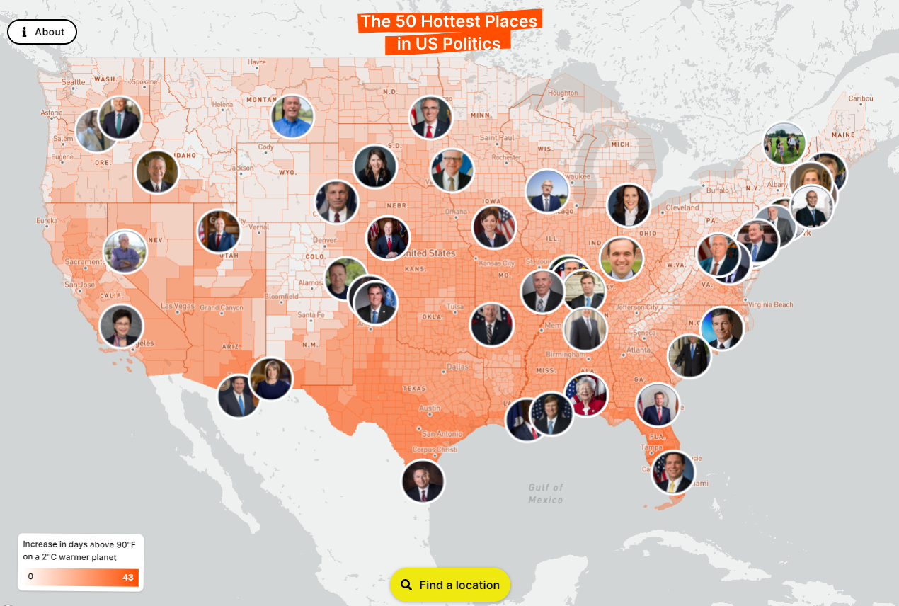
Together we designed a web-based tool that informs the public on the local impacts of climate change and highlights who their local officials are in order to hold them accountable. In creating this application, we relied heavily on the insight of our User Experience (UX) team to design a tool that not only informs the user but also drives them to take action by contacting their local officials.
Partnership with Probable Futures
Climate change is an extreme threat to humanity and will impact every aspect of human life: public health, the food chain, infrastructure, and immigration — just to name a few. Probable Futures decided to work with us in order to layer their climate data with additional geospatial datasets to tell a compelling story and drive action. This task was embraced by our UX team as they considered the challenge of bringing climate data to life in a way that wasn’t restricted to scientists and complex models. Our UX team understood that there are already plenty of climate change maps. They brainstormed what skills and datasets Azavea had to offer that could set this project apart from existing maps.
The whole is greater than the sum of its parts
Our UX team approached this project by thinking about how to present climate warming information in a way that drives action. After various brainstorms and design sessions, the team decided that adding political boundaries and matching those with elected officials would create an interactive visualization that could be used as an advocacy tool to demand action. To do this they aggregated local warming effects by political boundaries (counties) and ranked those counties by warming severity. We then layered in Cicero, Azavea’s in-house legislative district and elected officials database. Now the user could see the alarming data on climate warming but also be empowered to reach out to their local elected official to demand action.
Key UX Design Choices
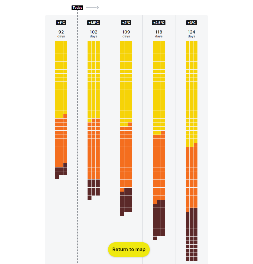
Initially, the UX team had ranked counties by the increase in wet-bulb temperature, a measure used to determine heat stress for humans. This proved to be less effective and ultimately °F/°C temperature was used instead. There are two noteworthy, playful design choices. First, when you select a location you see heat days in a chart inspired by Google calendar sheets. This was a choice to represent hot days in a non-traditional way instead of using, for example, a line chart. Second, some of the elements on the page are rotated by 1°, 1.5°, or 2°. The visual design picks up on the temperature changes that come up in many climate change conversations.
Partnerships that create powerful applications to drive climate change advocacy
We often see climate change visualized on global world maps, but the effects are felt locally and we must consider how to display data effectively. As a geospatial software firm, we aim to leverage the existing work and research of subject matter experts in order to tackle impossible problems together. With good, thoughtful, UX design we can support informed advocacy to combat the climate crisis. Organizations like Probable Futures are looking to close the knowledge gap between climate scientists and the average person. By connecting climate change data with local and state politics, we aim to highlight the power of acting locally.