
Have you had a colleague mention SAR imagery to you and thought, “What?!?!?”? If so, keep reading to find out what it is and learn more about labeling it for machine learning.

What is SAR imagery and why is it useful?
Unlike optical imagery which relies upon light, Synthetic Aperture Radar (SAR) gathers data via radio waves. A radar mounted on an air- or spacecraft sends pulses of radio waves to an area of interest and records the “echo” that returns. The resulting data are then turned into images that humans can interpret.
As a result, SAR can do many things that traditional earth observation collection methods cannot, like “seeing through” clouds. It can also image areas of interest at any time of the day or night. (For a more technical explanation, see SAR 101: An Introduction to Synthetic Aperture Radar.)
What does SAR imagery look like?
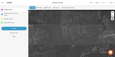
If you’re of a certain age, you can recall watching TV on at least one grainy black-and-white set. Imagine you had to watch it through binoculars. That’s close to what SAR imagery looks like to the data labeler. Understanding it presents several unique challenges.
")
SAR artifacts
The process of capturing SAR imagery creates several visual effects (including the “speckle” that makes it appear grainy). Learning to interpret them is key to the data labeling and machine learning processes. Among these effects are: shadowing, foreshortening, and layover.
Shadowing
In say, an aerial photograph of a city, tall buildings will cast shadows. But, a viewer can see that the shadow is obstructing something. Often, they can also determine what that something is. This is not true with SAR imagery. Since SAR captures information via radar, if something obstructs the radar beam, no signal will be returned. Shadows in SAR are true “dark” areas. Considering (and possibly identifying) shadow is critical to any machine learning process using SAR.

Foreshortening and layover
SAR data provider Capella Space provides a great description of the geometry that creates foreshortening in SAR imagery. But, understanding it is not necessary for the data labeler. What is important for them to know is that it can cause tall, slanted objects to appear steeper than they actually are. Layover is an extreme form of foreshortening and causes effects such as very tall buildings appearing horizontal.
What are the challenges of labeling SAR?
Even without such artifacts, SAR imagery would still be difficult to interpret. Because it looks so different from optical imagery, even common features can be tough to decipher. Then, of course, are all those features (greenery, bodies of water) where color is a major factor in classification. In SAR, those nuances are lost.
To make up for the lack of familiar visual information, some other source of (near) ground truth is needed to accurately label SAR imagery. This can be as simple as a reference map or as involved as contacting an area or subject specialist. The more features you want to identify, and the more granular those features are, the more guidance you will need to provide to the annotator. In our SAR data labeling projects, we have found the following helpful.
Training
- If someone on your team is familiar enough with your Area of Interest (AOI) to create an annotated version of your SAR imagery, this is an invaluable resource.
- Training materials should emphasize the importance of context and looking at the bigger picture–it’s very easy to get lost in the weeds labeling SAR.
Tooling
Additional layers of imagery
- A reference map identifying roads, municipalities, and bodies of water helps orient labelers and provides context clues to interpreting nearby features.
- Optical imagery of the same area on as near a date as you can find to your SAR image is necessary for understanding features that labelers can’t decipher using context, as well features where color is important.
Access to the bigger picture
Supporting annotators in their efforts to take in the greater context is important to ensuring the consistency and accuracy of the labels.
Labelers should be able to see what their teammates have decided while doing their own annotation. Unless your AOI is very small, you will need to break it down into manageable tasks for individual labelers. Being able to see what other labelers have done in tasks across the map helps in interpreting features, increasing uniformity, and surfacing areas of disagreement and other questions.
Technique
When we were having issues with inconsistencies in class choice, we tried a new process for labeling the data and found that it produced better results, faster. Prior to this change, labelers worked on random tasks assigned to them by our labeling tool GroundWork. Upon discovering a large number of tasks with differing label choices, I suggested that the team instead divide the task map into different areas that each individual would label. The idea was that this would create “seams” in the labeled task map if labelers disagreed, allowing me to discover and correct these problems during QA checks before they proliferated.

The CloudWorkers on our team took it a step further and decided instead that all labelers would start at the center of the task map and work their way out. This choice allowed the team to collaborate in or near real-time as they worked on adjacent tasks. Though slower at the start, the system allowed labelers to establish a shared understanding of the AOI and escalate problems they couldn’t solve earlier in the data labeling process. Eventually, they sped up and delivered a project so well-labeled that validators only needed to fix 8% of its pixels.
Probably the most important thing to understand when labeling SAR imagery is that the learning curve rises slowly, but steadily. Sisyphean as it may feel at times to the annotator, it is possible to make meaning of SAR data in ways that support machine learning processes. Given the avenues opened up by SAR’s unique abilities, it behooves us all to climb that hill.

What tips do you have for labeling SAR imagery? What pitfalls have you encountered or avoided? I’d love to hear your thoughts! And feel free to reach out to us if you’re looking to develop a SAR-based machine learning project of your own.