
Observable Notebooks and the Cicero API
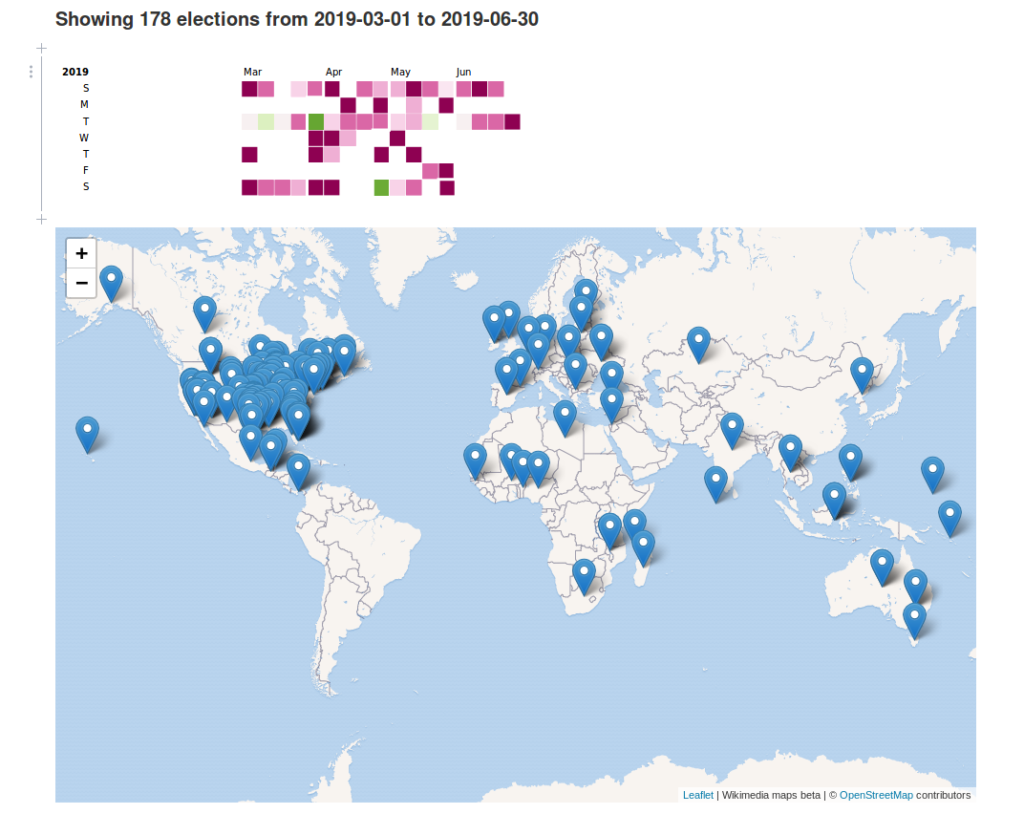
Most users know Cicero tracks elected officials, legislative districts, contact information, and social media. However many people do not know that Cicero also tracks and provides a free API feed of elections taking place across the world’s democracies (check out our Twitter project which tweets these out daily). Since March 1 to June 30 is an especially busy period, with 178 elections happening, we decided to make an interactive calendar of the feed. You can adjust dates and locations on the calendar here.
Getting Started with Observable Notebooks
We made this visualization using Observable Notebooks. They are a great way to quickly build and share an interactive data visualization on the web where it can be viewed without needing to publish to a website. They are sort of like Jupyter Notebooks for javascript data visualizations, and you can publish them to Observable HQ, where they are hosted for free. D3.js is the paramount data javascript graphics package beloved by people who build interactive data visualizations for the web.
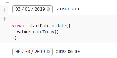
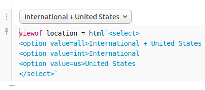
Each cell in an Observable notebook contains Javascript, which is evaluated and can be assigned to a variable. A cell can also render a UI element that assigns to a variable. In this notebook we use such elements to allow the user to specify how they would like to view the visualization i.e. International versus United States elections, the start and end of the date range to display, etc. See more options for interactive UI elements in the Observable demos.
Using UI elements in the notebook to assign variables

Editing dates 
Editing location
This notebook produces a map and a graphic. We render the map with leaflet, a library for embedding maps on websites, using wikimedia maps for the basemap. Observable provides lots of examples for swapping in other types of maps to display your data.
Calling the Cicero Election API
First you’ll need to register for an API key to access the Cicero Election API. Accessing elections is free, but Cicero’s additional resources for election officials and districts require purchasing credits. Once you have your API key, structure the rest call as follows:
$ curl "https://cicero.azavea.com/v3.1/election_event?election_expire_date_on_or_after=today&election_expire_date_before=tomorrow&format=json&key={api_key}"The response will contain a list of election event objects. Each contains the name of the legislative body or elected position up for election, the date of the election, and additional metadata associated with the election and the chamber.
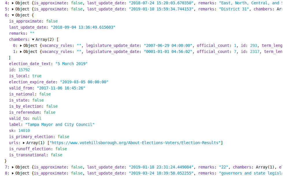
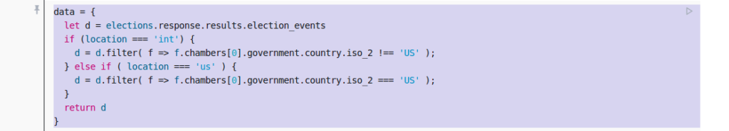
We process the API response with respect to whether the user specified United States or International election. The filtered response is assigned to the variable data.
Data is then fed to the functions to generate the calendar graphic and the map graphic.
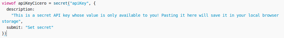
Keeping the API Key Secret
Like most APIs, Cicero requires a private key for each user. Observable Notebooks has a nice feature called secrets. A user enters a key that is used for requests to other web services, while at the same time is kept private in their browser when they publish and share their Observable Notebook. Once you have your Cicero API key, paste it and run the apiKeyCicero cell to make your request return a list of elections.
Mapping Elections
To plot election events on the map, we need to provide the coordinates associated with the location where the election is happening. One way to do this in Observable Notebooks when dealing with a small data set is to simply paste an object in a cell and assign it to a variable. In this example we create two variables containing most locations with elections in the Cicero elections feed. If we don’t have the location of a city or province, later in our code we default to plotting the location as the centroid for the country.

That’s it. You can view the source code for the project here. Once you register for an API key, you can paste it in the notebook to view the visualization. You can also fork the notebook and edit it for your own purposes.
Visit our website to learn more about the election data we keep. And if you do make your own election visualization, let us know!