
For several years, developers and GIS enthusiasts have been working to expand R’s spatial analysis and mapping capabilities. Packages like rgdal, sp and rgeos have turned R into a powerful GIS tool. However, up until recently, the processes of reading data into R, performing analysis, and mapping the results have been cumbersome. Traditionally, one would need to read spatial data into an R workspace with rgdal and store it in spatial data frame objects. These sp classes can interface with GEOS through rgeos for geoprocessing but mapping the results is clunky. In order to make maps in ggplot2 (R’s popular and highly flexible plotting library), these sp objects need to be ‘tidied’ into traditional R dataframes. This transformation makes it possible to display spatial information onto the cartesian plane of a ggplot output but not to do much else in the way of spatial or statistical analysis.
If this all seems unnecessarily convoluted to you, I think you get the point. The spatial data analysis pipeline in R has lead to some frustrating workflows until the recent release of the sf package. This library introduces the ability to store spatial data into the much simpler vectorized format of ‘simple features,’ for which it is named. It unifies each of the aforementioned steps of the spatial analysis pipeline into one package, dramatically streamlining the process of working with spatial data in R. Sf binds to GDAL, GEOS and Proj.4, allowing you to access a wide array of GIS operations. Furthermore, simple features act like R data frames, and are designed to fit seamlessly into the tidyverse. This means that you can easily reshape sf objects with dplyr and tidyr verbs. It also means that you can painlessly create maps and plots in ggplot directly from spatial objects.
This post offers a brief introduction to the sf package. It includes a tutorial that will walk you through some package basics including reading and writing from/to shapefiles, reprojecting, mapping with ggplot, filtering and reshaping with dplyr and extracting polygon centroids. It will make use of a dataset from FiveThirtyEight that tracks how frequently each member of Congress has voted in line with President Trump’s position. We will use sf to join these data to a shapefile of legislative districts from the U.S. Census Bureau to explore them spatially.
Before you begin, you will need to download the necessary datasets and place them in your working directory. Next, load the requisite packages for this tutorial.
library(sf)
library(dplyr)
library(ggplot2)
library(magrittr)
Reading data into R with sf is a relatively straightforward task. It does support directly importing simple features from a PostGIS database with various R database tools, but in this case we will simply read from a shapefile in our working directory.
cd <- st_read('congressional_districts.shp', stringsAsFactors = FALSE)
head(cd)
To view or manipulate the attributes associated with these polygons, we can simply treat the object as a conventional R data frame. The basic plot function gives you a quick and convenient view of each attribute mapped across all polygons.
Next we will need to load the voting dataset for each member of the House of Representatives.
cts <- read.csv('congressional_trump_scores.csv', stringsAsFactors = FALSE)[ , -1] %>%
  mutate(district = as.character(district))
head(cts)
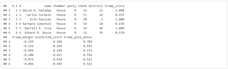
The folks at FiveThirtyEight have computed a series of summary statistics associated with each Representatives track record of voting realitve to Trump’s position on that measure. They have computed a ‘Trump Score’ (trump_score) that tells us the proportion of the time that each legislator has voted in line with the President. We will primarily be interested in visualizing this variable. In order to map this variable we will need to join the tabular voting data to our district polygons. Since we are able to treat sf objects as data frames, it’s easy to do this using dplyr’s join functions.
dat <- left_join(cd, cts)
Now that we’ve combined both datasets into one sf object, we can map them with ggplot. When you give ggplot an sf object, the geom_sf command knows to plot the points, lines, or polygons based on the well-known text ‘geometry’ field embedded in the object. The other sf-specific ggplot command in this example is coord_sf, which allows you to specify an alternate projection to use for your map. You can select a coordinate reference system by its epsg code, which can be found at spatialreference.org.
# first define a set of layout/design parameters to re-use in each map
mapTheme <- function() {
  theme_void() +
    theme(
      text = element_text(size = 7),
      plot.title = element_text(size = 11, color = "#1c5074", hjust = 0, vjust = 2, face = "bold"),
      plot.subtitle = element_text(size = 8, color = "#3474A2", hjust = 0, vjust = 0),
      axis.ticks = element_blank(),
      legend.direction = "vertical",
      legend.position = "right",
      plot.margin = margin(1, 1, 1, 1, 'cm'),
      legend.key.height = unit(1, "cm"), legend.key.width = unit(0.2, "cm")
    )
}

ggplot(dat) +
  # plot a map with ggplot
  geom_sf(aes(fill = trump_score), color = NA) +
  # specify the projection to use
  coord_sf(crs = st_crs(102003)) +
  scale_fill_gradient2('Trump Score \n', low='#0099ff', mid = '#ffffff', high = '#ff6666', midpoint = 0.5) +
  labs(
    title = 'Where have U.S. Representatives voted with and against President Trump?',
    subtitle = "Mapping FiveThirtyEight's 'Trump Score' of House of Representative's voting records",
    caption = "Source: Azavea, Data: FiveThirtyEight"
  ) +
  mapTheme()

The map reinforces our understanding of the severely partisan nature of Congress. Most Trump scores are at the extremes, as very few legislators have shown themselves to be willing to break from their party lines.
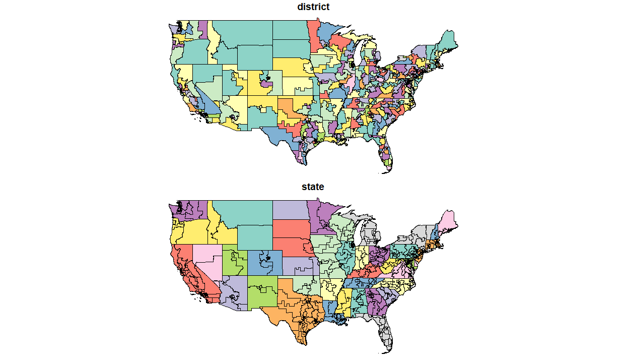
Our next step will be to zoom in on one particular part of the country. We’ll use dplyr to subset and map just three states in the Upper Midwest (Minnesota, Wisconsin and Iowa). Along the way we will also re-project an sf object, extract polygon centroids, and use those centroids to label each district.
upper_mw <- dat %>%
  # select a few states using dplyr::filter
  filter(state %in% c('MN', 'IA', 'WI')) %>%
  # re-project to an appropriate coordinate system
  st_transform(2289)

upper_mw_coords <- upper_mw %>%
  # find polygon centroids (sf points object)
  st_centroid %>%
  # extract the coordinates of these points as a matrix
  st_coordinates

# insert centroid long and lat fields as attributes of polygons
upper_mw$long <- upper_mw_coords[,1]
upper_mw$lat <- upper_mw_coords[,2]

ggplot(upper_mw) +
  # map districts by Trump Score
  geom_sf(aes(fill = trump_score), color = 'white') +
  # add labels according to locations of each polygon centroid
  geom_label(aes(long, lat, color = party, label = name), alpha = 0.75, size = 2) +
  scale_fill_gradient2('Trump Score \n', low='#0099ff', mid = '#ffffff', high = '#ff6666', midpoint = 0.5) +
  scale_color_manual('Political Party', values = c('Blue', 'Red')) +
  labs(
    title = "Congressional support for President Trump's policies in the Upper Midwest",
    subtitle = "Mapping FiveThirtyEight's 'Trump Score' of House of Representative's voting records",
    caption = "Source: Azavea, Data: FiveThirtyEight"
  ) +
  mapTheme()
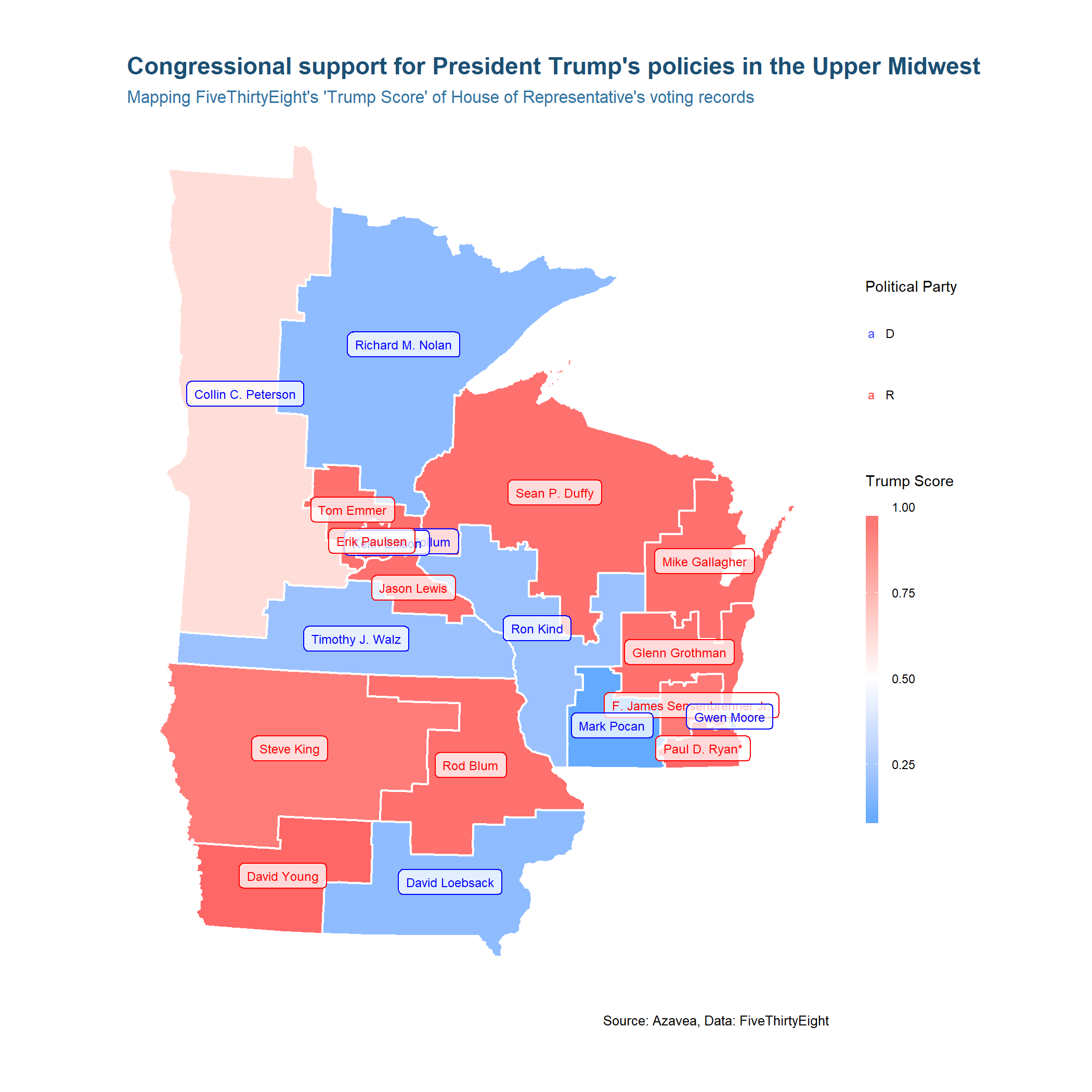
This example demonstrates how you can nest sf functions into magrittr pipelines, using the ‘%>%’ operator that a user of any tidyverse package is likely familiar with. Next you’ll see how you can use dplyr to dissolve polygons.
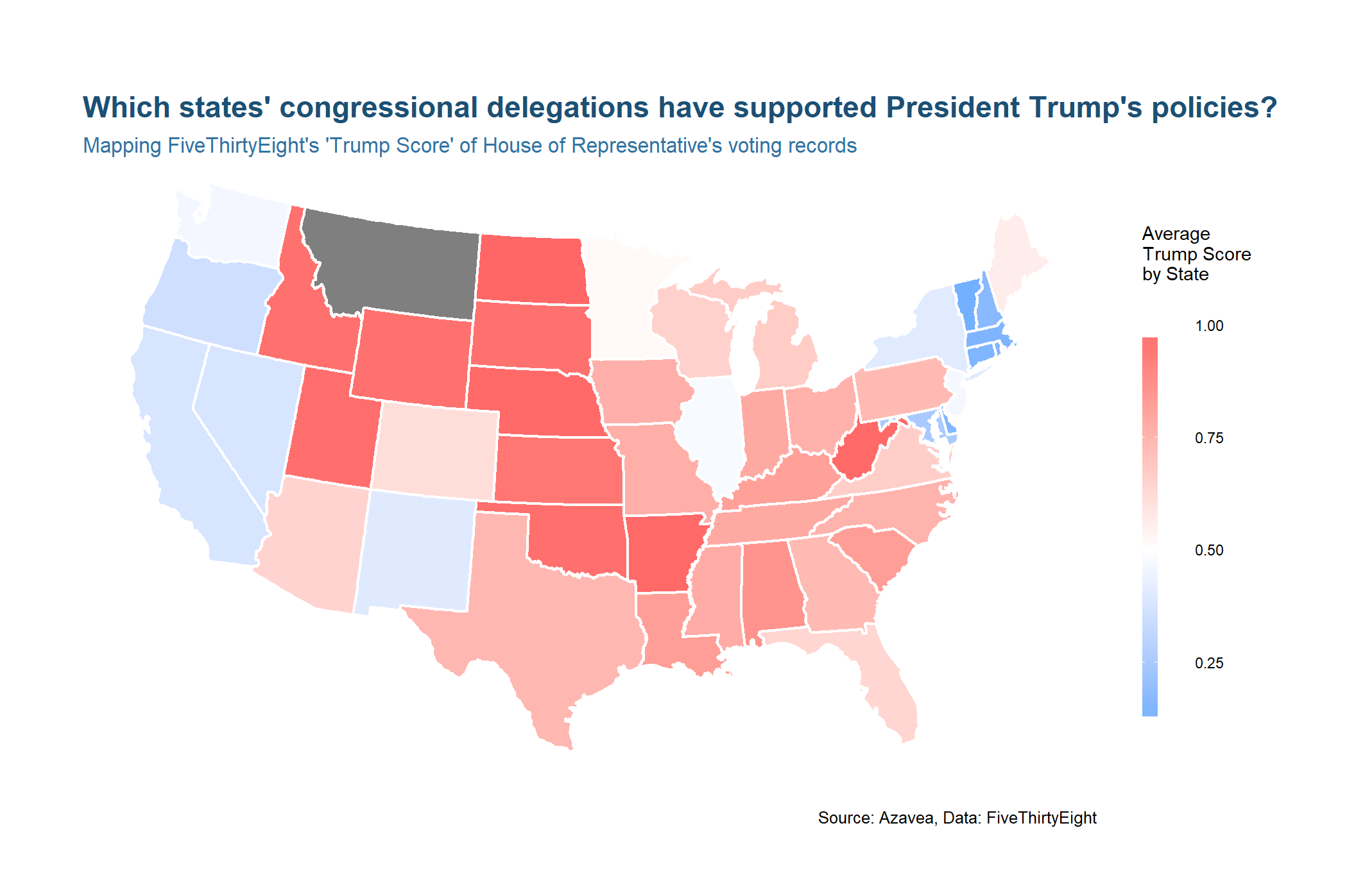
Let’s look at the original map of the whole United States but this time aggregate the Trump Scores to the State level.
by_state <- dat %>%
group_by(state) %>%
summarise(avg_trump_score = mean(na.omit(trump_score)),
districts = n_distinct(district))
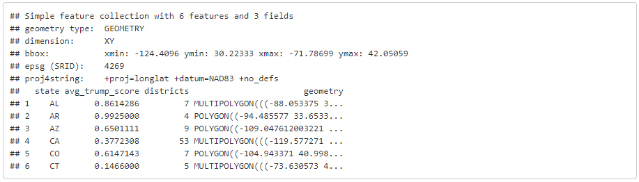
head(by_state)
We can use familiar dplyr syntax to group districts by state and compute summary statistics. Since sf objects integrate so well with dplyr, the function automatically groups and merges the spatial data along with the tabular. The end result is similar to that of the geoprocessing dissolve tool in a traditional desktop GIS.
ggplot(by_state) +
  geom_sf(aes(fill = avg_trump_score), color = 'white') +
  scale_fill_gradient2('Average \nTrump Score \nby State \n', low='#0099ff', mid = '#ffffff', high = '#ff6666', midpoint = 0.5) +
  coord_sf(crs = st_crs(102003)) +
  labs(
    title = "Which states' congressional delegations have supported President Trump's policies?",
    subtitle = "Mapping FiveThirtyEight's 'Trump Score' of House of Representative's voting records",
    caption = "Source: Azavea, Data: FiveThirtyEight"
  ) +
  mapTheme()
Finally, you can write your transformed sp object to a database or local shapefile with the st_write command.
st_write(by_state, 'Trump_score_by_state.shp')
This tutorial only scrapes the surface of sf’s analytical tools. If you are interested in learning to perform more advanced spatial analysis in R, I recommend checking out vignettes like this one or the package’s full documentation.