The Azavea Data Analytics Team is holding the last installment of the Map Readiness webinar series on March 22nd, 2017 from 2-3pm EST. We’ll walk you through the analytics techniques and tools we use to help our nonprofit partners answer their biggest questions.
Optimize Your Nonprofit
As you may know, we at Azavea’s Data Analytics Team have worked for more than 10 years helping nonprofits scale their social impact using data and technology. We’ve found that data analysis has helped nonprofits optimize every one of its core functions:
- Targeted fundraising – using data to identify where your donors are and where you can find more
- Reporting and evaluating impact – using data to communicate the impact of your programs through data visualizations
- Data-driven storytelling – using data to demonstrate the urgency of the need your organization is addressing
- Evidence-based advocacy – using data to advocate for your cause with the relevant policymakers
- Strategic management – using data to prioritize areas with the greatest need and allocating resources for maximum impact

But data isn’t a silver bullet. It’s only as useful as its ability to shed light on your organization’s most pressing questions, the ones that keep you up at night. That’s why we compiled some of the most common questions we’ve heard from the hundreds of nonprofits we’ve worked with over the last decade.
5 Questions You Can Answer with Maps & Data Visualization
In the third and final installment of our current Map Readiness webinar series, we’ll walk you through the analytics techniques and tools we use to help our nonprofit partners answer their biggest questions:
- Where are our current donors, supporters, and beneficiaries? Where can I find more?
- Who has access to our services and facilities? How do we measure that?
- What would be the impact of a policy change or program on our community?
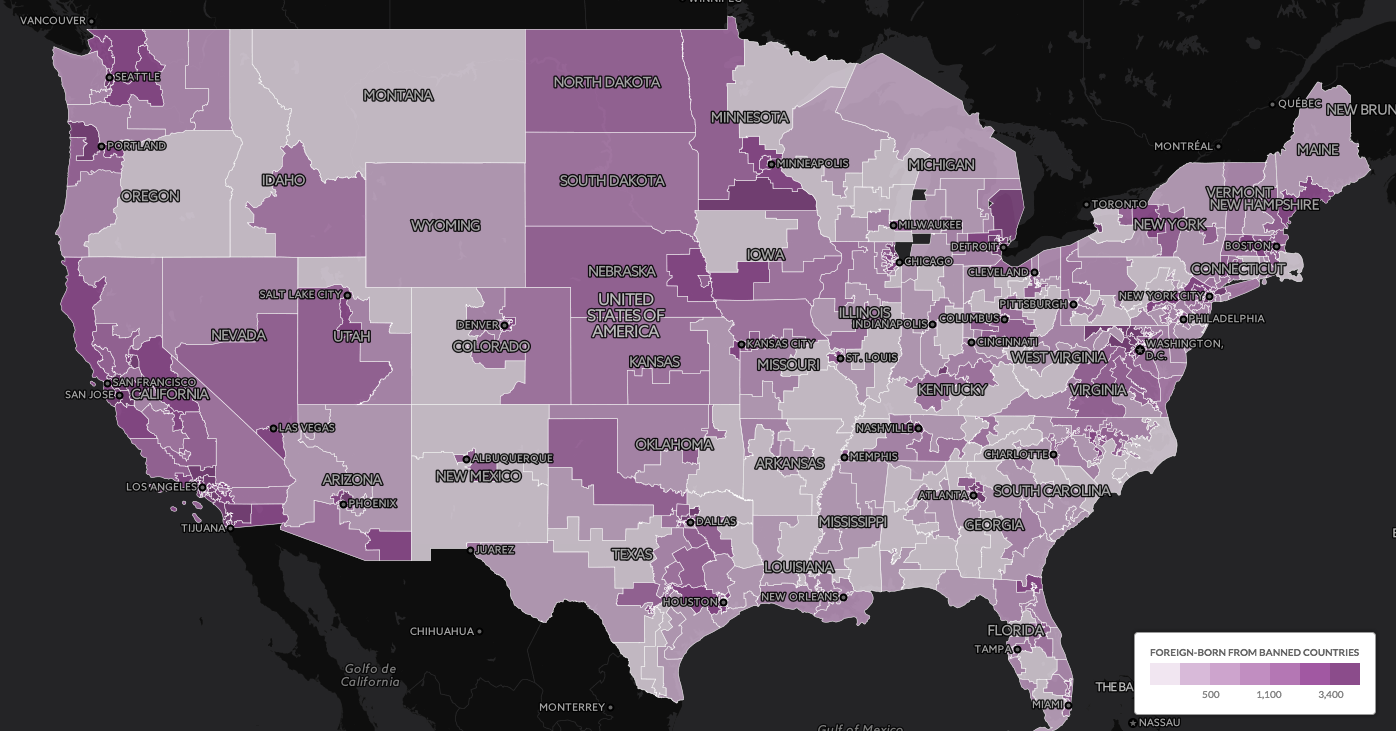
- Which constituents are most impacted by a policy issue or need? Which elected officials should we target based on where those constituents live?
- How do we use data visualizations to tell a more compelling story to funders, donors, elected officials, and our target audience?
In this political climate, advocacy is now more important than ever. Join us on 3/22 to learn how to scale your mission with data.
5 Questions You Can Answer with Maps & Data Visualization
Wednesday, March 22nd, 2017
2:00 PM – 3:00 PM EST
Previous Webinars in the Map Readiness Series
Data Analytics Webinar #1 Recording – Free Tools to Share Your Message with Web Maps
- How a nonprofit won $1,000,000 using data analysis and maps
- How to find open data & download spatial census data
- How to collect your own data
- How to prepare & format data
Watch the recording of Webinar #1…
Data Analytics Webinar #2 Recording: Putting Your Data on the Map to Communicate Your Impact
- What is geospatial data?
- How to geocode your data
- Intro to free desktop mapping apps for data-driven decision-making (eg QGIS)
- Intro to free tools to put web maps on your website or blog (eg CARTO)
