
Want to decrease a city’s carbon footprint? A good starting point may be with the largest offender: buildings, which account for more than 60% of all greenhouse gas emissions in most cities. Until very recently, however, there wasn’t enough data to act on this. The past few years have seen a significant change, however, with many cities adopting policies that requires large commercial buildings to report their energy usage, a process known as “energy benchmarking”. In Philadelphia, 2013 was the first year in which this requirement took effect and all large buildings had to start reporting their annual energy usage. The Mayor’s Office of Sustainability (MOS) released the data to the public via GitHub in fall 2014. And in an effort to make these results easy for everyone to explore and visualize, MOS worked with Azavea to build the Building Energy Benchmarking visualization tool.
Philadelphia is one of the pioneering ten cities involved in The City Energy Project, a groundbreaking national initiative led by the Natural Resources Defense Council (NRDC) and the Institute for Market Transformation (IMT) that aims to improve energy efficiency of buildings in order to create healthier and more prosperous cities. Under these regulations, each large commercial building is required to report its previous year’s energy usage by June 30th of each year. For 2013, 90% of the required buildings complied, leading to a significant new data set ripe for analysis.
In addition to releasing the data, MoS agreed to release the software under an open source license, making it possible for other cities to potentially use the visualization tools for their own data. The software includes maps, charts and statistics. Using the map, developed using the CartoDB platform, it’s possible to hone in on a region of interest and view energy usage statistics of individual buildings. There are many different ways to filter, classify, and size the displayed buildings by tweaking a variety of variables. Once a building of interest is selected, a full energy use report can be pulled up, which displays how the building ranks among all others. A comparison tool is also available for side-by-side comparisons of up to three buildings.
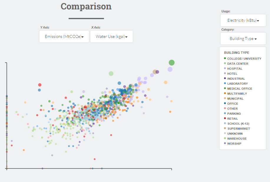
Viewing and analyzing aggregated data can be accomplished through the use of four D3 charts: each with interactive variables allowing for many different possible configurations. There’s a bubble chart of building types, a dual bar chart breakdown by year built and size, a four-variable scatter plot comparison of all buildings (totaling over 1,500 configurations!), and a 2012 to 2013 change comparison for the limited set of data that was also collected in 2012.
With a combination of the mapping tools and the charting tools, very interesting analyses can be made. We hope this will be used to research trends, pinpoint problematic buildings, and provide inspiration for creating change and reducing energy usage in Philadelphia.