
Recently attending the NACIS Annual Meeting provided significant inspiration on cartography and visual map design. This encouraged me to assemble some tips on the thoughtful use of color in cartographic design.
1. Never Use the Default Colors
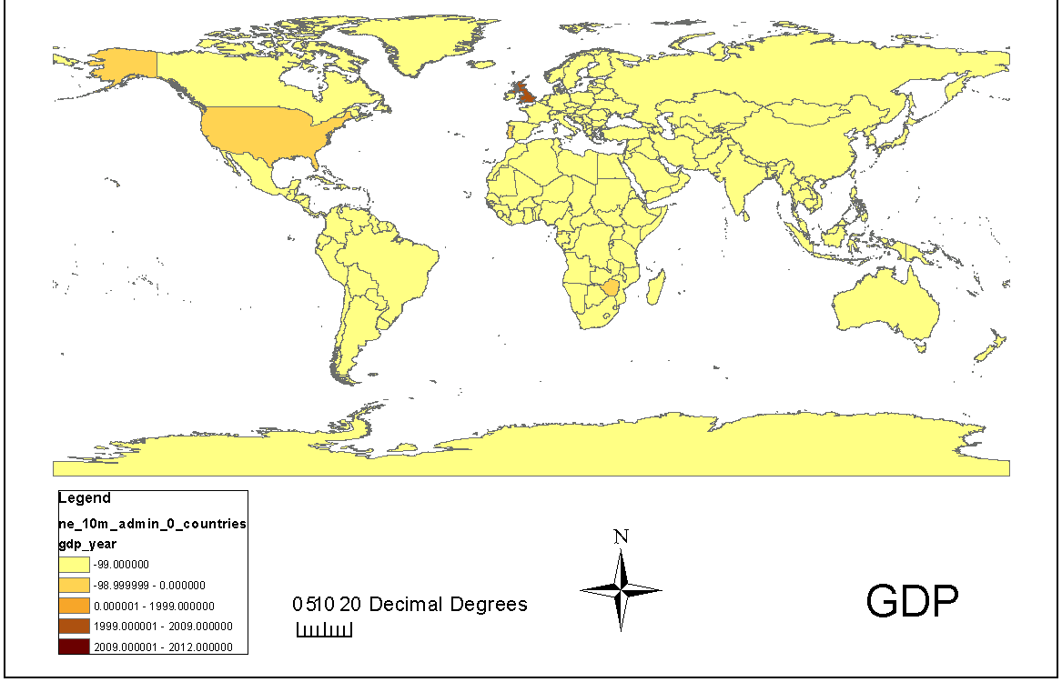
A frequently mentioned recommendation during the conference was to avoid defaults at all cost. One specific set of defaults to avoid in mapmaking are the default color schemes (and even classification styles) used for symbolizing data in your maps. John Nelson made this specific warning during his presentation on 20 Unrequested Map Tips (see tip #3 “Defaults are Evil”). His map below highlights the worst of the worst of relying on defaults in ArcMap.
Consider using the ColorBrewer web tool (Cynthia Brewer’s collection of beautiful color choices for ramped or categorical data) as an alternative to Arcmap’s uninspired defaults . You can even import ColorBrewer schemes directly into ArcMap or other GIS or data analysis software of your choice (GDAL, QGIS, R, TileMill, etc). Happily, a favorite web mapping tool, CartoDB, already includes these lovely schemes.
2. Palette Inspiration
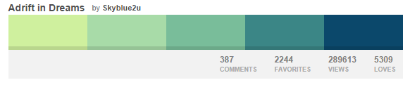
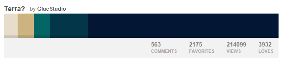
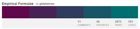
Color selection need not be traditional and stuffy. Inspire yourself to design a more creative color scheme by browsing some existing color palettes and even create your own. Here are a few I like:
Or browse old maps for inspiration:
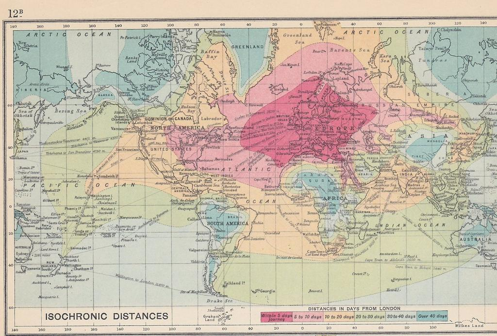
The above map was used as inspiration for the color palette below:
3. Logo or Photo Inspiration
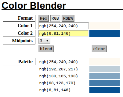
Are you designing a map for a client? Try coordinating their company colors with your map design. Identify the RBG codes of the colors in a logo or site by using a free eyedropper tool (in your Chrome browser or desktop) or add the Eyedropper tool to your toolbar in ArcMap. Now that you have identified a few of the predominant colors in your logo, decide how they will be used in your cartography (would these colors be suitable for categorical, divergent or sequential data?) You can simply use these colors for inspiration or you can use a color blender tool like this one or this one to create a range from two colors. Adjust saturation and transparency to suit your mapped data. Below is a logo, a ramp and a map created using this method. I decided to just use a palette made from only the blue in the logo but you can also find a divergent palette using both the red and blue here.
Logo of Inspiration: the Philadelphia Phillies Logo:

A palette created from the primary blue of the logo:
Finally, a map symbolized using the blended color palette:
Find the color palette of the above scheme here.
4. Design for Accessibility
Color deficiency or blindness is an important consideration in cartographic design. Red to Green color palettes are used frequently when mapping divergent data. The inability to differentiate these two colors causes significant challenges in interpreting data. Tip #17 from 20 Unrequested Tips and this fantastic blog post does a great job at describing the shortcomings of some color palettes and makes fantastic (and beautiful) recommendations for accessible colors. When selecting your accessible palette, consult Colorbrewer which has an option to select only colorblind safe palettes.
Other areas of consideration for design accessibility for vision impairment include tactile maps which deserve their own blog post, but I’ll say PATCO’s Tactile Transit Map is worth checking out for inspiration. (Routes and stop amenities are uniquely symbolized using tactile features for easy navigation).
Conclusions
It is important to consider how the colors in your maps communicate and whether it is successful in sharing the correct message. The book How to Lie with Maps by Mark Monmonier devotes an entire chapter on the misleading use of color in maps. As a cartographer, you have the power to make creative and thoughtful color choices. Use these tips and guidelines to bring careful color consideration and planning to your maps. This will help you communicate better with a wider audience and help your map stand out in a sea of ArcMap defaults.