
Last week, Data Analytics Project Manager Sarah Cordivano and I attended the North American Cartographic Information Society conference in beautiful Pittsburgh. After searching around for some of the best GIS and mapping related conferences to attend, NACIS was one of the mostly highly recommended, and I think it lived up to its reputation.
The conference started off with Practical Cartography Day, an entire day of sessions devoted to real-life examples of map-making. The talks touched on a diverse array of topics in mapping, which made it particularly valuable. If these talks were scheduled on topic-area specific tracks, I probably would have missed some interesting examples and discussions. One of my favorite speakers on Practical Cartography Day, John Nelson, offered his 20 Unrequested Map Tips. It’s really great advice for those just starting out in cartography, especially in academia, where often the ArcGIS defaults are the only thing taught. It made me reflect on how important user interface and design is to cartography and how that education is really lacking within today’s GIS programs.
Some other sessions and talks that were particularly good:
-
Alan McConchie of Stamen Design gave out a bunch of good tips for manipulating custom CartoCSS. It’s a must-see for anyone who uses Tilemill and wants to learn some cool tricks for customization.
-
Exemplifying the challenge of customizing maps, Nicki Dlugash of Mapbox talked about the design challenges in creating a basemap of the entire world styled optimally at all zoom levels using OpenStreetMap data.
-
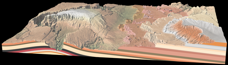
Though not strictly map-related, Miles Barger of the US National Park Service presented on a recent project to create a 3D model of the Grand Staircase, a major geologic feature in Utah. He touched on the need to “fiddle” with settings to create the perfect diagram and also started a bit of controversy (mostly from one attendee) when he suggested it’s okay to manipulate or exaggerate features for the purpose of creating a user-friendly design.
-
Also of the US National Park Service, Mamata Akella presented on the beautiful custom maps and tools the park service has been working on. They’ve put everything on GitHub (except the internal stuff, of course).
-
Patrick Kennelly, of Long Island University, showed the results of using a three dimensional helix model to visualize daily temperature data over time at over 250 weather stations across the US. Patrick and his team used the Blender API for data manipulation.
-
During the Transportation Maps session, Nate Wessel, student at the University of Cincinnati, presented his bicycle map of the Cincinnati area. Contrary to the typical government produced bike map based on subjectivity of conditions, Nate based his map on more objective conditions agnostic to the type of rider, such as elevation change, speed limit, and road condition. Nate’s map was also a runner up for the student competition.
In addition to attending the conference, Sarah and I also presented on some topics of personal interest. I introduced General Transit Feed Specification data and gave some examples of how to the data is being used in mapping and analysis today. Sarah talked about the importance of open data and open source tools which brought up a lively discussion of how the issue relates to cartography and spatial analysis. Overall, the conference had a nice balance between real-world and academic examples of cartography and analysis. Next year, the conference will be in Minneapolis and it’s definitely a must attend for anyone who loves maps.