
![]()
Now in its third year, Azavea’s Summer of Maps Program has become an important resource for non-profits and student GIS analysts alike. Non-profits receive pro bono spatial analysis work that can enhance their business decision-making processes and programmatic activities, while students benefit from Azavea mentors’ experience and expertise. This year, three fellows worked on projects for six organizations that spanned a variety of topics and geographic regions. This blog series documents some of their accomplishments and challenges during their fellowship. Our 2014 sponsors, Google, Esri and PennDesign helped make this program possible. For more information about the program, please fill out the form on the Summer of Maps website.
When you’re navigating the real world, the shortest distance between Point A and Point B is rarely a straight line. Instead, there are twists and turns in the path, difficult terrain, and impassible roadblocks that force you to detour and slow your journey (a lot like life!). This reality has important implications for understanding how close you are to things, whether you’re planning a cross-country road trip or simply walking to your closest neighborhood park.
A common way to measure proximity in a GIS analysis is through using a simple buffer tool, which measures a straight, set distance away from the point, line, or polygon boundary of interest and creates a polygon filling up that created space. This tool has practical applications when you’re looking at basic geographic proximity, but in many cases, measuring straight distance proximity or “as the crow flies” just doesn’t make for the most robust analysis.
One of these cases arose from my work this summer with the Community Design Collaborative to prioritize parks, playgrounds and schoolyards in Philadelphia for potential grants for revitalization or redesign efforts. Among the many factors that were considered for selecting candidate sites was park accessibility. We wanted to visualize where people in Philadelphia are far from existing parks so that we could identify schoolyards or community gardens in these parts of the city that could potentially be redesigned as neighborhood play spaces to serve communities lacking a nearby park. Since we are studying an urban environment and are particularly focused on access for children, we considered walking along sidewalks to be the dominant form of travel to parks.
One option for incorporating park access based on walking would have been to use Network Analyst tools in ArcGIS to develop sophisticated “service areas” for each park using the street network. The issue with this option, in this case, was simply the scale of the operation: with over 400 parks included in our analysis, the service area calculation would have been far too time-consuming and prone to ArcGIS crashes due to system overload. A more manageable way to illustrate park access using the street network was to create a cost distance surface that made traversing along sidewalks to be the preferred method of travel.
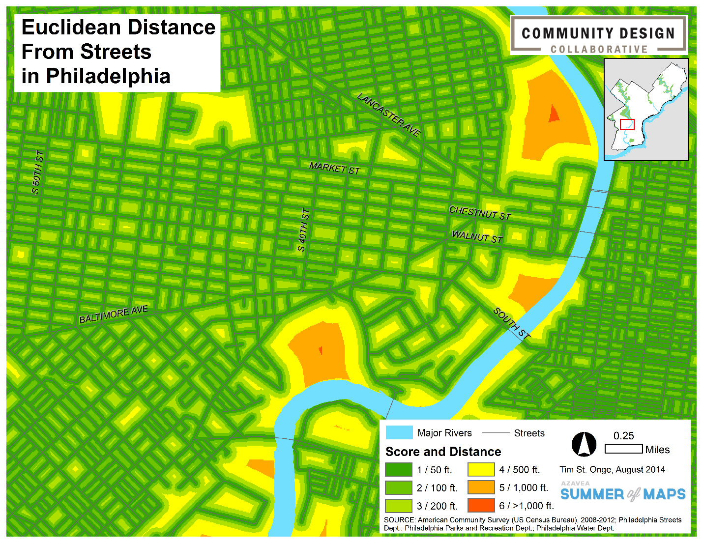
To do this, we first examined a dataset of Philadelphia streets, acquired from OpenDataPhilly, and eliminated highways and urban freeways from the data, as these cannot serve as walkable routes to local parks. We then converted the streets dataset into raster format and used the Euclidean Distance tool to create a surface of straight-line distances from each cell to a street. The resulting raster was then classified into a 1 to 6 based on its distance value to represent difficulty of travel, with a value of 1 being easiest to travel and 6 being most difficult. This classification establishes the street network and its sidewalks as the preferred route for travel. The map below shows what this classification looks like for a portion of West Philadelphia:
Our next step was to incorporate the park locations for the cost distance calculation. To both simplify our parks data and simulate access to park entry points, we extracted vertex points from our park polygon dataset and set them to be the “source” dataset, or the locations from which cell distances are measured, in the cost distance operation. We then applied the Cost Distance tool in ArcGIS to measure and record distances between each cell and the nearest park access point using the easiest or “cheapest” route. In other words, the distance of a vertex-to-cell route that covers the easiest terrain (for example, a 1- or 2-scored area on the street’s Euclidean distance layer) will be selected as that cell’s cost distance value, while an alternate route over more difficult terrain will not be (perhaps even if the difficult-terrain route is shorter in straight-line distance). For a more detailed breakdown of the algorithm generating cost distance surfaces, ArcGIS Resources provides explanations and examples of how node-to-node cost distance calculations are performed in the software.
The map below shows the resulting raster illustrating park proximity. You will notice that the edges of each data class appear to hug the street centerlines, showing that routes along streets and sidewalks are preferred to unrealistic routes that cut through city blocks.
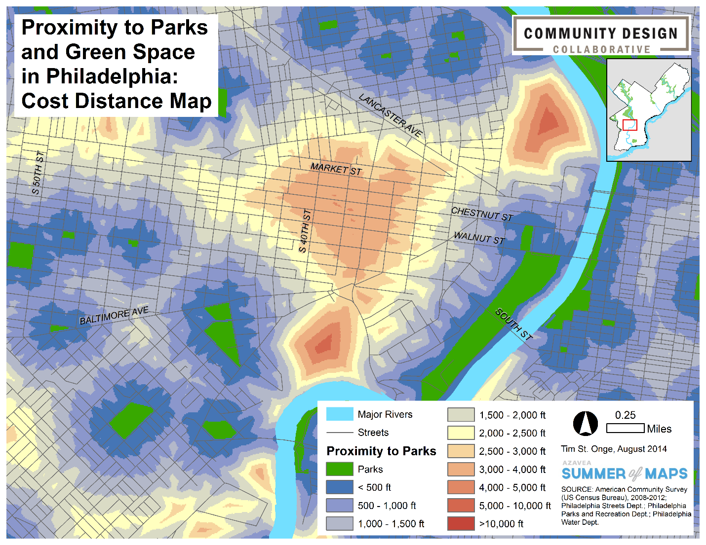
With this realistic dataset of park access, we were able to generate a clear picture of the walkable landscape of Philadelphia and identify areas of the city where walking to the park can be a long and tedious trip for children and families. Altogether, in using the cost distance tool, geodesic distances as well as terrain difficulty are incorporated to illustrate real-world proximity and what it really takes to get from Point A to Point B.