
Update 12:30pm, 8-16-2013: CartoDB is working on a fix for the WKT issues I stumbled upon in this blog and tweeted a workaround. Thanks Javier!
Many months ago, after the City of Philadelphia released some of its Part 1 Crime Incident data on OpenDataPhilly, I read a blog post by our very own Chief Data Officer Mark Headd where he visualized 6 years of homicides in the City of Brotherly Love on a temporal map using CartoDB’s Torque library. While the story the map tells is an important one, it is also depressing and sad – every second, as you watch, more dots appear on your screen representing way too many homicides in our city:
[iframe src=”http://mheadd.github.io/philly-homicides/” width=”100%” height=”480″]
I was talking with a friend outside Azavea about Headd’s visualization, and posed a question: “What positive, uplifting change over time in our city could we tell the story of?” I sometimes get the feeling that so much data and visualizations of it are negative or otherwise shock us: from our struggling education system, to stolen bikes, to the disparate impact of voter ID laws. While visualizations like these uncover important stories to tell, so much sad news (for me at least) can sap my motivation to help fix it all. We need to visualize the good and give praise for what’s working, as much as we should analyze the bad and criticize what still needs to be done.
Hearing my frustration, my friend asked, “What about tree plantings or something?”, I assume without even realizing the connection she had just made in my mind.
Of course! That’s it! I happen to work for Azavea, where we craft OpenTreeMap, the best open source public tree inventory software around! I knew I could easily export data from PhillyTreeMap.org for almost two full years worth of ongoing, crowdsourced tree inventory and edits to the map in Philadelphia. We know that having more green, leafy trees and nature around make people happier psychologically, increase property values, clean our air and water, and save electricity and our environment. This was going to be a fun project.
Open, really open
Usually I think of the “Open” in “OpenTreeMap” as referring to the fact that it’s open source software. But there’s no reason that word “open” can’t be referring to open data as well. When someone adds a tree or tree details to an OpenTreeMap site, they are creating new data. We have always been big proponents of open data at Azavea, having originally built the OpenDataPhilly catalog ourselves. We know data can be reused and analyzed in more ways than we ourselves can imagine or hope to build into OpenTreeMap itself. (Remember Amos Almy’s project?) So OpenTreeMap follows this philosophy, and doesn’t lock its data away once users collect it. Right next to the main map of every OpenTreeMap site are three little links: “Export this search: KML | CSV | Shapefile”.
Each of those links allows anyone to download the results of a search for a specific species of tree, the trees in a particular neighborhood, or even every tree and plot in the system, in three different widely-used geospatial data file formats. From there, you can use desktop analysis tools like ArcMap, QGIS, or Google Refine and Earth, or cloud services like Google Fusion Tables and CartoDB to filter, query, and visualize your collected tree data.
So, I went to PhillyTreeMap.org and waited eagerly as I downloaded a zipped file containing three CSVs with details on the 183,758 plots, 56,310 trees, and 300 species on the map. More on why I picked CSV versus KML or Shapefile in a moment…
Raked into a pile, or scattered over the yard?
Like Headd’s homicide visualization, I wanted to eventually use CartoDB’s Torque temporal data library on the PhillyTreeMap dataset. If we took a look at the “last_updated” timestamp each tree and plot has that changes when a bulk inventory is loaded, a user adds an individual tree, or when someone adds additional details or a photo to a tree or plot, what would happen? I had two theories.
One possibility was that the data just wouldn’t be temporal enough. PhillyTreeMap was originally loaded with large bulk inventories from the Philadelphia Department of Parks and Recreation, the Pennsylvania Horticultural Society, and the Township of Lower Merion. These bulk inventories number in the tens of thousands of records, and since they were all imported at the same time, they would have the same timestamps unless users had gone and added to or modified the original trees or plots later. These big temporal “piles” of trees might overwhelm individual user edits to the map, and provide for a rather sleepy visualization.
My second theory was that the data would have sufficient temporality, and we would be able to display it in a way that would show us where the most active neighborhoods were for user edits to the map. Edits would be scattered all over space and time for a really cool visual effect. Still, though, I suspected there would be a difference here between user edits to trees and user edits to plots. Most of the plots came from bulk imports, which Philly Parks and Rec had done years ago but there was no way of confirming that a tree was still planted there or not. Trees have more fields to edit and add to than plots, and therefore (so I assumed) they might encourage more individual user edits.
Get your trees in a row
So it was clear that I would want to upload and analyze both plots and trees in CartoDB. To enable more analysis, I also wanted to know which plots actually had trees in them. Normally, this would have been an easy “merge tables” operation in CartoDB: Each record in trees.csv has a “plot_id”, which is the same unique ID of the corresponding plot in plots.csv, so it’s a simple Column Join operation. However, we’re dealing with “big-ish” data here, and due to the way CartoDB currently handles table merging, my poor 50 MB CartoDB “Magellan” server wasn’t going to be able to swing that.
This is why I chose to download data in CSV format earlier. The Shapefile that PhillyTreeMap exports actually has plots and trees in the same file, but in two separate attribute tables. That’s OK if you’re doing your analysis with a desktop GIS tool like ArcMap, though to my knowledge CartoDB currently only supports mapping one attribute table per Shapefile. (As it turns out, it is relatively easy to join attribute tables in ArcMap – ah, well. In addition, exports and how they work are to be redesigned as we work to release OpenTreeMap version 2.0.) PhillyTreeMap also supports KML files, as does CartoDB, but because these are XML-based, joining plot records with tree records would be a bit of a pain. Comma Separated Value files are the least common denominators in the data world, and even though they don’t keep track of data types (string, number, date, etc), they work fine with just about everything.
So I went looking for another desktop-based way to join CSV files based on a unique ID, and found a useful open source tool called CSVFix. CSVFix can handle a bunch of operations on CSV files, but the one I was interested in was it’s ability to do joins and outer joins based on columns. Before I joined my plot and tree CSVs, I went through and appended “plot_” or “tree_” to the names of each of the column headers, respectively. This is so I could tell later on what each column was describing and to eliminate naming conflicts – both files have a “last_updated” field, for instance. I installed the Windows version of the command-line CSVFix program, and with this one command I had performed an “outer join” of my plots to corresponding trees, if any:
csvfix join -f 2:3 -oj plots.csv trees.csv > plottreeojmerged.csv
I decided I also wanted some information about each tree’s species for other possible visualizations, too. While trees.csv has the species code, the scientific and common names associated with that code are in the separate species.csv. Species.csv also contains a bunch of columns that aren’t currently tracked in PhillyTreeMap, so I made a shorter file with only the columns I cared about (id, scientific_name, and common_name) to cut down on the data I would have to upload to my small CartoDB instance, “shortspecies.csv”. I then performed a similar outer join on this file with CSVfix:
csvfix join -f 32:1 -oj plottreeojmerged.csv species.csv > plottreesspecies_ojmerged.csv
Now I was ready to upload my combined plot/tree/species-record file to CartoDB and get started…well, almost.
Well-Known, You Would Think
While CartoDB supports uploading CSV files, it does not (yet?) correctly georeference CSV files containing a column of Well-Known Text. (Update: Javier de la Torre, of the CartoDB team, tweeted at me soon after publishing this blog that they are working on this feature and have a quick SQL workaround in the meantime.) What is Well-Known Text, or WKT? WKT is an Open Geospatial Consortium standard for representing vector geometries (ie, points, lines, and polygons) as human readable text that computers can also parse. So, if you were making a graph and wanted to put a point at the Cartesian coordinate (1, 2), the WKT representation would be POINT (1 2). Say you wanted to draw a line between (1, 2) and (5, 4). In WKT, that would be LINESTRING (1 2, 5 4).
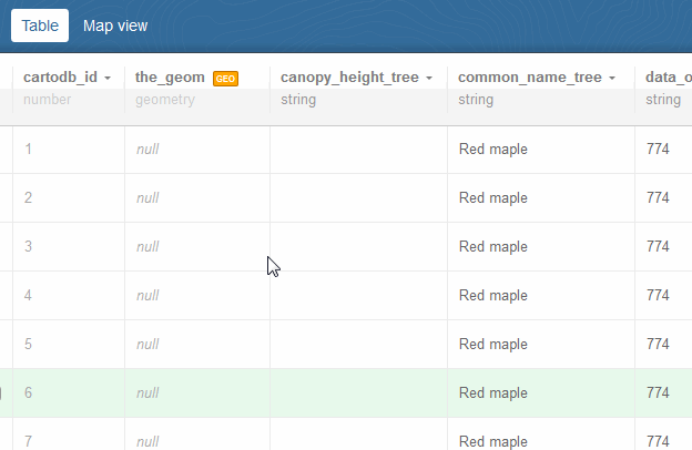
When you export OpenTreeMap data as CSV, the plots.csv and trees.csv files include a WKT column, defining the latitude and longitude points for each plot and tree. Great! Since WKT is an open, accepted standard, I first tried uploading my CSVfix-merged file with WKT right to CartoDB. Unfortunately, while CartoDB had recognized the WKT column as a geometry type and converted it to the binary equivalent, for some reason it did not populate its magic “the_geom” column with this data, and instead left it in a separate column. CartoDB uses the_geom column to display records on its maps, and with it filled with null values I wasn’t going to be able to visualize anything. (As per @jatorre’s update above: you would run “update plottreesspecies_ojmerged set the_geom = ST_SetSRID(invalid_the_geom,4326)” as an SQL query to define an SRID for the invalid_the_geom column and set it to the proper the_geom column. Great quick help from the CartoDB guys, I should have asked sooner!)
GIF showing the real the_geom column empty and an invalid geometry column in CartoDB after uploading a CSV with WKT.
OK, no problem, we can convert our WKT data to a format that CartoDB does support. I first thought about using Esri’s ArcMap to do the conversion. After all, Esri is a member of the OGC that promulgates the WKT standard, and ArcMap is fully featured and often easier to use than command line tools like OGR, so it should be no problem. Turns out, it is. The only way to add data from a CSV in ArcMap (without writing a Python script using ArcPy’s FromWKT function, which I found out about afterward) is to use the “Add X/Y Data” option – which requires your CSV to have X/Y data (ie, latitude and longitude columns – not one single WKT column). I knew there was probably a way to use the open-source OGR library, but not without the hassle of creating my own virtual file format first.
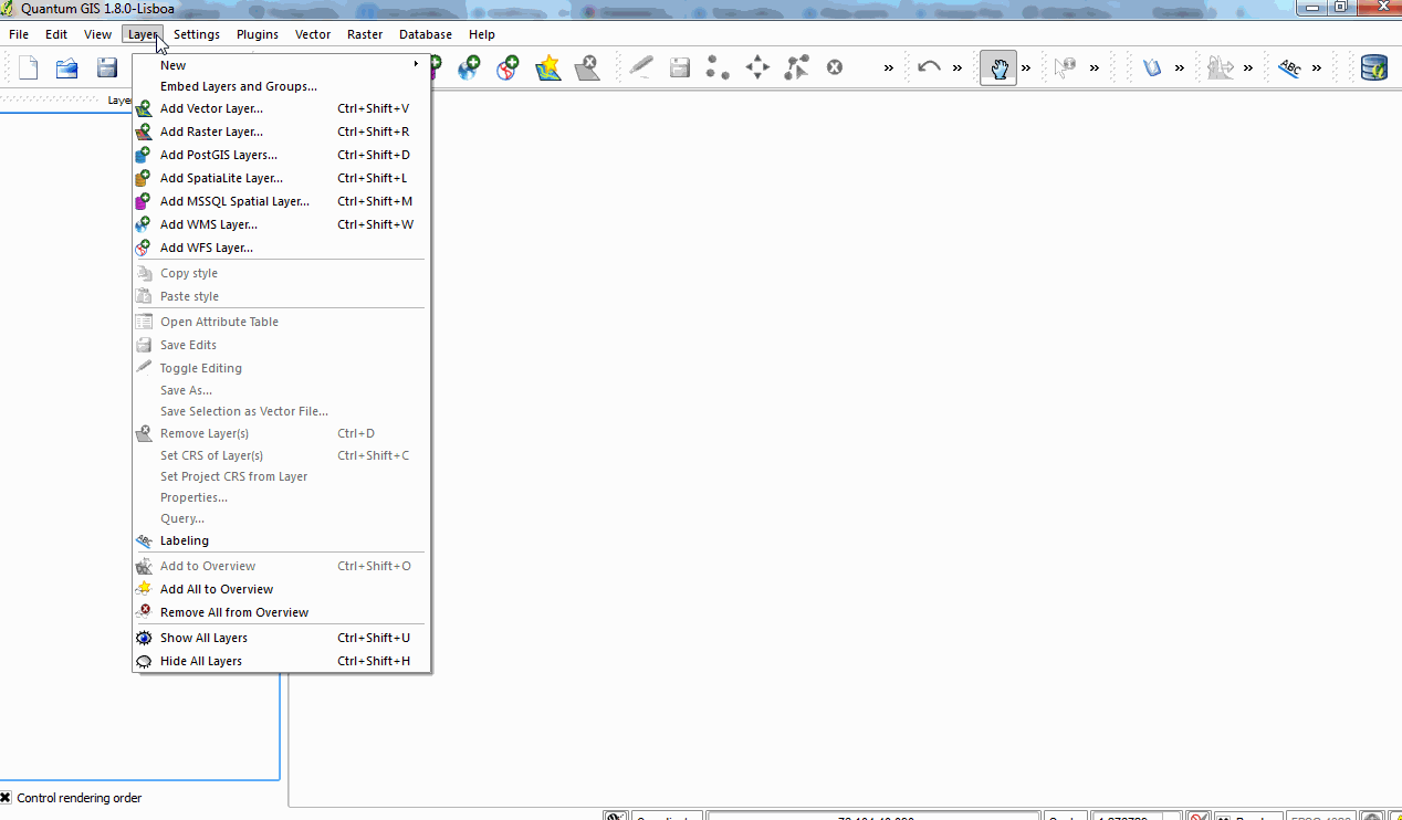
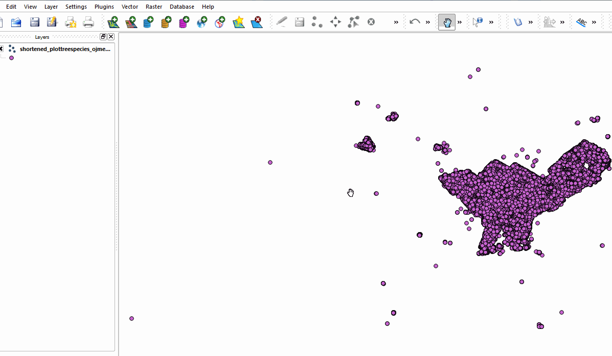
But guess what desktop-based GIS tool does support instantly importing CSVs with WKT data? Quantum GIS! QGIS is free and open source, and easy to install and use, too. I just used the Layer>Add Vector Layer… menu option, told it to open my plotstreesspecies_ojmerged.csv file, set the WGS84 Coordinate Reference System, and voila! We see in the map window a view of our plot points in the very familiar geographic outline of Philadelphia and surrounding towns.
Importing a CSV with WKT data into QGIS.
Next, I use QGIS’s “Export to Shapefile” tool, because I know CartoDB supports Shapefiles and the geospatial information will no longer be stored in WKT as a result of the file conversion. QGIS generates the 4 constituent files a shapefile is made of, which we then zip up and send off to CartoDB.
QGIS exporting our trees to shapefile format.
To the Cloud!
Okay, we’re solidly past the pedestrian world of manipulating CSVs and converting files and have our final, visualizable Shapefile up in CartoDB. (Nevermind the fact that my final shapefile table took up nearly 40 MB of my Magellan account’s 50 MB of storage…180,000 plots is a lot!).
As I mentioned earlier, CSVs don’t keep track of types of data normally. So, when I imported my CSV into QGIS, all the columns were imported as text, even if they had numbers or dates in them. QGIS can easily add data types after import, and Shapefiles (like the one we finally just imported into CartoDB) do keep track of attribute datatypes natively. In my excitement to get started with CartoDB, I forgot to make these changes in QGIS though. No matter – from the Table view in CartoDB you can also easily change the type of your columns appropriately. To use some of the queries, filtering, and the temporal Torque library for visualization, we’ll need to ensure certain columns of our tree data are properly typed as numbers or dates.
CartoDB’s datatype picker in action.
Also, while we’re going through and verifying the types of our columns, one frustrating quirk of CartoDB is that it does seem to re-name each of your columns if their names are longer than 10 characters. So as I was changing types, I reverted back to my original longer column names.
Paint by Hex Code
With every column named and typed correctly, its time to finally create some visualizations! Before I jumped straight to using Torque, I figured I’d experiment a bit with some basic “static” visualizations using CartoDB’s SQL and CartoCSS features. Something easy to start with was creating a map highlighting plots versus confirmed trees, much like the main map on PhillyTreeMap.org:
[iframe width=’100%’ height=’400′ src=’http://azavea-maps.cartodb.com/u/azavea/viz/0d741ca0-a734-11e4-a898-0e9d821ea90d/embed_map?sw_lat=39.92895792815383&sw_lon=-75.21995544433594&ne_lat=39.99079933583801&ne_lon=-75.05516052246094′]
The CartoCSS needed for this map was fairly simple. I started with the Color Visualization wizard and tweaked its output a little to make wider markers for trees than plots (to draw more emphasis to them), and make them two different colors (a green and orange, which I looked up from Color-hex.com). It’s easy to distinguish these records and apply different CartoCSS styling to each by testing the “tree_present” column’s value:
/** color visualization */
#plots_and_trees {
 marker-opacity: 0.9;
 marker-allow-overlap: true;
 marker-placement: point;
 marker-type: ellipse;
 marker-line-width: 0.5;
 marker-line-color: #FFF;
 marker-line-opacity: 0.9;
}
#plots_and_trees[tree_present=1] {
 marker-fill: #229A00;
 marker-width: 7;
}
#plots_and_trees[tree_present=null] {
 marker-fill: #FFA300;
 marker-width: 3;
}
In my next visualization, I thought I’d analyze the data a bit using CartoDB’s SQL query feature. It’s important for OpenTreeMap to know what species each tree is, so it can calculate the various eco-benefits of that tree (and the all the trees of the urban forest as a whole) using the USFS’ i-Tree Streets research. Still, we have a great deal of trees entered on PhillyTreeMap.org with no species information. It’s easy for users to identify the species of trees using OpenTreeMap’s built in dichotomous tree key and adding species to trees can be a fun way to contribute essential and needed data to the map, especially in areas where most trees have already been “mapped.” But where can users find neighborhoods or areas with a dearth of species information? Enter an intensity visualization:
[iframe width=’100%’ height=’400′ src=’http://azavea-maps.cartodb.com/u/azavea/viz/1098a462-a736-11e4-bfa5-0e4fddd5de28/embed_map?sw_lat=39.86020895357945&sw_lon=-75.4925537109375&ne_lat=40.107487419012415&ne_lon=-74.83337402343749′]
From this intensity visualization, we can tell that Lower Merion township and a few areas in South Philly and Fairmount would be good places for someone to practice their species identification skills! I made this map by applying CartoDB’s Intensity visualization “wizard,” but adding some custom SQL to only visualize records where there was a tree present (tree_present column = 1) and said tree did not have a species logged for it (species_id column is null):
SELECT * FROM plots_and_trees WHERE (tree_present >= 1 AND tree_present <= 1) AND (species_id is null)
Finally, I wanted to experiment with visualizing specific species info. My first attempt was simple – just applying CartoDB’s Color Visualization wizard:
[iframe src=”http://azavea-maps.cartodb.com/u/azavea/viz/0637786c-a737-11e4-a1a8-0e018d66dc29/embed_map?sw_lat=39.914476331396216&sw_lon=-75.35179138183594&ne_lat=40.03812939078128&ne_lon=-75.02220153808594″ width=”100%” height=”400″]
I did tweak the CartoCSS a little bit to diminish the emphasis on plots and any records from non-major species groups by making their markers gray, smaller, and transparent:
#plots_and_trees {
   marker-opacity: 0.3;
   marker-allow-overlap: true;
   marker-placement: point;
   marker-type: ellipse;
   marker-line-width: 0.1;
   marker-line-color: #000;
   marker-line-opacity: 0.9;
}
...
#plots_and_trees[species_id=212] {
   marker-fill: #6A3D9A;
   marker-width: 7;
   marker-opacity: 0.9;
}
#plots_and_trees {
   marker-fill: #DDDDDD;
   marker-width: 4;
}
This map felt a bit funky. First of all, the Color visualization wizard limited me to the ten most numerous species codes which it would visualize automatically. Second, it picked a distinctive but decisively non-botanical color ramp, coloring some species shades of blue and purple. Though they certainly had a sense of humor in Sacramento at last year’s Partners in Community Forestry conference, trees aren’t normally supposed to be blue. Finally, lopped in that gray “others” category were both plots and trees with no associated species info. I was visualizing two different types of record and not being clear about it – the visualization (incorrectly) implied a higher number of trees without species info by lobbing in the plot data as well. So I tried a new visualization with a bit more SQL and CartoCSS customization:
[iframe src=”http://azavea-maps.cartodb.com/u/azavea/viz/5aba41ec-a739-11e4-8cb2-0e018d66dc29/embed_map?sw_lat=39.914476331396216&sw_lon=-75.33805847167969&ne_lat=40.03812939078128&ne_lon=-75.00846862792969″ width=”100%” height=”400″]
In this attempt, I wanted to be intentional about what colors I chose for what trees, and leave plots out of the mix. Essentially, I was going for a rough approximation of, “What does Philadelphia look like in full fall colors?” By manually modifying the CartoCSS, I wasn’t limited to only 10 colors, but the more colors you add, it gets harder and harder to keep them distinctive. The best way to visualize species, I decided, would still be to assign color values to the most common varieties – every species above about 1,000 records or so. I ran some SQL against my table and sorted the results to find the most common species:
SELECT tree_common_name, species_id, count(species_id) as counted FROM plots_and_trees
GROUP BY species_id, tree_common_name
Because we have a lot of Red maples, Sugar maples, and Northern Red Oaks, and they’re all red in the fall, I could keep them the same color and still be “accurate” in my artistic depiction here. Hues of yellow and green for trees like the Callery Pear, Honeylocust, Eastern White Pine, Ginkgo, and a splash of pink Flowering Dogwoods rounded out many of my other CartoCSS choices. All other records, I set a default very, very transparent gray again:
/** color visualization */

#plots_and_trees {
   marker-opacity: 0.9;
   marker-allow-overlap: true;
   marker-placement: point;
   marker-type: ellipse;
   marker-line-width: 0.5;
   marker-line-color: #FFF;
   marker-line-opacity: 0.9;
}

#plots_and_trees[tree_common_name="Red maple"]{
   marker-fill: #E31A1C; //red maple
   marker-opacity: 0.8;
   marker-width: 7
}
#plots_and_trees[tree_common_name="Norway maple"] {
   marker-fill: #eeb509; //norway maple
   marker-opacity: 0.8;
   marker-width: 7
}
#plots_and_trees[tree_common_name="Sugar maple"] {
   marker-fill: #E31A1C; //sugar maple
   marker-opacity: 0.8;
   marker-width: 7
}
#plots_and_trees[tree_common_name="Northern red oak"] {
   marker-fill: #E31A1C; //northern red oak
   marker-opacity: 0.8;
   marker-width: 7
}
#plots_and_trees[tree_common_name="Callery pear"] {
   marker-fill: #9EC108; //callery pear (green)
   marker-opacity: 0.8;
   marker-width: 7
}
#plots_and_trees[tree_common_name="Honeylocust"] {
   marker-fill: #EEE709;//honeylocust (yellow)
   marker-opacity: 0.8;
   marker-width: 7
}
#plots_and_trees[tree_common_name="Eastern white pine"] {
   marker-fill: #AFE5CF;//eastern white pine (mint)
   marker-opacity: 0.8;
   marker-width: 7
}
#plots_and_trees[tree_common_name="Pin oak"] {
   marker-fill: #ee6f0a;//pin oak (green-red/orange)
   marker-opacity: 0.8;
   marker-width: 7
}
#plots_and_trees[tree_common_name="Ginkgo"] {
   marker-fill: #C2EE09;//ginkgo (yellow-green)
   marker-opacity: 0.8;
   marker-width: 7
}
#plots_and_trees[tree_common_name="London planetree"] {
   marker-fill: #FFFFFF; //london planetree (white)
   marker-line-color: #000000;
   marker-opacity: 0.8;
   marker-width: 7
}
#plots_and_trees[tree_common_name="Flowering dogwood"] {
   marker-fill: #ff9ae1;//flowering dogwood (pink)
   marker-opacity: 0.8;
   marker-width: 7;
}
#plots_and_trees[tree_common_name="Japanese lilac"]{
   marker-fill: #F3FFDD;//japanese lilac (creamy green-white)
   marker-opacity: 0.8;
   marker-width: 7;
}
#plots_and_trees {
   marker-fill: #b0b0b0;
   marker-opacity: 0.2
}
I was pretty happy with these visualizations. With some wizards, a bit of SQL and the really powerful CartoCSS language, I had easily visualized my large PhillyTreeMap dataset in a variety of ways almost as pretty as the trees themselves.
What about Time?
So, you’ve read this far, but you’re still interested in how I’m going to use the Torque library? Stay tuned, and follow me to the next blog!