
This Month We Learned (TMWL) is a recurring blog series highlighting what we’ve learned in the last month. It gives us an opportunity to share short stories about what we’ve learned and to highlight the ways we’ve grown and learned both in our jobs and outside of them. This month we learned about fancy responsive CSS borders and OBS Studio scenes.

Alex Lash 
James Santucci
Creating a border mask on one side of an element
Alex Lash
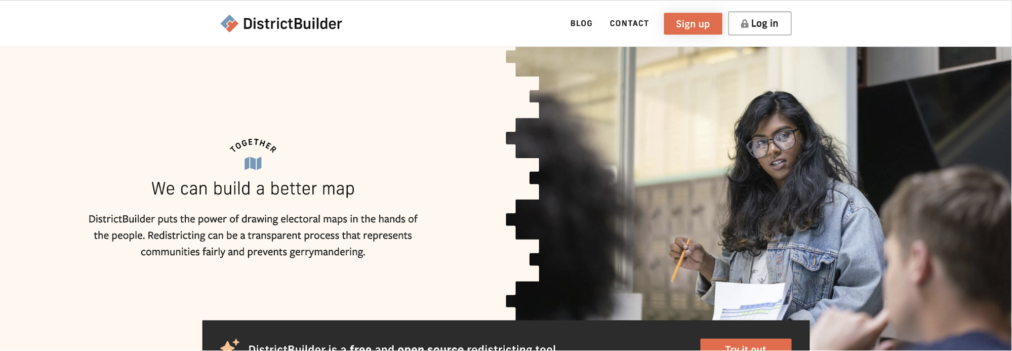
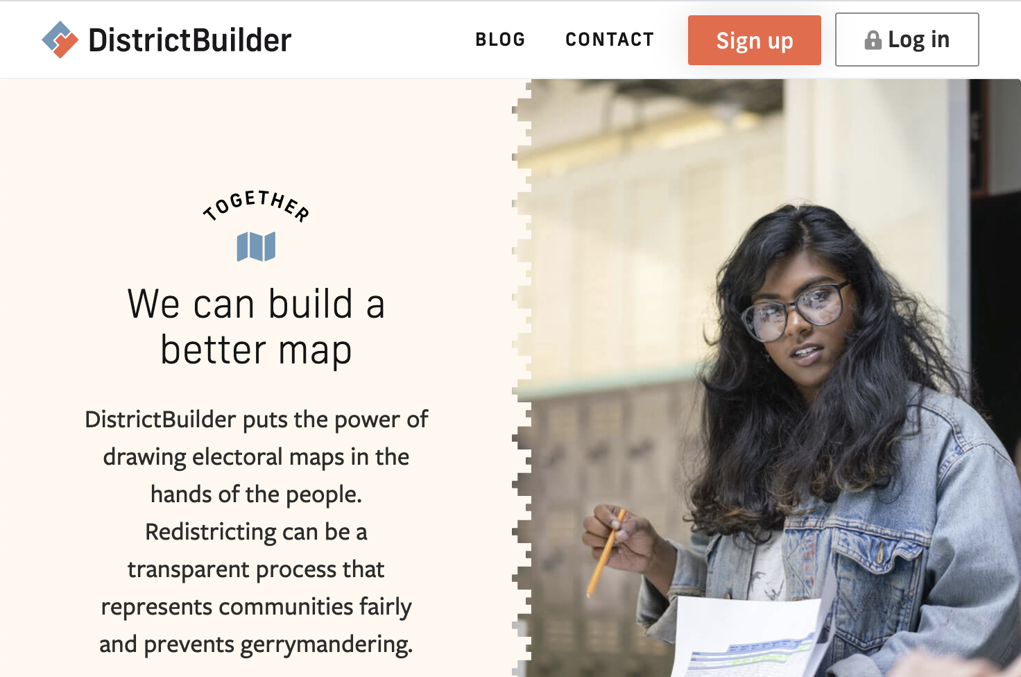
Sometimes I’ll design something and think to myself: boy, wonder how I’m going to actually make that happen in CSS. This month, I did just that. In this case, the CSS challenge in question was for the forthcoming marketing page for our DistrictBuilder product, (which is receiving its first facelift in 10 years this September):
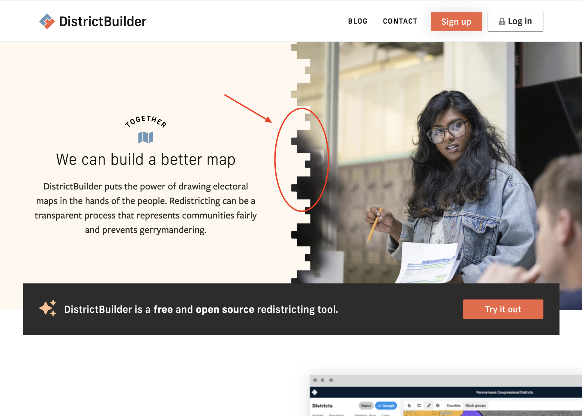
My goal was to create an image mask on my hero image, where only one side would use a complex SVG border. Of course, it needed to resize with the browser, so I couldn’t fake the effect by saving out the image with the border applied or else awkward-looking stuff would happen:
Research
This effect ended up being less well-documented than I expected. I dug into three methods for clipping an element:
clip-path: This was the first property that came to mind. Clip-path allows you to use a simple or complex shape to mask an element but there isn’t a way to only affect part of an element, nor can you provide multiple values.mask-border: This initially sounded exactly like what I was looking for. Mask-border cuts a square source image into parts to make up the sides and corners of a masking border. However, there were three issues:- It’s experimental and has little browser support.
- I only wanted my border to mask along one side of my element.
- My shape is odd enough that developing the source image seemed unnecessarily tedious.
mask: Eventually, digging into this property led me down the right path (pun intended). The mask property can be used for all or part of an element. Importantly, multiple masks can be used in a single declaration.
Demo
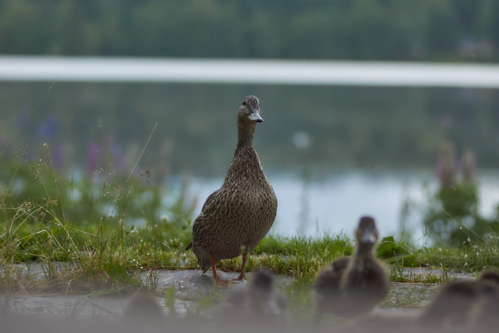
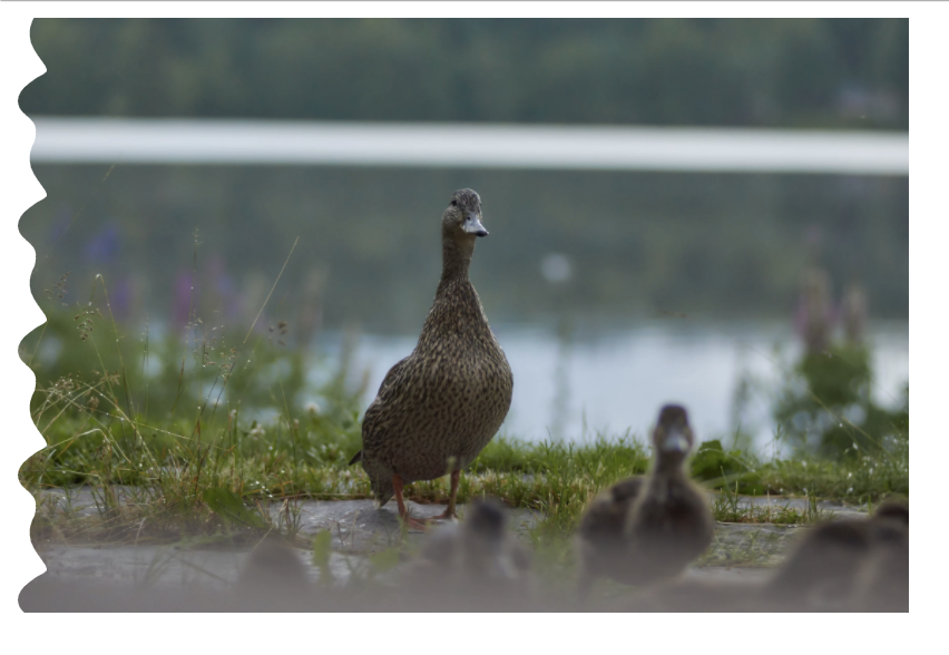
Let’s look at how the mask property can be used to create a border on one side of an element. We’ll start off with this oddly somber image of some ducks:
<div class="masked-image">
    <img src="url(sad-ducks.jpg)" />
</div>
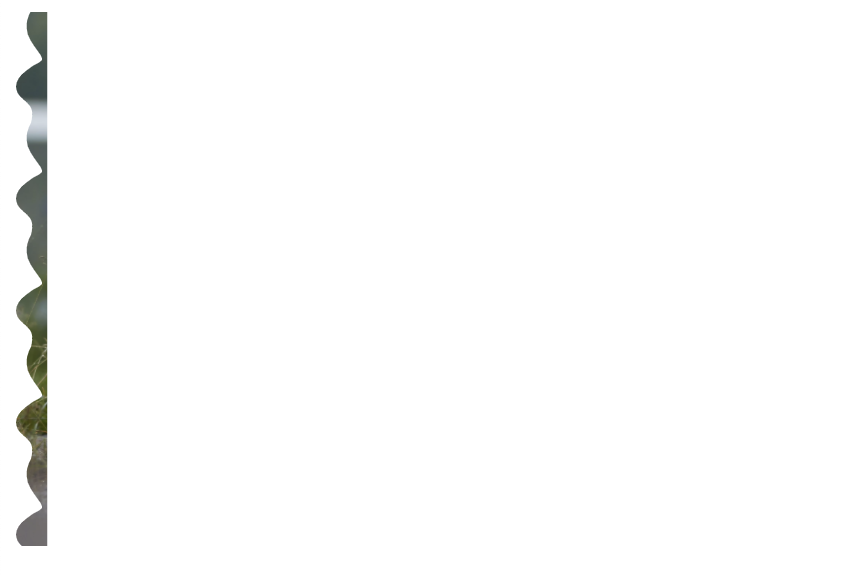
Before we start, we’ll need two things in addition to our duck image. First we’ll need the SVG shape that will be making our border. In this example, the most important thing is that the shape creates a seamless pattern top to bottom. I’ll use this weird, custom shape:

Second, we’ll need a simple rectangle SVG. This can be any dimension.
Let’s start with the border. Using the mask shorthand, I’m going to reference my source file, set its position to the left-hand side of my element with a width of 16px, and have it repeat vertically.
.masked-image: url(“images/border.svg”) left / 16px repeat-y;
This gets us here:
Next, we’ll need to leverage a powerful aspect of the mask property: declaring multiple values. Multiple masks will sit directly on top of one another, so we’ll add a declaration for our rectangle shape that makes it only take up the remaining space:
- Set the rectangle shape’s position to the opposite side of our border.
- Set the width of the rectangle to 100% of the element width minus our border width using
calc(). This may require a bit of fiddling to avoid 1px of blank space. - Vertically repeat the rectangle mask.
.masked-image: url(“images/border.svg”) left / 16px repeat-y,
               url(“images/rect.svg”) right / calc(100% - 16px) repeat-y;
Final result
With the -webkit- prefix, this works in every browser but IE, where it defaults to the maskless image.
That’s it! I made a CodePen that contains a set of examples for doing this on different sides of your element.
OBS Studio Scenes
James Santucci
This month I learned how to use scenes in OBS Studio. One of my goals is to get better at writing and talking about software development, and to that end I’ve been trying to work up the guts and practice the skills to produce a video series on the joy of functional programming. Long-term I’d like to learn in public with as much enthusiasm and humility as Rollie Williams, but short-term I’m working on figuring out how basic streaming and recording software works.

I’ve watched streams of video games and software development and assumed that mixing different scenes was some kind of arcane magic, but actually it’s really easy!
Getting started
The two concepts to keep in mind are scenes and sources. A source is something that produces audio, video, or an image. It can be a file, an input device of some sort, screen capture, or other similar things.
A scene is a group of sources arranged in a particular way. For example, if you’ve arranged a video capture in a bottom corner and a screen share just so, that arrangement, along with any other sources you’ve included like audio capture, are a scene.
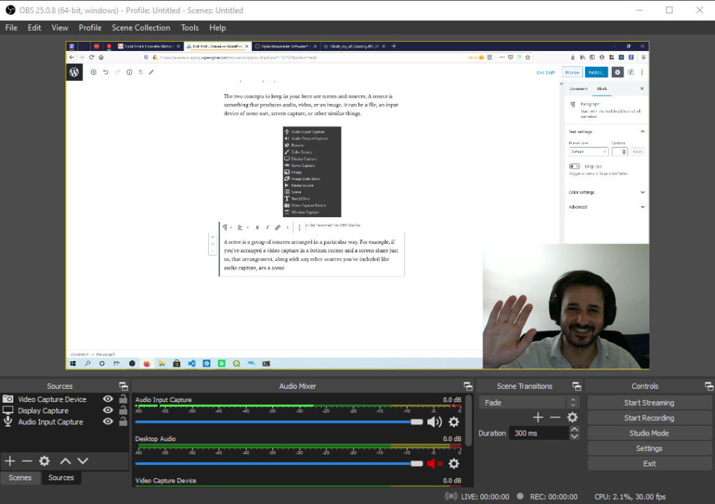
Where I thought things would be tricky is in reusing components across scenes, but it turns out that’s not the case. It turns out to reuse a source – including configuration about where it is in your recording and any audio filters you have applied – you can just copy and paste it between scenes. That copy grabs the capture device and configuration for where it is on the screen, opacity, and anything else that I don’t even know about yet feels really powerful. Also, while recording, to switch between scenes… you click the scene you want to switch to. This experience was a reminder to me that most things that I think are magic probably aren’t.
I attended STAC Sprint 6 in mid-August and had a chance to try out what I’d learned. Since the sprint was fully remote, the end-of-sprint wrap up included creating and submitting a video about what you worked on. This was a chance for me to practice with a short video.
Final result
Here’s the video I produced, with scenes for the STAC logo + my talking head, a picture of one of the problems I was trying to solve + my talking head, and a screen capture + my talking head.