
In April of this year, Azavea launched Temperate. Temperate is an application that guides city staffers through developing actionable plans that address challenges posed by the changing climate.
![]()
This is the second post of a two-part series detailing our design process.
Now that we had a better sense of what we were building and for whom, the team focused its attention on coming up with a name and look-and-feel for our product.
Evaluating the current landscape
Before even touching a pencil, we identified all of the tools in the climate space, researching their structure, pricing models, and design elements. Once we had this list, we got a sense for how the climate space looked.
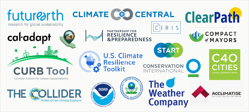
Our research allowed us to identify patterns in color, naming conventions, and imagery in the climate space. Those patterns then served as a benchmark.
Unsurprisingly, we found through this process that green and blue are the most popular colors in use. We also noticed that product names are typically an abbreviation or include the word “climate” or “tool”. Imagery also tends to be abstract or include environmental symbols.
All of this information was crucial in helping us develop our brand strategically. The climate adaptation space is bustling and we knew that many people would see our product’s logo alongside others at conferences and on tool roundup sites.
Choosing a name
When the time came to name our product, we looked to two of the branding greats for inspiration:
Apple: Looking to compete
Apple was famously coined by Steve Jobs and Steve Wozniak after Jobs visited an apple farm. However, it’s less well-known why the duo went with such an obscure name. One reason most relevant to our team’s efforts is that they wanted their company’s name to show up early in the phone book, as they knew that this would be a common way that people would find their company.
The most obvious modern-day equivalent to the phonebook is, of course, search engines. In order for our product to be easily found, it would be vital for our product to have little crossover with existing applications in the already saturated climate landscape. Therefore, name ideas that depended on words like “climate” and “resilience” were out.
Visa: Looking to inspire
Currently the world’s second largest card payment organization, Visa used to have many names: BankAmericard, Barclaycard, Carte Bleue, etc. However, as they continued to expand internationally, the company realized that they needed to consolidate all of their brands in order to truly build brand equity. They went with “Visa”—the word for a stamp on a passport—in order to denote universal acceptance.
We gravitated to the idea of positive, inspiring connotations for our product’s name. Though climate change is a daunting problem that seems to promise a grim future, we feel that our product is a force for positive change. We wanted our product’s name to be a reflection of the goal that climate adaptation planners are working to achieve.
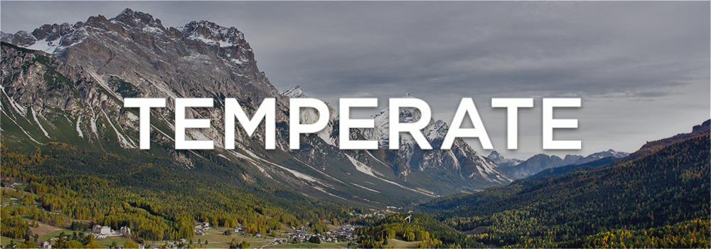
Enter: “Temperate”
We started by taking a “spaghetti at the wall” approach by asking everyone at Azavea to contribute to a spreadsheet of names and a reason for their suggestion. From there, our team developed a short list, and met to discuss pros and cons of each option. Ultimately, “Temperate” met all of our criteria: available domain name, little competition in search results, and, most importantly, a nod to our team’s loftiest hope for the product: that Temperate would assist city adaptation planners in maintaining a temperate climate for our world.
Developing the logo
A perfect symbol
Now that we had chosen a name, we needed to design the mark for our product. As noted earlier, we knew that our logo would frequently be viewed alongside others and we wanted to ensure that we would stand out without looking like a sore thumb.
We started by sketching out many possibilities, eventually finding ourselves more attracted to weather symbology than environmental symbols like leaves and trees.
![]()
Early on, the idea of including a mascot in our brand was attractive to our team. We knew that the in-app support of the ICLEI-USA team was Temperate’s distinctive edge. Creating a friendly face to identify our product could help in making this clearer.
A mascot logo had other benefits as well:
- It would help personalize the support experience
- People tend to more quickly notice even abstract “faces”
- Few other products in the climate space use a mascot
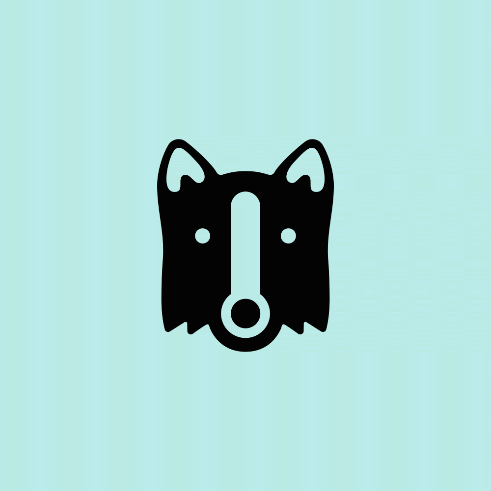 Logo sketches began to skew toward developing a personable mascot, when we came across the visual trick of combining a collie dog’s nose with a thermometer.
Known for their ability to herd large groups of sheep and cattle, Collies are brilliant dogs and companions. As Temperate would assist climate adaptation planners with wrangling large amounts of climate data and plan suggestions from other cities, we felt that we had hit on a perfect symbol.
Filling out the rest of the brand
Once we had our mark and name, the rest of the branding process centered around supporting those decisions. The connection that we developed between the mascot and the product was meaningful, but relatively obscured from our users. The same went for our product, as our decision to go with a less literal name makes Temperate’s purpose less immediately obvious.
We developed an accompanying tagline that could carry the burden of explaining the purpose of our software and our mark:
![]()
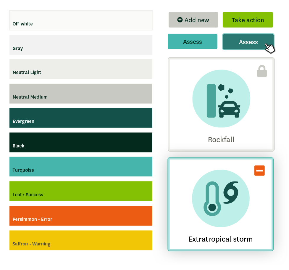
We paired our new mascot (internally coined “Tempy”) with a humanist typeface with high legibility and a friendly, distinctive personality: Ideal Sans from Hoefler & Co. The tagline and UI for our application would use a typeface with similar qualities: National from the Klim Type Foundry. Finally, now that we had developed a logo that would stand out, we developed a color palette with classic greens and blues as primary colors to keep Temperate from feeling out-of-place:
Conclusion
Following in the footsteps of other successful branding efforts, we made efforts to ensure that the Temperate identity would stand out in a saturated industry, be unique enough to find organically in search results, and represent the positive goals of our product. Throughout the design process, our team let Temperate’s loftiest goal—solving climate change—guide our decision-making.
You can learn more about Temperate in our launch announcement or open up your own account (it’s free) and tells us what you think!