
This blog post offers a brief tutorial for beginning to use React with Leaflet. It’s inspired by lessons Azavea‘s Civic Apps team has learned while using React and Leaflet together in our projects.
Since we make mapping applications — and since we rely on open-source mapping libraries — we’ve had many opportunities to figure out how to make React play well together with JavaScript packages that don’t share React’s paradigm of using a virtual DOM and updating UI elements in response to changes in component state.
One such package is Leaflet. Leaflet holds onto its own state and has a collection of setters and getters which allow users to modify or read map state directly, independently of React. What this means is that…
- changes to the state of a Leaflet map won’t automatically trigger changes to React state
- changes in React state won’t automatically lead to updates in a Leaflet map
…without some additional work to stitch React and Leaflet together.
To illustrate how developers might use the two libraries together, the tutorial walks through building a simple custom Leaflet “pan-the-map” control as a React component.
We typically use ES6, Babel, and Webpack for our React projects, and the code samples here assume familiarity with ES6 syntax and some knowledge of how transpiling works. You can see a GitHub repo with runnable code at github.com/azavea/react-leaflet-demo.
If you’d like to follow along, clone the repo, then check out the basic-react-leaflet-setup branch. Make sure you’re using a recent version of Node (4.x/6.x), then run:
npm install
npm start
This will install the Node dependencies listed in package.json and start webpack-dev-server on port 7171. The demo project configures webpack-dev-server to use hot module reloading; as you make changes to the code you’ll generally see the changes immediately in the browser.
Getting Started
We’re going to create a simple React app in two files: an index.html file and an App.jsx file. In addition to React and Leaflet, we’ll also use the React-Leaflet library which creates a React interface for common Leaflet elements like maps, layers, markers, and popups.
We’ll start out with a simple index.html file which provides a div on which the bundled React app can mount:
<!DOCTYPE html>
<html>
    <head>
        <title>Map</title>
    </head>
    <body>
        <div id="mount"></div>
        <script type="text/javascript" src="bundle.js"></script>
    </body>
</html>
We’ll also begin with a single App.jsx file comprising the whole app. Webpack will transpile the code into the bundle.js file which executes when the index page loads:
import React, { Component } from 'react';
import { render } from 'react-dom';
import { Map, TileLayer } from 'react-leaflet';
const stamenTonerTiles = 'http://stamen-tiles-{s}.a.ssl.fastly.net/toner-background/{z}/{x}/{y}.png';
const stamenTonerAttr = 'Map tiles by <a href="http://stamen.com">Stamen Design</a>, <a href="http://creativecommons.org/licenses/by/3.0">CC BY 3.0</a> — Map data © <a href="http://www.openstreetmap.org/copyright">OpenStreetMap</a>';
const mapCenter = [39.9528, -75.1638];
const zoomLevel = 12;
export default class App extends Component {
render() {
return (
<div>
<Map
center={mapCenter}
zoom={zoomLevel}
>
<TileLayer
attribution={stamenTonerAttr}
url={stamenTonerTiles}
/>
</Map>
</div>
);
}
}
render(
<App />,
document.getElementById('mount')
);
In addition to importing from React and React-DOM to create and mount the basic application component, we also here import Map and TileLayer components from React-Leaflet. We pass props to set the initial center and zoom level of the map (along with props for the tile layer url and attribution) and React-Leaflet will take care of creating the proper Leaflet elements.
Visit localhost:7171 in the browser and you’ll see the map:
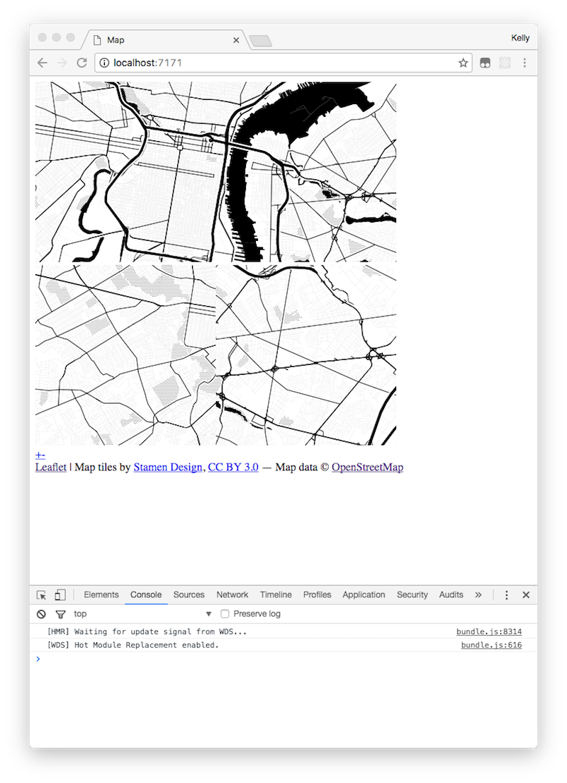
Uh-oh! The tiles don’t seem to be arranged correctly.
How to Set Required Styles for Rendering a Map with React-Leaflet
To fix this we need to load Leaflet’s CSS style sheet and we also need to set the height for the map component per the instructions in React-Leaflet’s “Getting Started” guide.
Just to simplify things, we’ll load the Leaflet stylesheet from a CDN, add the required height CSS rule, and add a width CSS rule to style the map component in index.html.
First, update the head tags in index.html:
<head>
    <link rel="stylesheet" href="https://unpkg.com/leaflet@0.7.7/dist/leaflet.css" />
    <title>Map</title>
    <style>
        .leaflet-container {
            height: 600px;
            width: 600px;
        }
    </style>
</head>
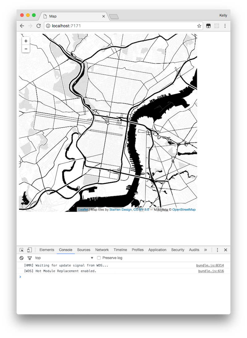
Next, refresh localhost:7171 in the browser to reload the index page with the new styles. (We have to refresh the page for these changes because Webpack’s not monitoring index.html for changes.)
Now the map should display properly:
How to Track Changes in Leaflet Map State in React
Both React and Leaflet are designed to manage their own state, which means that there’s some work involved in having changes in one trigger updates in the other. React monitors the state of its virtual DOM, updating components in the tree as necessary in response to changes of state. Leaflet maps maintain their own state and enable making changes to the DOM directly via DomUtil functions. The discrepancy here means it can be a little bit of a puzzle to figure out how to have state changes and events in the Leaflet map trigger updates to React state.
One solution we’ve found is to use React’s ref attribute, a property which allows one to tag a component in order to access its DOM element. You can add a ref to the Map component using a fat tail function:
<Map
    ref={m => { this.leafletMap = m; }}
    center={mapCenter}
    zoom={zoomLevel}
>
    <TileLayer
        attribution={stamenTonerAttr}
        url={stamenTonerTiles}
    />
</Map>
m => { this.leafletMap = m; } will bind a reference to the Map element to the App component class, which means we can add event listeners and call Leaflet methods on this.leafletMap.leafletElement in other class methods.
For example, if we want to track and log the map’s zoom level, we can add an event listener to the map in React’s componentDidMount method:
componentDidMount() {
    const leafletMap = this.leafletMap.leafletElement;
    leafletMap.on('zoomend', () => {
        window.console.log('Current zoom level -> ', leafletMap.getZoom());
    });
}
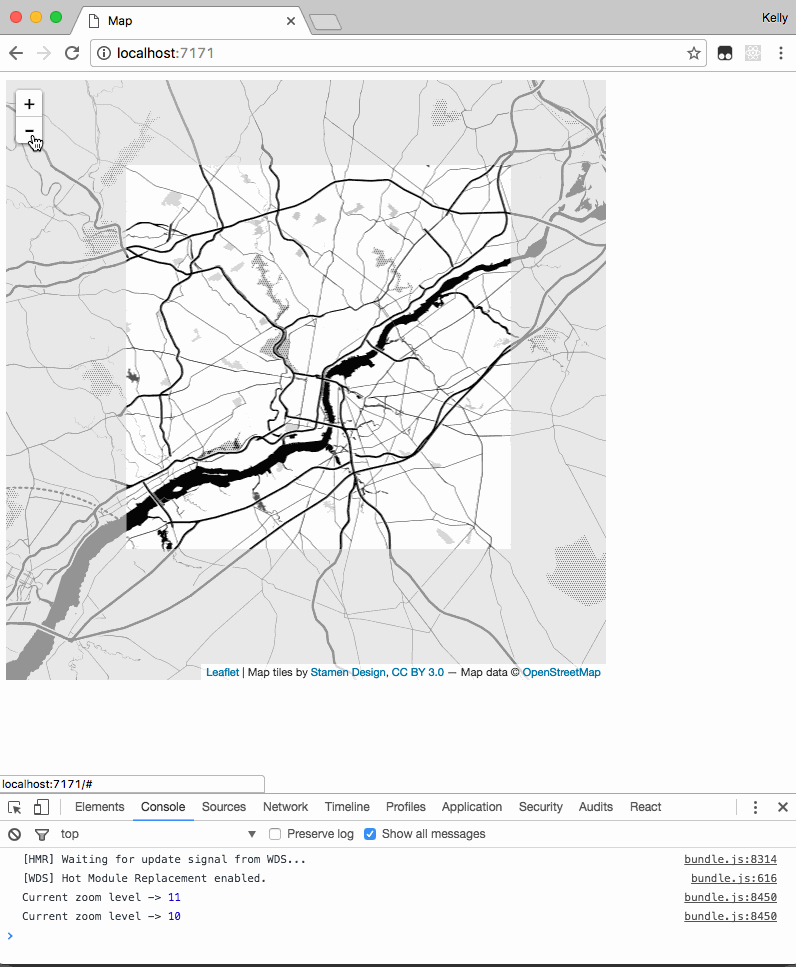
Here we access the Leaflet map via the leafletElement property, add a listener for its zoomend event, then log the map’s current zoom level to the console.
Zoom with the console open and you’ll see the zoom level logged:
If you’d like to call a React method here to update the UI in some way here, you could replace the console.log statement with a method you create, them implement some update to the component state based on the event. Leaflet’s documentation has a list of map events to which you can add listeners, including events like mouse clicks, map drags, geolocation, and layer changes. Leaflet also has a set of getter methods to expose the map state, which can be used to update React’s state so that the UI can respond to changes in map state.
For example, if we want to track the zoom level of the map in the App component’s state so that we can pass it to other components, we can update the class to add the currentZoomLevel to the component state and call setState to update on zoom level changes:
export default class App extends Component {
    constructor(props) {
        super(props);
        this.state = { currentZoomLevel: zoomLevel };
    }

    componentDidMount() {
        const leafletMap = this.leafletMap.leafletElement;
        leafletMap.on('zoomend', () => {
            const updatedZoomLevel = leafletMap.getZoom();
            this.handleZoomLevelChange(updatedZoomLevel);
        });
    }

    handleZoomLevelChange(newZoomLevel) {
        this.setState({ currentZoomLevel: newZoomLevel });
    }

    render() {
        window.console.log('this.state.currentZoomLevel ->',
            this.state.currentZoomLevel);

        return (
            <div>
                <Map
                    ref={m => { this.leafletMap = m; }}
                    center={mapCenter}
                    zoom={zoomLevel}
                >
                    <TileLayer
                        attribution={stamenTonerAttr}
                        url={stamenTonerTiles}
                    />
                </Map>
            </div>
        );
    }
}
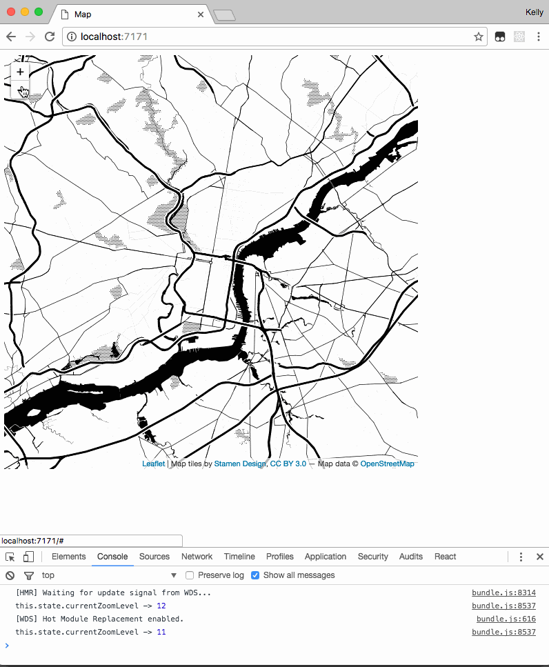
Zoom the map and you’ll now see the currentZoomLevel property of the component’s state:
It’s tempting here just to set the Map component’s zoom prop from the state, but doing so risks creating a recursive loop whereby a change to the map first bubbles up to the React component, then gets passed back down to the Map as a prop, then bubbles back up, and so on. Depending on the use case, it may be preferable to treat the Leaflet map as an “uncontrolled component” rather than a controlled component, like an input or checkbox field for which React can get but doesn’t set the value.
How to Update Leaflet Map State from React Methods
Leaflet maps also have some setter methods for modifying map state and you can call those setters in React methods.
For example, to implement a simple set of button controls to pan the map when clicked, we can write React methods to call Leaflet’s panBy method, passing it the proper x, y pixel array for each direction.
We’ll do this in three steps:
- add and implement React methods for handling panning in each direction
- bind these methods to the component class so that they can access
this.leafletMap - create a few buttons to call the methods when clicked
First we add the new methods to the React class beneath handleZoomLevelChange:
handleUpPanClick() {
    const leafletMap = this.leafletMap.leafletElement;
    leafletMap.panBy([0, -100]);
    window.console.log('Panning up');
}

handleRightPanClick() {
    const leafletMap = this.leafletMap.leafletElement;
    leafletMap.panBy([100, 0]);
    window.console.log('Panning right');
}

handleLeftPanClick() {
    const leafletMap = this.leafletMap.leafletElement;
    leafletMap.panBy([-100, 0]);
    window.console.log('Panning left');
}

handleDownPanClick() {
    const leafletMap = this.leafletMap.leafletElement;
    leafletMap.panBy([0, 100]);
    window.console.log('Panning down');
}
Next, we bind these methods to the App.jsx class in its constructor so that they’ll access the correct instance of this in order to get the leafletMap:
constructor(props) {
    super(props);
    this.state = { currentZoomLevel: zoomLevel };
    this.handleUpPanClick = this.handleUpPanClick.bind(this);
    this.handleRightPanClick = this.handleRightPanClick.bind(this);
    this.handleLeftPanClick = this.handleLeftPanClick.bind(this);
    this.handleDownPanClick = this.handleDownPanClick.bind(this);
}
Finally we create and style a few directional buttons in the class’s render method to call the “pan-the-map” methods:
render() {
    window.console.log('this.state.currentZoomLevel ->',
        this.state.currentZoomLevel);

    return (
        <div>
            <Map
                ref={m => { this.leafletMap = m; }}
                center={mapCenter}
                zoom={zoomLevel}
            >
                <TileLayer
                    attribution={stamenTonerAttr}
                    url={stamenTonerTiles}
                />
            </Map>
            <div>
                <div style={{ marginLeft: '37px' }}>
                    <button onClick={this.handleUpPanClick}>
                        Pan up
                    </button>
                </div>
                <div>
                    <button onClick={this.handleLeftPanClick}>
                        Pan left
                    </button>
                    <button onClick={this.handleRightPanClick}>
                        Pan right
                    </button>
                </div>
                <div style={{ marginLeft: '30px' }}>
                    <button onClick={this.handleDownPanClick}>
                        Pan down
                    </button>
                </div>
            </div>
        </div>
    );
}
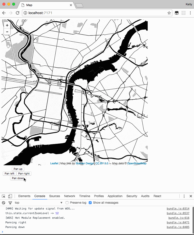
Clicking the buttons now pans the map:
How to Create a Custom Leaflet Control with React
Let’s turn the pan buttons into a control and place it on the map. React-Leaflet’s documentation has a guide for extending its base classes to create custom components, including custom controls, which we could use.
Another library I like is React-Leaflet-Control, a plugin which allows you to render a React component as a Leaflet map control, passing it props and having it update as you’d do with any other React component. The demo project already includes React-Leaflet-Control as a dependency, so we’ll just need to:
- import it into
App.jsx - wrap our pan buttons with the
Controlcomponent - place the entire
Controlcomponent on the map
First, add React-Leaflet-Control to the file’s imports list:
import React, { Component } from 'react';
import { render } from 'react-dom';
import { Map, TileLayer } from 'react-leaflet';
import Control from 'react-leaflet-control';
Next, adjust the render method to wrap the buttons in Control tags and nest that in the Map component’s JSX tags:
return (
    <div>
        <Map
            ref={m => { this.leafletMap = m; }}
            center={mapCenter}
            zoom={zoomLevel}
        >
            <TileLayer
                attribution={stamenTonerAttr}
                url={stamenTonerTiles}
            />
            <Control position="topright">
                <div
                    style={{
                        backgroundColor: 'black',
                        padding: '5px',
                    }}
                >
                    <div style={{ marginLeft: '37px' }}>
                        <button onClick={this.handleUpPanClick}>
                            Pan up
                        </button>
                    </div>
                    <div>
                        <button onClick={this.handleLeftPanClick}>
                            Pan left
                        </button>
                        <button onClick={this.handleRightPanClick}>
                            Pan right
                        </button>
                    </div>
                    <div style={{ marginLeft: '30px' }}>
                        <button onClick={this.handleDownPanClick}>
                            Pan down
                        </button>
                    </div>
                </div>
            </Control>
        </Map>
    </div>
);
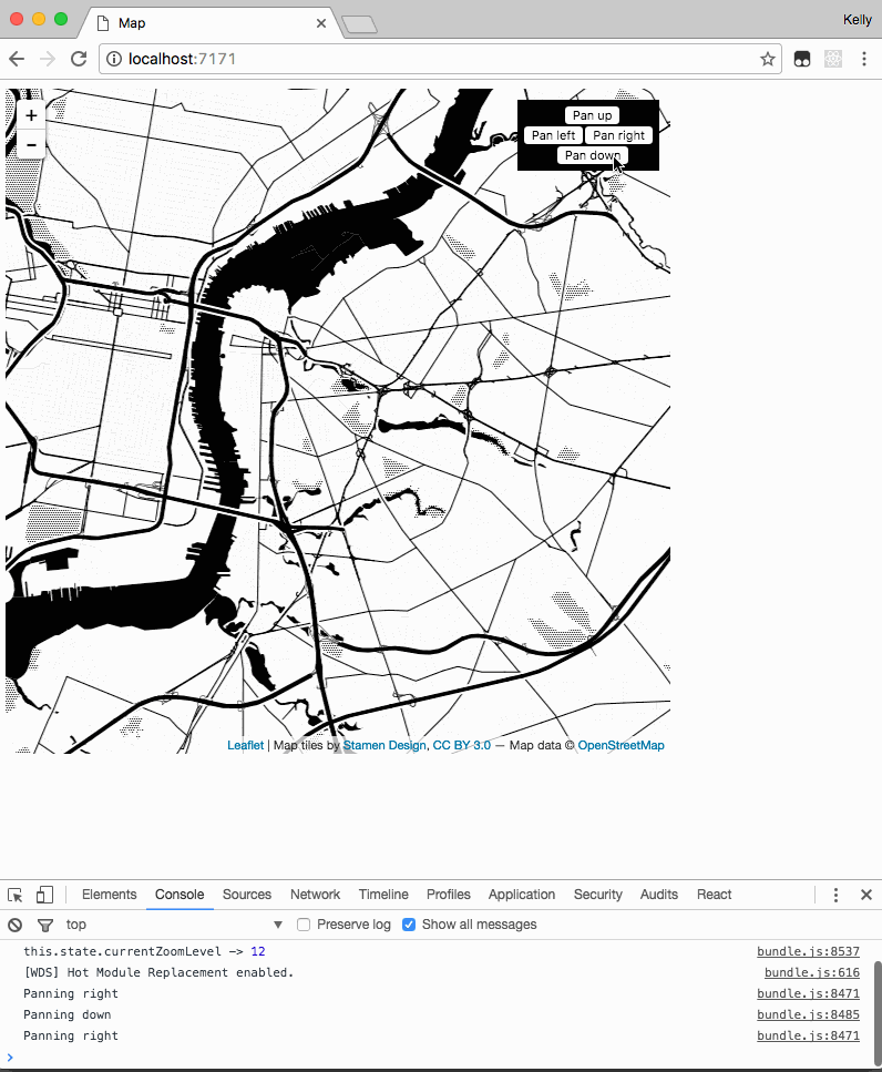
After refreshing the page, our control component will appear in the top right corner of the map and still work as before:
React-Leaflet-Control passes its props through to elements nested in Control tags, and if we wanted to go further we could extract the code to create and style the buttons into a separate React component file.
We could also pass this new component props to do things like change button titles, adjust the pan distance, change the behavior of button clicks, or toggle the control component on and off based on changes to state elsewhere in the React app.
Conclusion
We’ve now set up React and Leaflet and written a custom Leaflet control as a React component. It’s still fairly simple, but the techniques we’ve used to enable React to monitor and trigger changes to Leaflet’s state can be building blocks for creating more complex mapping applications. You can see the complete code at github.com/azavea/react-leaflet-demo/tree/completed-react-leaflet-demo-app.
If you’d like to read more about the Civic Apps team uses React, we’ve also written about our standard React/Redux project structure and about how we use React-inspired design patterns in vanilla JavaScript.