In Sitka, Alaska, landslides represent one of the most harrowing effects of climate change. In 2015, Sitka experienced a series of fatal landslides which ignited local and national action to address how to best keep communities safe and informed. After learning about our geospatial services, the Sitka Sound Science Center (SSSC) contacted Azavea to request a tool able to communicate immediate landslide risks and present information to residents to prepare for landslide events and understand the risk involved. SSSC also wanted the tool to include static elements like FAQs, pertinent links, and articles.
Through working with community stakeholders including SCCC, the RAND Corp., the Sitka Tribe of Alaska, the University of Southern California, and the University of Oregon, our Azavea team developed a web-based landslide awareness dashboard to meet these needs.

Building a Solution: Assessing and Communicating Landslide Risk
The landslide dashboard represents just one component of the work and research involved in this project. SSSC approached Azavea to build out the web-based landslide awareness tool given our experience creating geospatial decision-support tools that address the impacts of climate change.
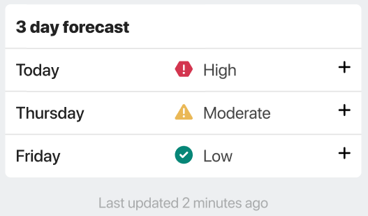
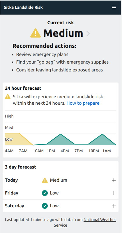
Rainfall data is the primary data source used in the dashboard. Three-hour rainfall, the amount of rain that falls over a three-hour period, is the biggest indicator of a landslide. When a lot of rain falls over a brief period of time, the soil becomes saturated and is more likely to move. The application provides users with three different levels of data: what’s happening right now, what’s happening over the next 24 hours, and a three-day forecast.
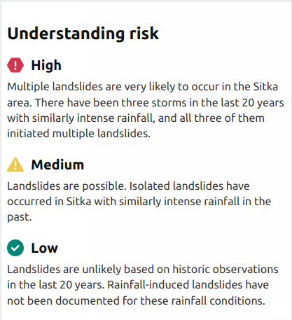
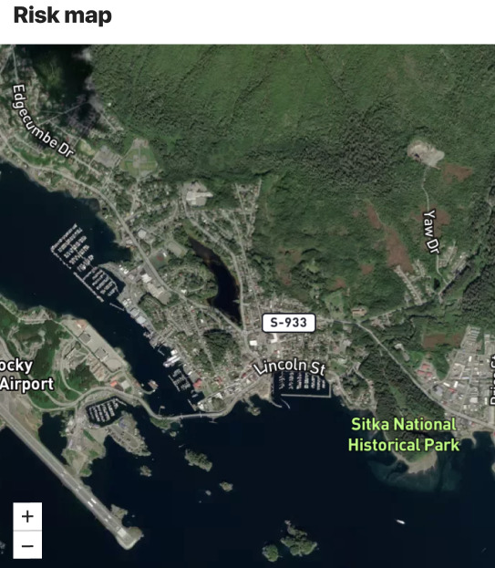
The dashboard includes three levels of risk depending on the amount of rainfall: low, moderate, and severe. This risk algorithm was developed by Annette Patton, a hillslope geomorphologist with whom we collaborated when developing the application. The dashboard also explains each level of risk, provides a risk map, and visualizes the current conditions compared to past storms.
How User Discovery Influences Risk Visualization
When the SSSC team first came to Azavea, they aimed to provide the people of Sitka with a way to make better, more informed decisions in their day-to-day life based on science and weather data; but they didn’t have a clear vision for the final product. Sitka is a very active community where people live, work, and visit. The area draws hikers and campers who, much like full-time inhabitants, need to be informed about landslide risk in order to keep themselves safe.
Initially, our client pictured a page full of information, charts, and widgets. However, when our UX team talked to end-users during the discovery process, we learned that most Sitkans were not looking for infographics. Instead of graphs and widgets, users wanted a simple warning conveying the likelihood of a landslide. After our UX team brought the findings from this user research back to the client and showed them a simple, streamlined design of a risk visualization webpage, the SSSC team ultimately decided this paired-down approach was best for keeping Sitkans safe.
The Future of Landslide Risk Visualization in a Changing Climate
To ensure that the dashboard and associated data stream outlive the landslide project, we built this dashboard for SSSC using open-source technology. Azavea is a strong advocate for building open-source software, and in this instance it ensures that there are plenty of opportunities to scale and duplicate the application for other communities that are prone to landslides. Living with climate change means that communities just like Sitka will be in desperate need of similar risk warning systems, and we are happy to partner with organizations like SSSC who recognize the need to share this technology and knowledge.