
![]()
Now in its fourth year, Azavea’s Summer of Maps Program has become an important resource for non-profits and student GIS analysts alike. Non-profits receive pro bono spatial analysis work that can enhance their organizational decision-making processes and programmatic activities, while students benefit from Azavea mentors’ expertise. This year, three fellows worked on projects for six organizations that spanned a variety of topics and geographic regions. This blog series documents some of their accomplishments and challenges during their fellowship. Our 2015 sponsors Esri, Temple University Geography and Urban Professional Masters Studies Program and Betsy and Jesse Fink helped make this program possible. For more information about the program, please visit the Summer of Maps website.
While working with the African Family Health Organization, an organization that provides health and human services for African immigrants in Philadelphia, I realized they had a substantial need to understand the distribution of African-born populations throughout the City.
But before visualizing this data, it’s important to consider the data at hand. Geographic data often has a hierarchical structure. Total populations can be split into smaller subsets, like individuals that are: employed, unemployed or out of the labor force. Geographic boundaries themselves also usually have a hierarchy. (For instance, in the US, Census Data is commonly reported as counties, tracts, block groups and blocks, each smaller than the last. A visualization technique called small multiples can be useful for showing how these subsets stack up by displaying a grid of maps with related data for easy comparison. But what if you want to emphasize the specifically hierarchical nature of the data? Or what if the small multiples are just too small? Using the D3 JavaScript library you can make a data visualization that turns your series of maps into a collapsible, zoomable, draggable tree. Clicking one map opens a branch showing the next layer of sub-maps. I made this tool to display data from the American Community Survey on the African-born population in Philadelphia, but it is widely applicable to many types of hierarchical data. Take a look at this repository for all the code, and this site for a full-size version.
At its core, this visualization is just a modified version of the D3 tree structure. Start from a simple tree like this:
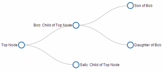
If you want your map tree to be vertical, switch all of the x coordinates to y’s and vice versa.
Next, replace the circular nodes with images of your maps. Before starting this step, produce all of the maps you want to include in the tree using your favorite GIS software. Make sure that they all have the same dimensions, and export them as PNG or JPG. Upload them to your preferred image hosting platform. I also chose to add the label text into the image files because it removed the hassle of positioning all of the text through JavaScript.
Add the image URLs as icon fields in your JSON data, as shown in this example. At minimum your JSON data should contain the name, parent, and icon fields:
{"name": "Son of B","parent": "Level 2: B","icon": "https://raw.githubusercontent.com/lilader/MapTree/gh-pages/images/TotalEA.png"}
Replace the nodeEnter.append(“circle”) section of the code, which draws the circles on the tree, with a reference to your images, as follows:
nodeEnter.append("image")
    .attr("xlink:href", function(d) { return d.icon; })
    .attr("x", "0px")
    .attr("y", "0px")
    .attr("width", "210px")
    .attr("height", "230px");
At this point your images will probably be overlapping each other or too small. You will need to tweak the size and position them as you want, but save this until you’ve made the tree interactive and can see their positions when branches are opened and closed. You may also remove any sections of the code referring to links if you don’t want the paths between images to display.
The final step is to make your tree interactive.Put all of the tree-drawing components into an update function, and make a couple of modifications as this example illustrates. You’ll enter the nodes at their parent’s initial positions, source.x0 and source.y0. Then you’ll use nodeUpdate to transition them to their new positions, d.x and d.y. Finally you’ll use nodeExit to transition the exiting nodes to their parent’s final positions, source.x and source.y. To make all of this work, add a click function that toggles the clicked node’s children and then calls update, and add the event handler that calls the click function, .on(“click”, click), to the nodes. If you want the tree to start collapsed in a collapsed state , it’s easiest to modify your JSON data by putting an underscore in front of each of the nodes that you want to initialize undisplayed.
Zoom is achieved by adding the following simple zoom function:
function zoomed() {svg.attr("transform", "translate(" + d3.event.translate + ")scale(" + d3.event.scale + ")")}
and a zoom event handler. Since you want to be able to zoom and drag from anywhere on the canvas, not just when you hover over the images, you can add a transparent rectangle to your SVG canvas on which you call the zoom listener, but the zoom function itself acts on the group containing the tree.
One final useful trick is necessary to prevent the tree from expanding or collapsing every time you drag by grabbing a map. This will stop the maps from toggling when the click event is suppressed during a dragging action. In the click function, add
if (d3.event.defaultPrevented) return;
And that’s it! You now have an interactive tool for exploring hierarchical data! You can add whatever text, menus, legends, etc to your svg canvas that you’d care to. This particular visualization will allow the African Family Health Organization to explore at a glance where subsets of the African immigrant population live. The next time you are trying to visualize a similar type of nested data, give this technique a try!