
Infographics that combine maps, charts, and text help to tell the full story of a geographical area. Without an automated workflow, creating a series of infographics that have the same layout and information but are specific to unique locations can be time consuming and tedious. Using a data-driven workflow will limit the number of files you’ll need to edit and maintain throughout the course of the project.
This data-driven method applies to a variety of use cases, including delivering custom reports to elected officials. By telling representatives the story of how their jurisdiction compares to surrounding areas, you can help them understand the implications of their decision-making and drive conversation towards specific solutions for the people they represent.
In the past, we used this formula for creating custom reports to help a nonprofit advocate for the need for high-quality childcare in the Philadelphia region. Delivering custom reports to City Council members helped the nonprofit win $1 million in funding.
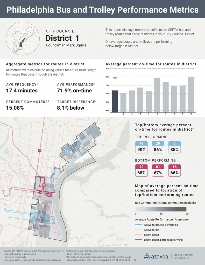
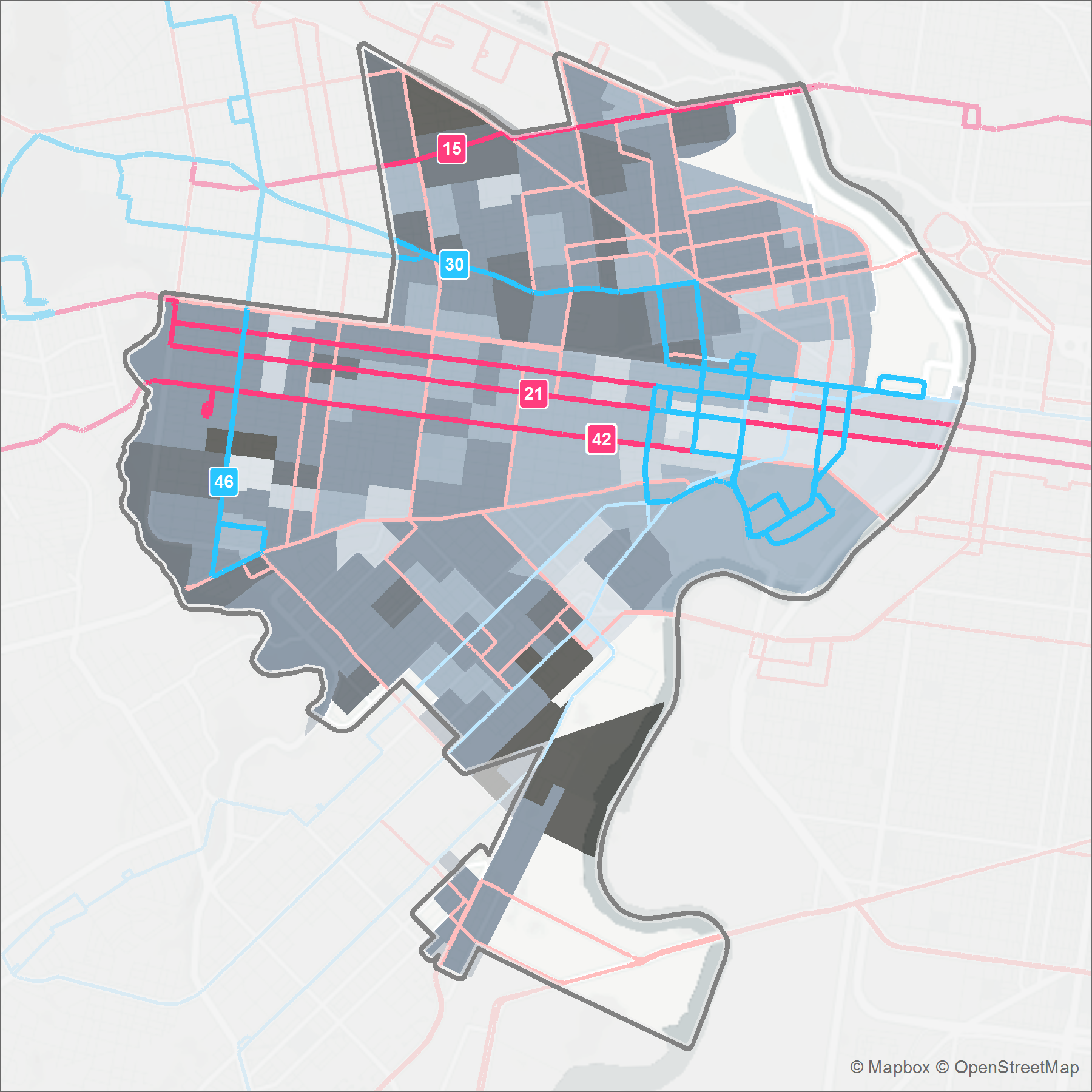
In this post, I’ll walk through steps that result in a series of custom infographics that correspond to a list of geographies. The project example in this outline was completed for a Philadelphia regional transit advocacy groups, PA for Transit and 5th Square, and aims to illustrate bus and trolley performance statistics for the routes that run through each City Council District.
Here’s a preview of the final results:
Data-driven documents
Nope, I’m not talking about D3.js, although you could build out a similar HTML template using the open source JavaScript framework. I’ll walk you through a process that leverages a combination of software that data and GIS teams often have on hand.
The backbone of this workflow is a spatial dataset. The visualizations on each document represent data analysis results for a specific geography.
In this example, we determined that a static design (rather than an interactive one) fit the needs of the advocacy group best, since they intended to share the documents as hard-copies or via email. In addition to displaying text and numerical metrics on the page, we included maps and charts to visualize the story of transit performance in each district.
Creating data driven maps
Since I aimed to design one map layout that changes dynamically based on a list of geographies, I decided to use the Esri ArcMap Data Driven Pages tool. I’m using ArcMap 10.5 in this example, but Data Driven Pages functionality is baked into ArcGIS Pro as well.
Select an Index Layer
The driving force behind this tool is an Index Layer that includes the geometries for each feature you would like to use as the either the subject or frame of the map. You have two general options for Index Layers: create an Index Layer or select an existing layer from your Data Frame.
Think about how you would like to design your map layout to determine which Index Layer option will work best for your project. If you set the portions of the bounds of geometries in your Index Layer equal to the map layout dimensions, you can use the Index Layer as the bounding box of the entire map. There are built-in tools in ArcMap that make it pretty straightforward to create an Index Layer using a vector feature input.
Creating an Index Layer
You can use either the Grid Index Features or Strip Map Index Features tool to create a custom Index Layer. The Grid Index Features tool works best for point or polygon inputs and the Strip Map Index Features tool works best for line inputs.
Navigate to ArcToolbox -> Cartography Tools -> Data Driven Pages and select the tool that matches your input feature type. Fill necessary options shown in the dialogue box.
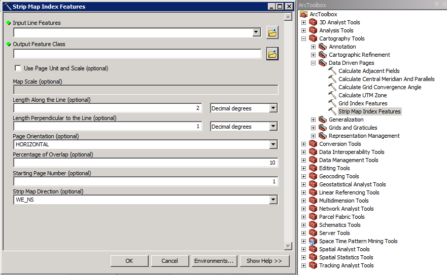
It may be necessary to edit features in the resulting Index Layer when using these tools, especially the Strip Map Index Features tool.
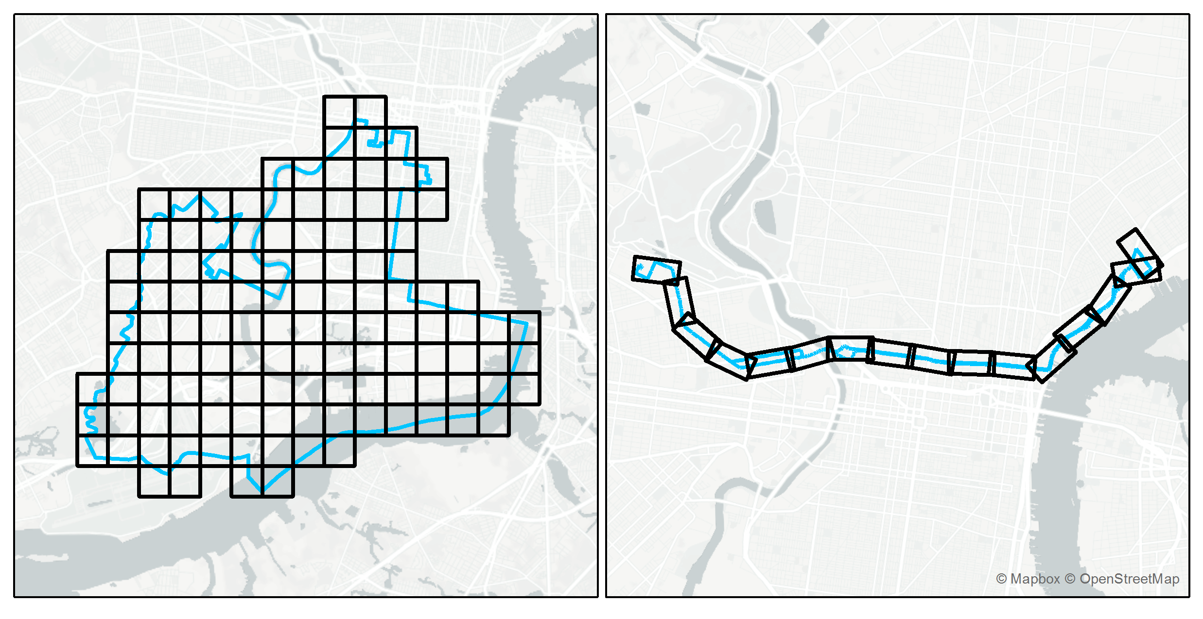
Unless you need to display the Index Layer grid on the map, set the portions of the bounds of geometries in your Index Layer equal to the map layout dimensions. Then, use the Index Layer as the bounding box of the entire map.
Use existing data as an Index Layer
Select any vector feature as the Index Layer. It’s important to structure the attribute data in a way that is compatible with Data Driven Pages. At the very least, you’ll need an attribute column with integer values that determine the sort order of features.
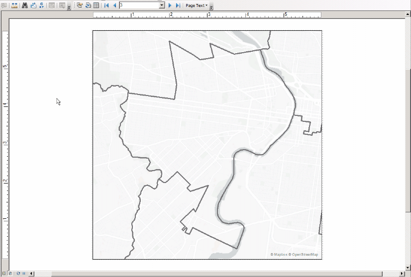
In this example, I set the Philadelphia City Council Districts spatial dataset as the Data Driven Pages Index Layer because I needed to cycle through maps by district.
Enable Data Driven Pages
To view Data Driven Pages options, right click on the top toolbar area and select “Data Driven Pages”. Open the Data Driven Pages Set Up menu from the toolbar and enable Data Driven Pages. Then, select the Data Frame that you plan to export as the main map later.
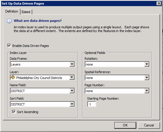
The Name Field defines the label of each Index Layer feature within the Data Driven Pages dialogue. The Sort Field attribute values define the order by which Data Driven Pages will be displayed.
The Rotation and Spatial Reference fields come into play if you created an Index Layer using the Strip Map Index Features tool. The attribute, “angle”, is calculated during processing. Remember, if you edit the rotation of features in an Index Layer that you created using the Strip Map Index Features tool, you may have to manually update the “angle” field.
The Page Number field is not necessarily a duplicate of the Name or Sort Fields. For example, your project may require you to sort using an integer field (1, 2, 3, 4, 5), but label Page Numbers with string values (1, 2, 3a, 3b, 4).

If you use an Index Layer that includes a set of unique geometries (i.e. City Council Districts or neighborhoods) you can define a margin for the Data Driven Pages Map Extent.
Styling data driven maps
After you define Data Driven Pages parameters and complete the general map layout, style each feature layer.
In this example, I wanted to focus the reader’s attention on the data within the City Council District.
Confining data to the area of interest
There are two ways that you can limit data display to the current Index Layer feature in Data Driven Pages:
- Clip data by each feature in the Index Layer and create individual feature classes
- Use the Page Definition Query tool to match a feature class attribute value to the current Index Layer feature
To create maps for this project, I used the Page Definition Query method.
The bus and trolley route line features extended outside each district, but instead of clip route lines to the boundaries of each City Council District, I decided to show the full routes. If you’re clipping features, you could use the built in geoprocessing Clip tool, or a script in Python or R to loop through the Index Layer, clipping the other data to each feature.
I styled the routes Symbology -> Categories -> Unique values, many fields styling option to define line color by performance value and highlight top/bottom performing routes.
Since bus routes often run on streets that share the district boundary line, I also used a line offset to bump out the border on the City Council District boundary. This removed the potential for overlapping lines.
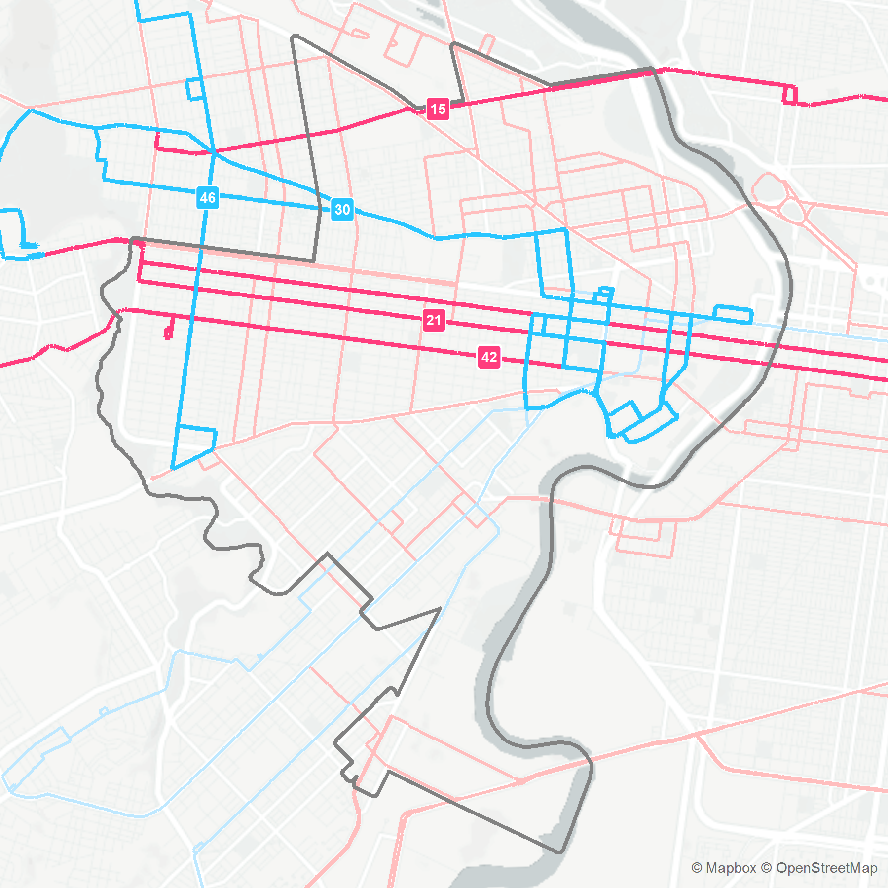
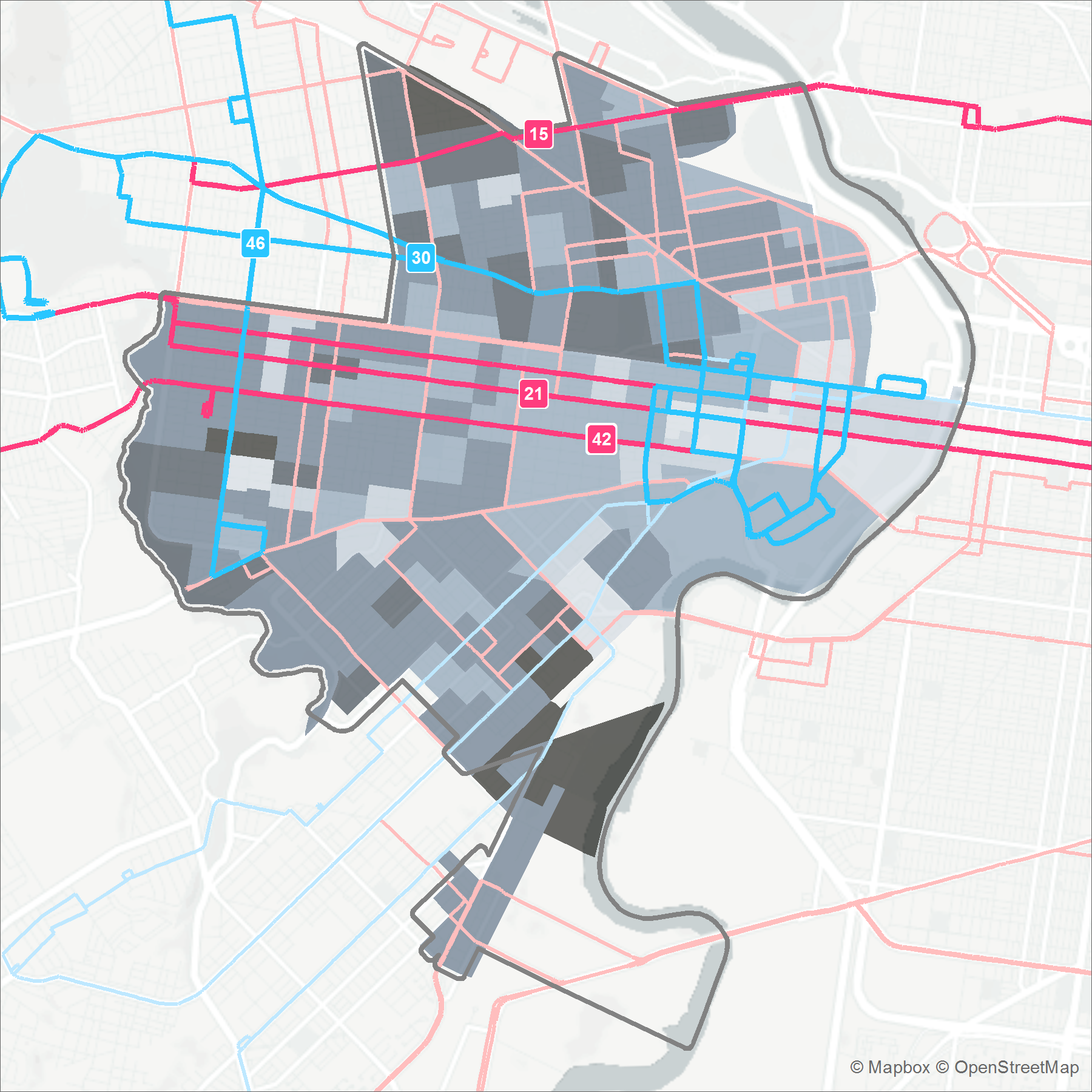
I also wanted to show American Community Survey (ACS) commuter data on the map to illustrate any correlations between low performing routes and high bus commuter need.
In order to display only ACS data within the district, I created an ACS centroid file and ran a spatial join operation with the City Council District data. Now that I had an attribute District in the ACS centroid file, I joined the data with the ACS polygon data to transfer the district values.
If you have data with attribute values that match the Index Layer Name values, you can use a Page Definition Query to display matching or non-matching features from the data.
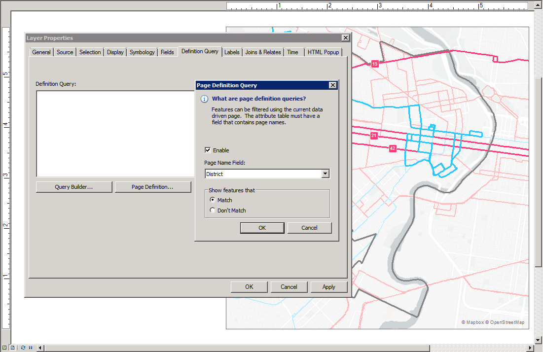
Navigate to Layer Properties -> Definition Query -> Page Definition… and enable the tool. Select the field that matches your Index Layer Name Field. Then, you can either “Match” (display features within the Index Layer feature) or “Don’t Match” (display features outside the Index Layer feature).
Creating a masking effect
Although I wanted to highlight bus and trolley routes within the district, I also wanted to display the routes outside the district to provide some subtle spatial context that helps a reader understand the connection between districts.
To create a subtle display effect, I masked the routes and basemap outside the district by leveraging both clipping and Page Definition Query methods.
First, I created a large polygon that encompassed the Philadelphia region. Then, I clipped holes using each feature in the Index Layer and combined the outputs into one file. I set an attribute field District, defining each row in the new file. Last, I used the Page Definition Query tool to display only the relevant feature for each Data Driven Page and styled the polygon with a transparent grey color.
Alternatively, you could set a transparency on specific feature layers, although this will not mute the basemap.
Labeling Index Layer Features
If you use the grid or strip map Index Layer output and would like the user to be able to identify adjacent index features, enable Maplex Label engine Data Frame Properties -> General -> Label Engine -> Maplex Label Engine and set the Placement Properties for the Index Layer to General -> Boundary Placement. Adjust the display settings to make the labels fit perfectly.

Cartography for data driven reports
I limited cartographic design to as few map components as possible. My goal was to produce an image file of a map focused on each district in ArcMap. I took care of styling other map components, like a legend and text elements, in Adobe Illustrator.
Tip: create a legend in ArcMap and export as an SVG to provide a starting point for styling in Illustrator.
Generating data driven charts
We leveraged R to create a script that utilizes a loop function to create an output for each feature in the Index Layer we used during the mapping step of the project.
One of our resident R experts helped me whip up a script that generated one chart for each district. Like the map files, the R script can easily be iterated upon; the script includes chart data and design components as variables so that we could go back and tweak as needed.
Our goal was to plot the mean bus/trolley performance (percent on-time arrival) for routes that intersect each district.
Leveraging loops
First, we loaded in the ggplot2, ggthemes, dplyr, and scales libraries and read in a .csv of summary statistics. Then, we converted the mean performance to a decimal so that we could later display values as a percentage using the scales library.
dat <- dat %>% mutate(mean_performance_decimal = (mean_performance / 100))
Next, we created a for loop that cycled through each line in the dataframe and set a field value as selected or not_selected. We used this field value to style the color of the bars and created one chart for each district.
for (i in seq_along(dat$district_id)) {
  # create plot for each district in dat

  # assign the value of i to a variable
  district <- dat$district_id[i]

  # create a field to save whether a district is selected or not for each iteration, this is used for coloring the bars
  dat <- dat %>% mutate(selected = ifelse(district_id == district,"selected", "not_selected"))
...
}

 # nested within the plot function inside the for loop
    ggplot(dat, aes(x=district_id, y=mean_performance_decimal, fill=selected))+
    scale_fill_manual(values = c(not_selected_color, selected_color))+
We defined each of the color design elements for the chart as variables so that we could update styling quickly based on feedback.
We also used the ggplot: geom-hline function to display a horizontal line for the target performance value.
# define target performance value
target <- 0.8

# nested within the plot function inside the for loop
# create horizontal line and text label
    geom_hline(yintercept = target, colour = target_color, size=1)+
    geom_text(aes(1, target, label = 'target', vjust = 1.25))+
Last, we placed a ggsave function within the for loop to export one chart for each district using a defined file naming convention.
# for loop to create and save all of the graphics
for (i in seq_along(dat$district_id)) {
  # create plot for each district in dat

  # assign the value of i to a variable
  district <- dat$district_id[i]

  # create a field to save whether a district is selected or not for each iteration, this is used for coloring the bars
  dat <- dat %>% mutate(selected = ifelse(district_id == district,"selected", "not_selected"))

  # create the plot
  plot <-
    ggplot(dat, aes(x=district_id, y=mean_performance_decimal, fill=selected))+
    geom_bar(width = 0.7, stat="identity",position="identity")+
    theme_wsj()+
    theme(axis.text.x = element_text(angle = 0, hjust = 0.35),
          legend.position="none",
          panel.background = element_rect(fill = "#ffffff", colour = NA),
          rect = element_rect(fill = "#ffffff", colour = NA)
          )+
    coord_cartesian(ylim = c(min, max))+
    geom_hline(yintercept = target, colour = target_color, size=1)+
    geom_text(aes(1, target, label = 'target', vjust = 1.25))+
    scale_fill_manual(values = c(not_selected_color, selected_color))+
    # convert mean_performance_decimal into a percentage for the label
    scale_y_continuous(labels = scales::percent)

  # for viewing in the side panel only
  print(plot)

  # save each plot as a png. The dimensions can be changed. To save as svg, change the file ending and install the svglite library.
  ggsave(file=paste0("../../deliverables/figures/district_",district,".png"), plot=plot, width=9.25, height=5)

}
Chart styling
Similar to the strategy I used when styling the data driven maps, I limited chart design to as few components as possible. Since the ultimate goal was to create a report layout in Adobe Illustrator, I avoided adding a title, legend, or axis labels to the chart design.
The final result was a series of charts that highlight the district-of-interest.
The script is open source – feel free to fork and edit to fit your project!
Now that we exported charts for each district, we could add them to the report layout dynamically.
Creating data driven graphics in Adobe Illustrator
So far we worked through using a data-driven approach to create maps and chart to visualize aspects of the data analysis. There are several software tools we could use to compile these data visualizations into one report.
In this case, I chose Adobe Illustrator so that I could use the Data Merge feature. This specific workflow is compatible with Adobe CC. You may have slightly different interface elements and options in other versions of the software.
The general process for creating data driven graphics is to design a template, format a data source file, link objects in the template to the data source file, and export a template page for each data set.
Create a template
First, open a new file in Adobe Illustrator with dimensions that work for your project.
I chose a standard portrait Letter layout since the advocacy group intended to share the reports as hardcopy and digital PDFs. Then I used File -> Place to add the maps and charts to the Adobe Illustrator document. Note that you only need to place one series of images.
In this case, I added the data for one City Council District manually to design the layout. Later, I referenced a source data file to change each object dynamically and exported a copy of the template for each district.
Even though this workflow is centered on static outputs, you can take inspiration from web interface elements that users recognize. I designed a second series of small maps using ArcMap Data Driven Pages that served as a profile picture at the top of each document.

Creating a source data file
Designing the template and creating a source data file go hand-in-hand. You may need to cycle back-and-forth between these steps to configure the source data file in a way that matches the template design.
You can use a .csv file format as the source data to iterate through the list of features and create a unique page for each item.
First, create a .csv that includes all data you would like to display on the template. The file can include text strings, numerical values, and file paths. Each row in the data source file should correspond to the features that you used as the Index Layer in the map and chart steps.
For the transit advocacy project, I used a combination of text, numbers, and file paths to populate objects in the Adobe Illustrator template.
Text strings
You can populate a text box in Illustrator with a text string from the data source file. If you’re using a program like Excel to create the .csv, be sure to set the data type for the column to text. If you’re working in a text editor, surround any text strings in double quotes (”this is a string”).
I decided to convert numerical values to strings and include symbols or text descriptions in the same field. This added some flexibility to my template design because I could size objects to fit the area perfectly through each document iteration.
Numbers
Using numbers in the source data file is pretty straightforward. If the numbers vary dramatically between Index Layer features, you’ll need to design your template for the largest number.
File Paths
One of the most powerful aspects of the Variable Importer feature is the ability to reference file paths from within an Adobe Illustrator template.
I created series of maps and charts that correspond to each City Council District. To display these images in Illustrator, I added the full filepath for each digital asset in the data source file.
Use a descriptive name as the column header in the data source file for easy reference later. It’s important to use the proper formatting so Illustrator can read the filepaths: write the column header as @MapFilepath. If you’re using Excel to create the .csv, you will likely need to add an apostrophe to the beginning of the column header name to ignore the @ as a formula input.
| District | CouncilpersonName | @Map |
| 1 | Councilman Mark Squilla | /dford/transit-advocacy-project/map-district01.png |
| 2 | Councilman Kenyatta Johnson | /dford/transit-advocacy-project/map-district02.png |
| 3 | Councilwoman Jannie Blackwell | /dford/transit-advocacy-project/map-district03.png |
Import the data source
If you use the Variable Importer tool native to most versions of Adobe, you’ll need to save your source data as an .xml file, not a .csv. Luckily, Vasily Hall wrote an open source script that allows you to read in a .csv source data file.
To read in the .csv data source file, I downloaded Hall’s script and placed it in the Adobe Illustrator scripts directory on my machine.
This directory is a good starting point to place the download in the correct location:
/Applications/Adobe Illustrator CC 2017/Presets.localized/en_US/Scripts
Access the script in Adobe Illustrator via File -> Scripts -> VariableImporter.
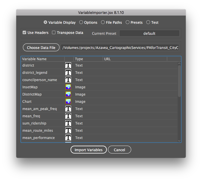
Select “Choose Data File” and browse to find your data source .csv file. Each column header should display as a Variable Name in the Import window. The data type column will help you to confirm whether the data will be imported properly.
Note that in the example window (shown above) the data type for InsetMap, DistrictMap, and Chart is “Image”. This indicates that the Variable Importer script read the filepaths in from the data source file correctly.
Click “Import Variables” to configure the Variable Importer tool in Illustrator.
For additional details or troubleshooting information, follow the steps in this guide.
Link template objects to source data
At this point, we have a template design and imported the data source as variables. To connect objects in the template to variables, enable the Variables toolbar (Windows -> Variables). Then, select an object and select the matching source data field in the Variables toolbar.
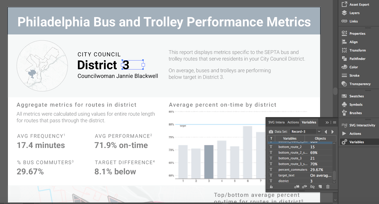
Click the “Make Object Dynamic” button at the bottom of the toolbar. The “Objects” column should populate with info from the source data file.
After you bind each object to a data source file attribute, you can cycle through the Data Sets using the arrow buttons in the Variables toolbar to preview each data driven document page.

Export files
All the work we did to create a full data driven design would be for naught if we had to save and export each document individually. Instead, we can create an Action in Illustrator and iterate through the Data Sets we generated with the Variables toolbar.
First, open the Actions toolbar (Window -> Actions) and select “Create New Action”. Name the New Action to match the intended result – something like: “Save as PDF”.
Then, “Start Recording” and navigate through the steps to save the document as a PDF.
File -> Save As… -> Format: Adobe PDF (pdf) -> [select any custom Save options] -> Save PDF
You’ll need to complete the Save process to record the full Action. “Stop Recording” to save the full Action.
To run the Action and export one version of the document for each Data Set, select “Batch” from the Actions toolbar. Select the Action you created (“Save as PDF”) and set the “Source” to “Data Sets”.
Enable “Override Action “Save” Commands” and select the directory location where you would like to save the files. Select a “File Name” convention and click “OK” to run the Action.

Note that if you run the Action more than once without changing the export directory location, the Batch process will save over previous versions. Update the filepath or create a New Action to save different versions if you iterate on your design and would like to save previous drafts.
Need additional info? This Adobe guide covers the details of the process for creating data driven graphics in Illustrator using the Variables tool.
Data driven results
You likely saved a ton of time by implementing a data driven workflow – if your client or team requests edits to the maps, charts, or infographic document, you can make changes in a limited number of files, update every document, and export in a batch.
Does this workflow apply to a project you’re working on? We’d be happy to answer questions about the process or help you complete the project. Shoot me a message or contact our team to learn more!
Check out the final results of leveraging a data driven workflow for the transit advocacy project: