
CartoDB’s Editor is an easy to use interface for creating beautiful webmaps. In the past couple of years, CartoDB has improved the ability to create simple infowindows and legends in Editor. However, the default styling for infowindows and legends can get a bit tiresome for someone that uses CartoDB frequently.
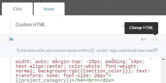
Each time you create an infowindow or legend, you’re given the default options to toggle layers on and off, display labels and pick a default styling regime. However, CartoDB also offers the ability to customize the HTML and CSS of both the infowindow and legend by clicking on the Change HTML button. When you click on it, you’re taken to the automatically generated HTML based on the selections you made in the Toggle Fields and Titles pane (if you made any at all).
Creating Your Own Infowindows
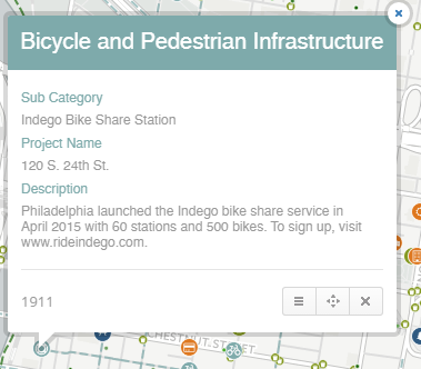
Many HTML and CSS tags won’t work here, but let’s see what we can do with the limited options we have. Let’s start with infowindows. The example here is from a project Azavea worked on with the Philadelphia Mayor’s Office of Sustainability to map green infrastructure projects across the city. So, how do we get to something like this?
Here’s a look at the code for the infowindow:
<div class="cartodb-popup v2" style="font-family: 'Open Sans'">
<a href="#close" class="cartodb-popup-close-button close">x</a>
   <div class="cartodb-popup-content-wrapper">
      <div class="cartodb-popup-header">
<h4 style="margin-left: -15px; margin-right: -15px; width: auto; margin-top: -15px; padding: 14px; text-align:center; color:white; font-weight: normal; background:rgb({{section_color}}); text-transform: none; font-size: 20px">{{project_category}}</h4><br></div>
   <div class="cartodb-popup-content">
      <h4 style="color: rgb({{section_color}}); text-transform: none; font-size: 12px; font-weight: normal">Sub Category</h4>
      <p style="font-size: 12px; color: #999; margin-top: 6px;">{{sub_category}}</p>
      <h4 style="color: rgb({{section_color}}); text-transform: none; font-size: 12px; font-weight: normal">Project Name</h4>
      <p style="font-size: 12px; color: #999; margin-top: 6px;">{{project_name}}</p>
      <h4 style="color: rgb({{section_color}}); text-transform: none; font-size: 12px; font-weight: normal">Description</h4>
      <p style="font-size: 12px; color: #999; margin-top: 6px;">{{description}}</p>
    </div>
  </div>
  <div class="cartodb-popup-tip-container"></div>
</div>
We’ll take it piece by piece. CartoDB’s infowindows and legends make use of the HTML <div> tag, which is a container unit that encapsulates page elements and divides the document into sections. The first <div> merely defines the type of infowindow, and we’re using the default option. In this case, we’re defining a font family, Open Sans, for the entire infowindow. The close button is also in there by default, and we’re going to let it stay.
<div class="cartodb-popup v2" style="font-family: 'Open Sans'">
<a href="#close" class="cartodb-popup-close-button close">x</a>
Next there’s this line, which is the <div> that acts as a wrapper for the entire infowindow. Best not to mess with this.
<div class="cartodb-popup-content-wrapper">
Below that we find the rest of the infowindow divided into two sections, defined by these div tags:
<div class="cartodb-popup-header">
<div class="cartodb-popup-content">
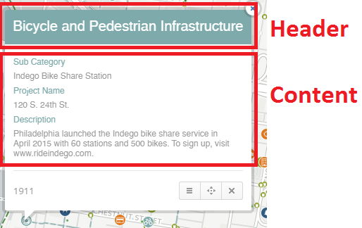
Header Code
<h4 style="margin-left: -15px; margin-right: -15px; width: auto; margin-top: -15px; padding: 14px; text-align:center; color:white; font-weight: normal; background:rgb({{section_color}}); text-transform: none; font-size: 20px">{{project_category}}</h4><br></div>
We’re using the h4 style tag, but applying some custom CSS. The margins (in pixels) define how the section will be offset from either the left, right or top. Padding will adjust how the text fits vertically. A neat feature is that you can use data from your table as a variable in the CSS. For the background color, we applied a conditional based on a field in our data, {{section_color}}, which applied a thematic color.
Content Code
    <div class="cartodb-popup-content">
      <h4 style="color: rgb({{section_color}}); text-transform: none; font-size: 12px; font-weight: normal">Sub Category</h4>
      <p style="font-size: 12px; color: #999; margin-top: 6px;">{{sub_category}}</p>
      <h4 style="color: rgb({{section_color}}); text-transform: none; font-size: 12px; font-weight: normal">Project Name</h4>
      <p style="font-size: 12px; color: #999; margin-top: 6px;">{{project_name}}</p>
      <h4 style="color: rgb({{section_color}}); text-transform: none; font-size: 12px; font-weight: normal">Description</h4>
      <p style="font-size: 12px; color: #999; margin-top: 6px;">{{description}}</p>
    </div>
  </div>
  <div class="cartodb-popup-tip-container"></div>
</div>
Here, we’re really just applying the section color to the field name and a custom color to the description text. In another project, we added an image tag <img> for some custom images for descriptions, so that tag works as well. Though I don’t have an example here, the same sort of tips can be useful for customizing hover windows as well.
Creating Your Own Legends
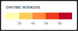
Now, onto legends. One limitation of CartoDB’s legends is their default behavior will only place a value at the lower and upper end of the range of your data. This makes it difficult to delineate class breaks in the data when making a choropleth map.
Legend Code
<div class='cartodb-legend choropleth'> <div class="legend-title" style="color:#284a59">Daytime Workers</div> <ul> <li class="graph leg" style="border-radius: 0; border:none"> <div class="colors"> <div class="quartile" style="background-color:#FFFFB2"></div> <div class="quartile" style="background-color:#FECC5C"></div> <div class="quartile" style="background-color:#FD8D3C"></div> <div class="quartile" style="background-color:#F03B20"></div> <div class="quartile" style="background-color:#BD0026"></div> </div> </li> <p style="padding-top:5px"> 2k 4k 6k 8k</p> </ul> </div>
Similar to infowindows, there’s a div defining the type of legend (choropleth). I applied a custom color to the title. The rest of the legend is contained in an unordered list tag <ul>. I removed this list containing the min and max to start from scratch:
<li class="min">
698.50
</li>
<li class="max">
16524.00
</li>
Based off this nice custom legend example, I added the “graph leg” class for the legend style, with zero border to give a nice clean look.
<li class="graph leg" style="border-radius: 0; border:none">
Here’s where it gets hacky. There’s no systematic way to add breaks for each class in the legend, but you can use the space html tag and just add the correct amount of spaces between the text for each break until it looks right!
<p style="padding-top:5px"> 2k
4k 6k 8k</p>
The CartoDB Editor is a powerful cartographic tool, and the ability to use your own HTML makes it even better. Use these tips to break out of the defaults and make your maps exactly the way you want.