
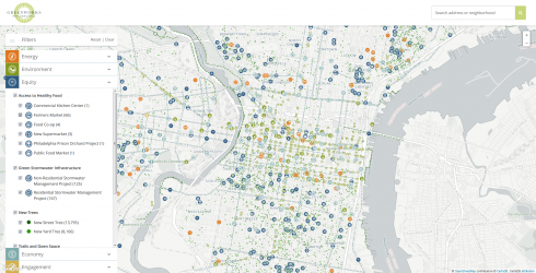
A common problem in cartography is determining how to display many different data sets. Maps can quickly become confusing with more than a handful of attributes. Adding too many data layers can hinder legibility of the map. This was an issue Azavea’s Data Analytics team ran into recently when it worked on a project for Philadelphia’s Mayors Office of Sustainability (MOS) Greenworks Map. Greenworks is a program that set targets to improve Philadelphia’s energy efficiency in five trackable focus areas: energy, environment, equity, economy, and engagement. In order to make the progress more accessible to the public, Azavea was asked to create a single web-based map to display over 15,000 records of data across thirty seven variables, with fifteen outcomes, in five thematic categories.
Another challenge was that this project’s web mapping software, CartoDB, only allows 4-6 layers on a single map depending on the account level. How was the team to display thirty-seven layers on a single map? The answer: lots and lots of custom design with CartoCSS, a styling language developed by Mapbox and used by CartoDB. CartoCSS enables dynamic and robust layering of control over many aspects of a map’s design instead of locking style information inside data files.
Rather than follow the traditional GIS system of stacking many layers, all of the disparate point data was merged into a single shapefile to get things started. The Data Analytics team made use of a category field to create a single CartoCSS style entry for every category, such as bike share stations, or solar panel installations. Next, Azavea’s UI/UX team created a suite of custom icons to add extra visual definition. Finally, Azavea’s web developers built a custom website to interact with and display the styled data.
Visual queues like color help site visitors distinguish data among the five thematic categories at a glance. Filters enable visitors to add and remove variables to quickly identify and visualize specific Greenworks initiatives.
Modern tools like CartoDB, CartoCSS, and a little creativity can go a long way toward turning daunting data sets into effective visualizations. See the results of Azavea’s collaborative effort for yourself at http://greenworks.com/map.