
In Part 3 of our 3-part series on Azavea’s redistricting and gerrymandering work, we look at the technical process behind developing infographics for efficiency gap reports.
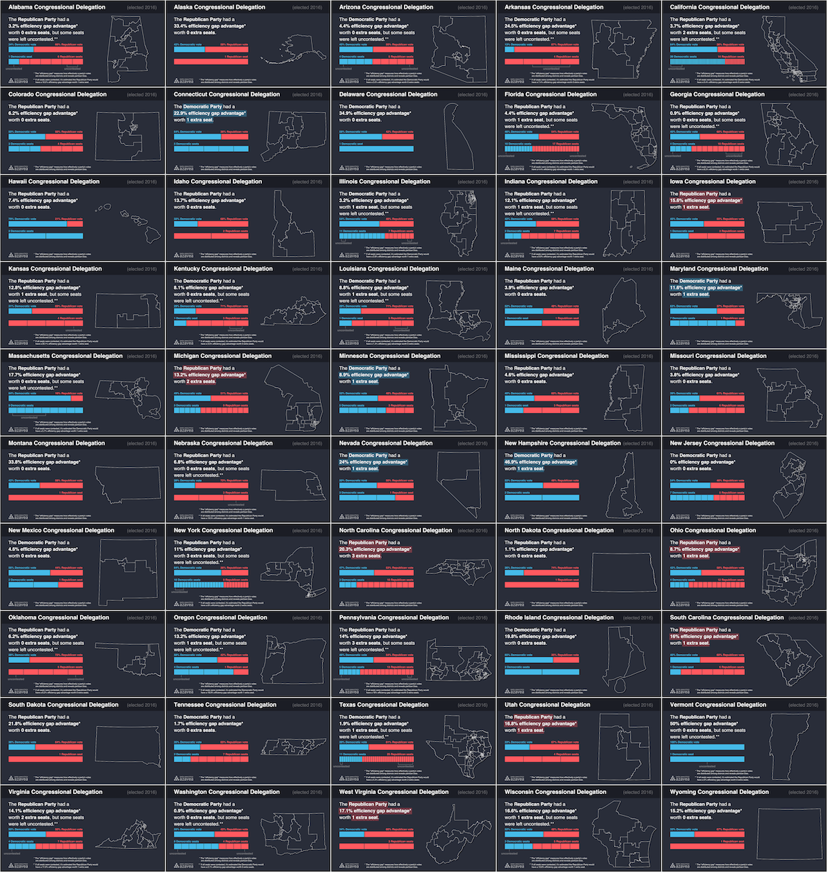
We made strategic use of JavaScript visual tools and Node.js as a scripting language in our design and production of 50 infographics about the efficiency gap, automatically creating one for each US state.
Designing an infographic is a long process that requires a lot of preparation and many fine adjustments. Manually designing multiple graphics in a program like Inkscape or Illustrator can quickly become a burden. With our automated workflow, we can analyze data, create data visualizations, and iterate on our design at any scale, whether we need one graphic or several thousand.
Node.js, D3, and Canvas as a Framework
For this project, we used Node.js (JavaScript) as our scripting language and D3.js with Canvas for visual elements. The core of our project is a single script executed with $ node index.js that loads a CSV and GeoJSON file, processes our data, generates graphics with D3.js and Canvas, then writes images to output files: one for each row of the CSV. Check out the project on GitHub and read some of the highlights below.
Analysis with JavaScript
The data analysis and calculations needed for the infographic can be built right into the same script that generates images. We calculated efficiency gap scores for each state in pure JavaScript. (Read more about the analysis here…)
// Hypothetical election results  for a delegation with a 25% efficiency gap worth 1 extra seat
var districts = [
  { district: 'District 1', votes: [190000, 110000], result: 0 },
  { district: 'District 2', votes: [170000, 130000], result: 0 },
  { district: 'District 3', votes: [ 60000, 240000], result: 1 },
  { district: 'District 4', votes: [180000, 120000], result: 0 }
]

// Seats: the number of seats in the delegation
var seats = districts.length;

// Seat Results: the number of seats won by each party
var seatResults = [0,0];
for (var i = 0; i < districts.length; i++) {
    seatResults[districts[i].result]++;
}

// Vote Results: the number of votes won by each party
var voteResults = [0,0];
for (var i = 0; i < districts.length; i++) {
  voteResults[0] += districts[i].votes[0];
  voteResults[1] += districts[i].votes[1];
};

// Votes: the total number of votes cast
var votes = voteResults[0] + voteResults[1];

// Seat Margin: the amount above or below 50% of all the seats that were won by the right-party;
// negative value indicates left-party won more seats
var seatMargin = seatResults[1] / seats - 0.5;

// Vote Margin: the amount above or below 50% of all the votes that were won by the right-party;
// negative value indicates left-party won more votes
var voteMargin = voteResults[1] / votes - 0.5;

// Efficiency Gap: a measure of how effectively votes were distributed by the right-party;
// negative value indicates votes were more effectively distributed by the left-party
var efficiencyGap = seatMargin - (2 * voteMargin);

// Efficiency Gap Seats: the seat advantage in the Delegation explained by the Efficiency Gap;
// negative indicates the left-party had an advantage
var efficiencyGapSeats;
if (seats === 1) { efficiencyGapSeats = 0; }
else {
  absEfficiencyGapSeats = Math.round(Math.abs(efficiencyGap * seats));
  if (absEfficiencyGapSeats === 0) { efficiencyGapSeats = 0; }
  else {
    var benefittingParty = efficiencyGap < 0 ? 0 : 1;
    efficiencyGapSeats = absEfficiencyGapSeats < seatResults[benefittingParty] ?
absEfficiencyGapSeats : seatResults[benefittingParty];
  }
}

console.log(
  'seats', seats,
  'seatResults', seatResults,
  'voteResults', voteResults,
  'votes', votes,
  'seatMargin', seatMargin,
  'voteMargin', voteMargin,
  'efficiencyGap', efficiencyGap,
  'efficiencyGapSeats', efficiencyGapSeats
);
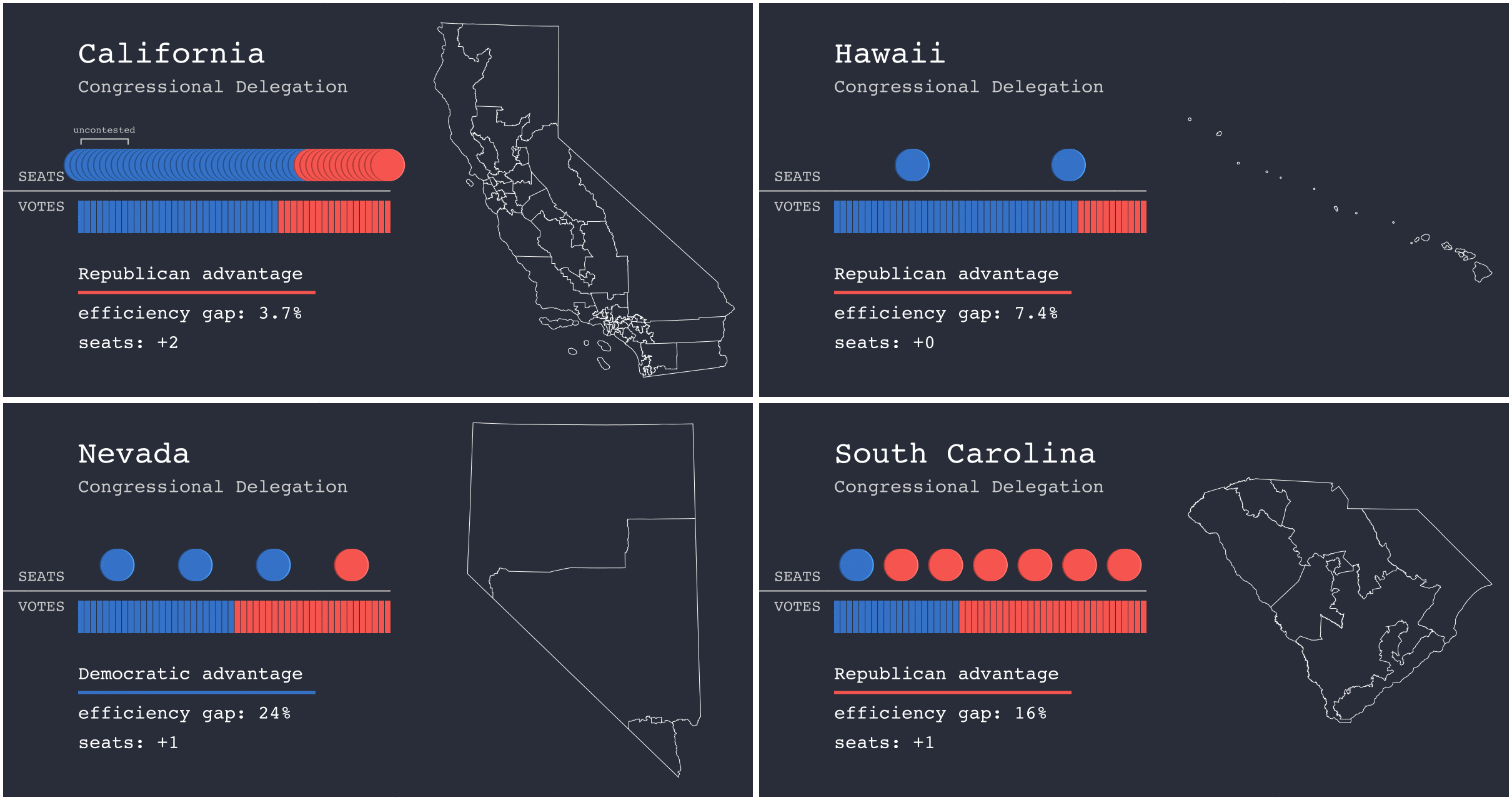
We can also use the logical operators of a scripting language to add whatever caveats and disclaimers may be necessary for each graphic. For example, we made several notes on our graphics to communicate the impact of uncontested seats on efficiency gap scores in certain states. We also gave special treatment to graphics for states with At Large congressional districts where the efficiency gap is less meaningful.
Static Image Generation
The Node Canvas package brings the features of HTML Canvas drawing into our scripted workflow. A Canvas element starts as a blank set of pixels that can be colored with rectangles, paths, text and more. The powerful data visualization tool D3.js allows us to draw maps and graphical elements on Canvas in completely customizable ways.
We also used the d3-geo package to draw district boundaries for each state with automatically defined custom map projections. Framing each map by hand would have required hours of additional work.
After building the Canvas image in JavaScript, the fs Node.js package lets us write to a PNG file that’s easy to publish and share.
Design Iteration
Because generating all of our graphics only takes a few seconds, we can quickly iterate on design decisions and test new formatting. Automating the image generation process allows us to make small design decisions and not have to worry about the time required to apply changes to each of the graphics. With the whole process defined in code, a revision control system like Git provides freedom to try new ideas, revert what doesn’t work, and track progress.
We will continue to adapt this workflow to other projects and explore how we can link together powerful, open source tools for iterable design and analysis. We are excited about the value of simple, static, accessible graphics generated at scale.
If you have a project where you’d like to see this design process applied, we’d love to hear about it! Reach out to our Data Analytics team and let us know your thoughts.
Check out the other blogs in this 3-part series:
The Evolution of Azavea’s Redistricting and Gerrymandering Work
Learn how our mission of creating positive civic & social impact through geospatial data analysis applies to work centered on redistricting & gerrymandering…
The Most Gerrymandered States Ranked by Efficiency Gap and Seat Advantage
Learn about our methodology for ranking the efficiency gap for each Congressional delegation in all 50 states and visualize the results…